
Project 2: Making to Refine, Adapt, Resolve
Exercise 3: Make work
Instructions: “It is important to keep up the momentum of making, particularly during and after a public showing of work. In response to your Project 1 reflections and evaluations, start to develop some provisional ideas, or make new works out of your current body of work.”
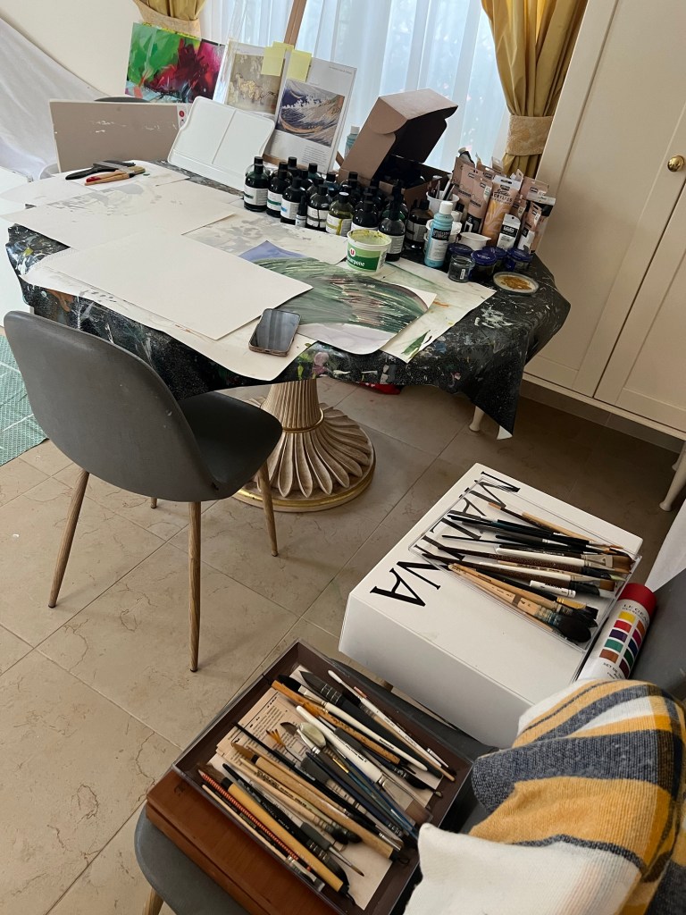
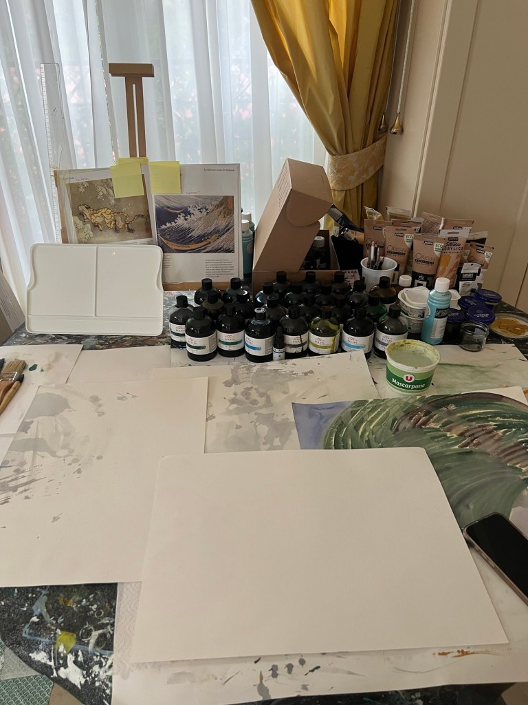
Below are some moments from my work that I did immediately after my showcase. I had a strong feeling that I needed to produce more artworks, as I realised that my Mediterranean Garden theme pieces were just a small beginning. I was thinking about expanding my theme and bringing more elements, such as below.
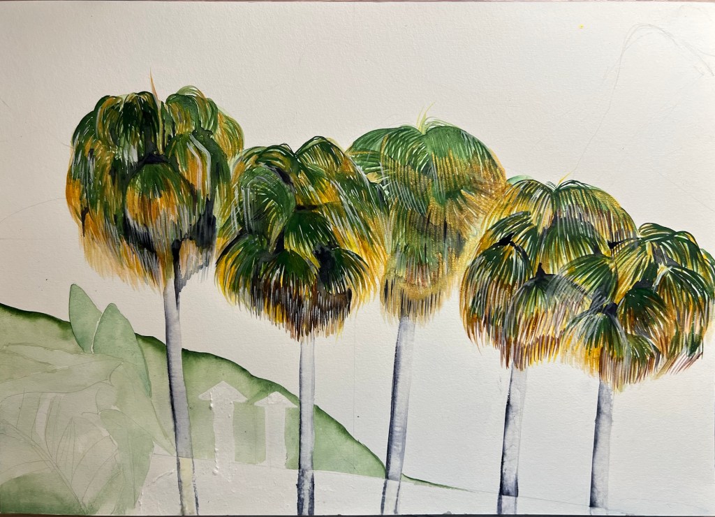
Working on local Palm trees.
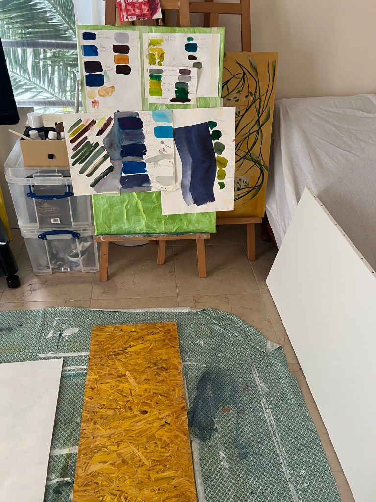
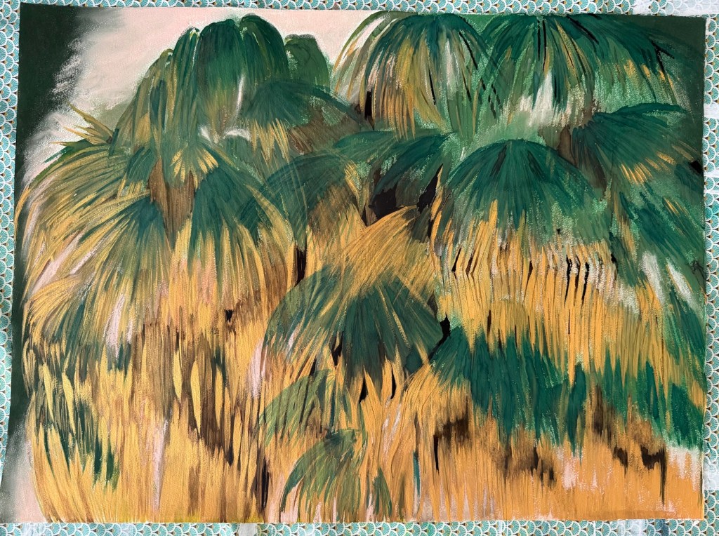
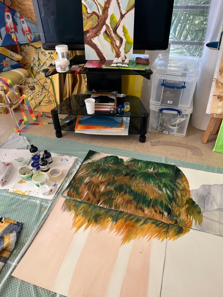
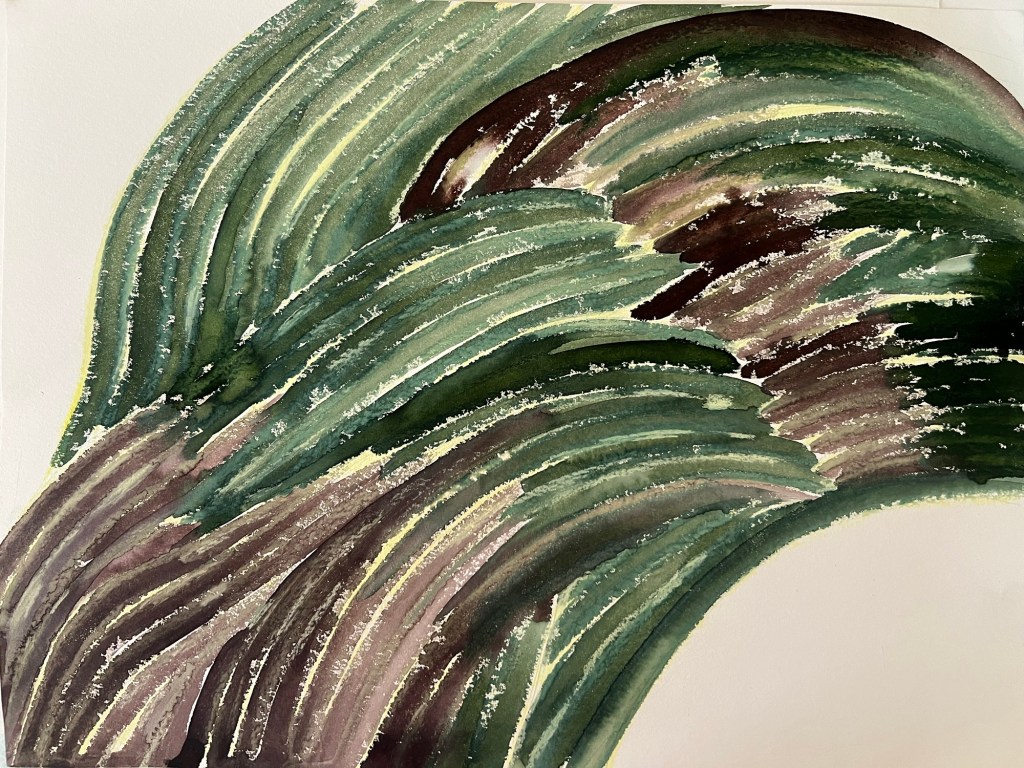
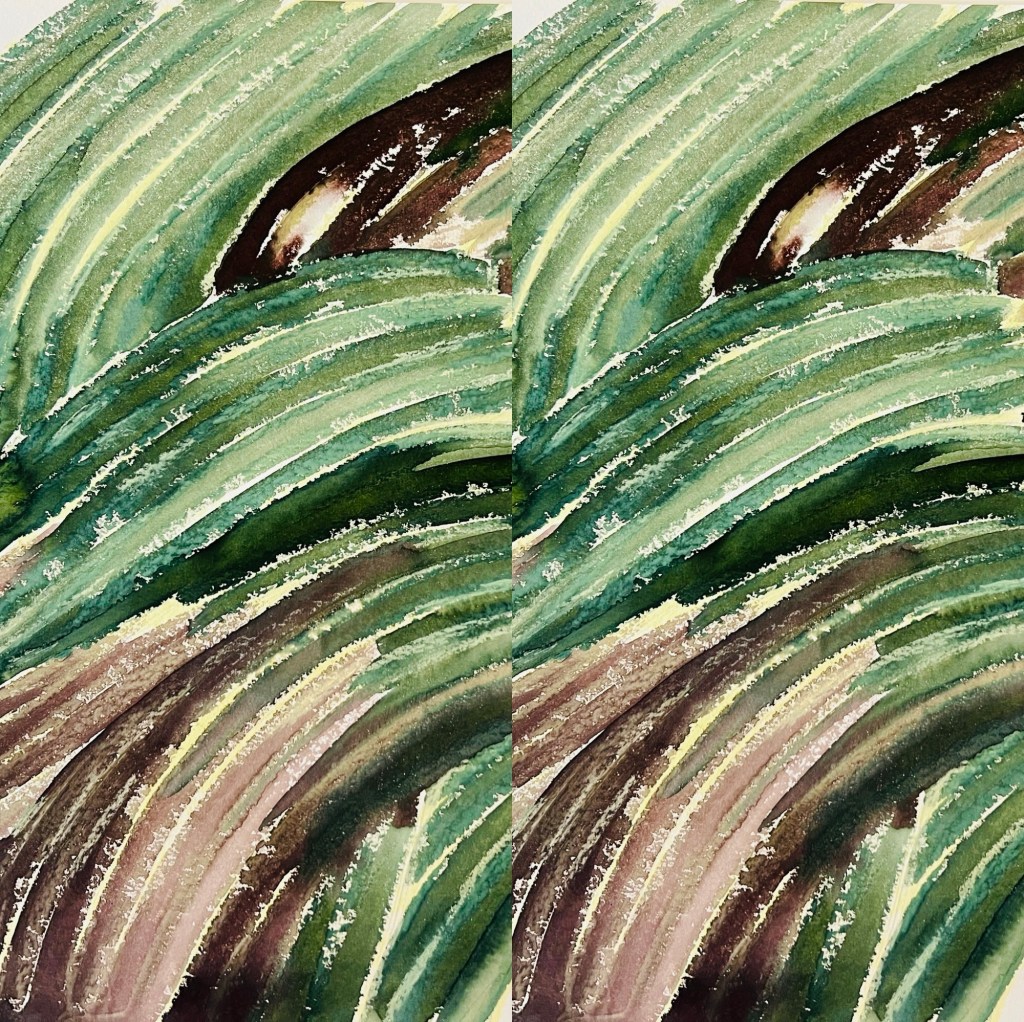
In this study, the best element was the foliage of the palm trees on the upper left paper sheet. It turned out rich and engaging, and I think I can continue with it. However, I am unsure whether I should place the massive rock. I sketched it with ink, but in the final work, it will require many more details and will be somewhat heavy, drawing attention away from the palm leaves, which I wanted to keep as a dominant element.
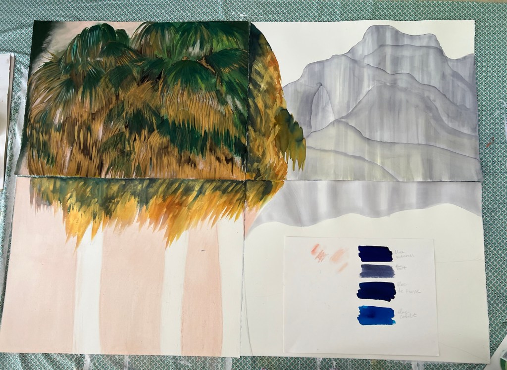
Another study of Palm trees.
This study is different because I made the rock less massive and incorporated additional plants into the composition. I am trying to sense and find the right design solution.
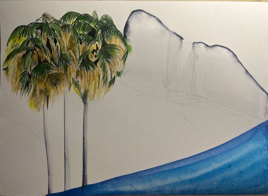
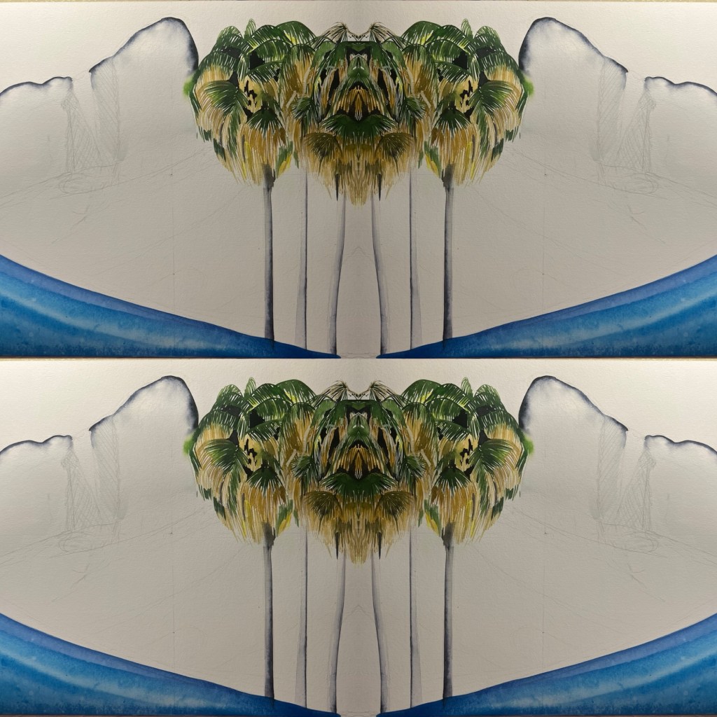
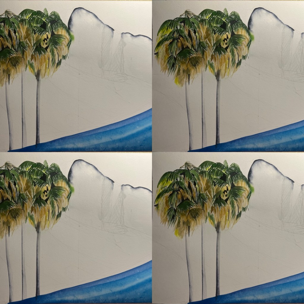
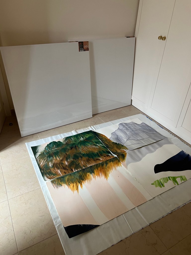
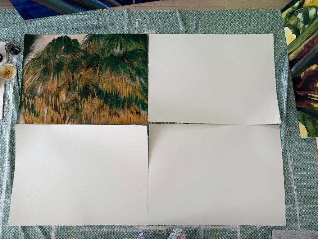
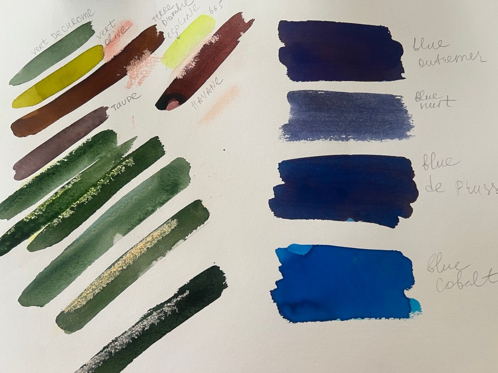
The Palms, as a visual element, are very appealing to me. Still, they are complex subjects from a technical point of view, or as I envision them in the large painting, and they are pretty demanding of the surrounding elements. I plan to create a large artwork, and I have purchased four canvases, each measuring 120 cm x 120 cm. This is a remarkably ambitious size, not just for me, but for the industry as a whole. This is a challenging task for me, which requires a lot of reflection and an unerring eye and hand. I took a pause here since I was unsure about the composition. I researched famous palm tree paintings to see what other artists did with the same subject and ensure that I remain original with it. I placed below these paintings I have consulted.
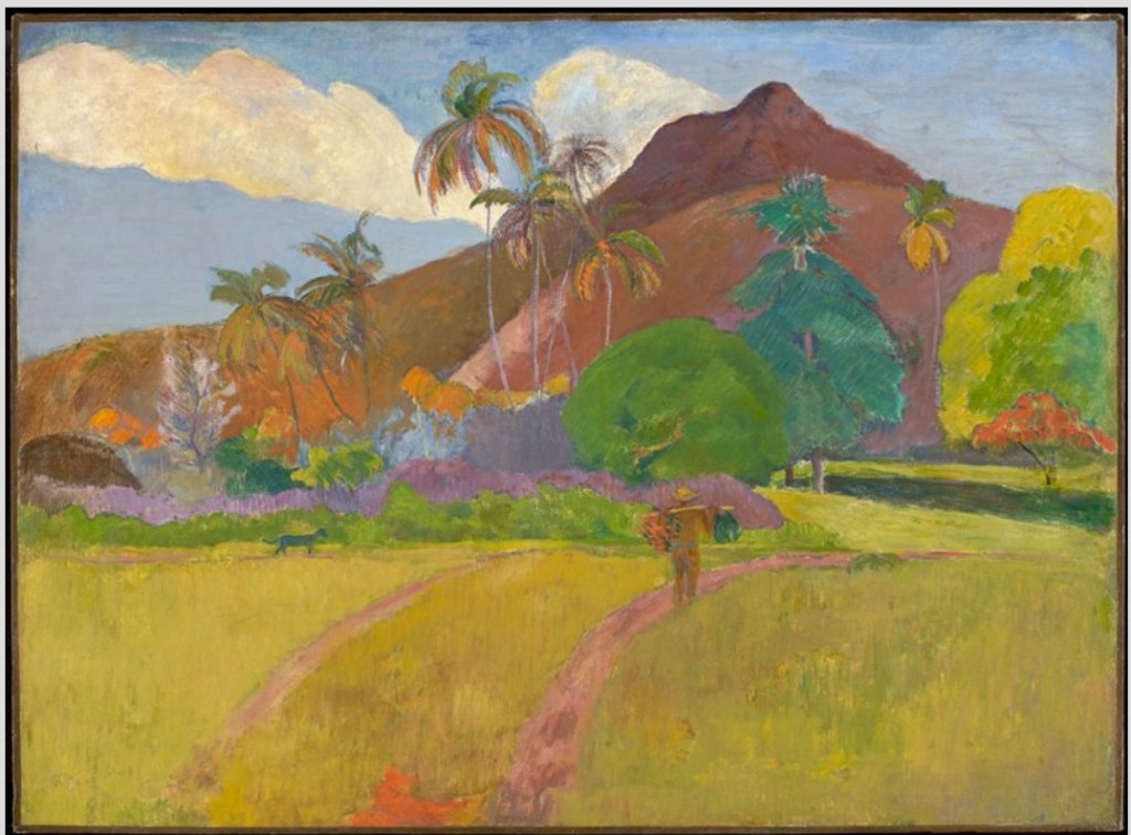
In Gauguin’s landscape, the palm trees don’t play a dominant role. The composition is built up around the central line of the surface. It is interesting to note how much space the artist dedicates to the yellow grass, which accounts for almost 40%. The artist employs multiple diagonal and curved intersecting lines, which help create a sense of space and create the vibration and movement in the painting.
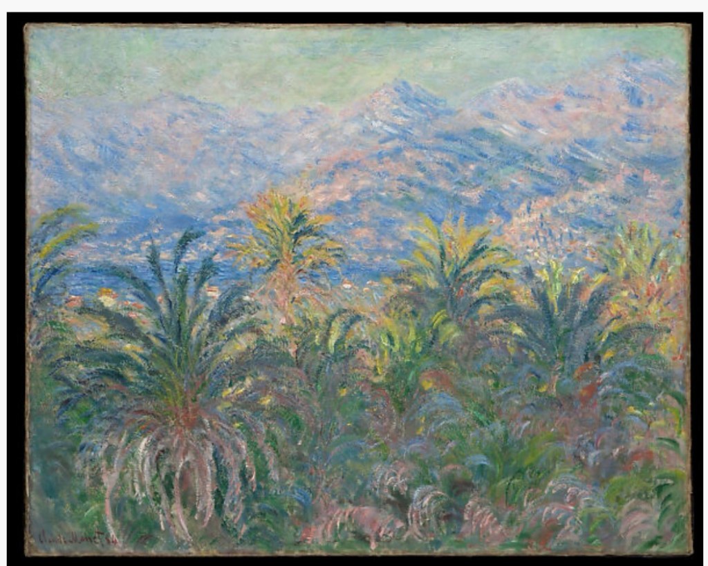
Interestingly, I visit Bordighera frequently, and this town is indeed notable for its lush greenery, old pine trees, and palm trees. Monet’s soft colours, impressionistic, illusionary notes, and fading line work are in odd contrast with the strong, graphic lines of the trees in Bordighera. But this is Monet’s interpretation of the palm trees he observed. His Palm trees. It lacks visible stems in the painting and appears almost like a dense wall of vegetation. I resonate with Monet’s colour work and the accent he made on the Palm trees’ rich foliage.
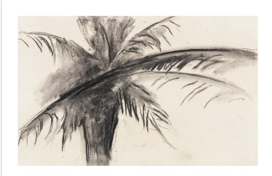
This is a quick study of the Palm tree. The artist channelled the eccentricity and the movement of the palm tree’s leaves, which are long, sharp and messy. I aim to do as well. In my palm tree study, I also accentuate the moving long leaves.
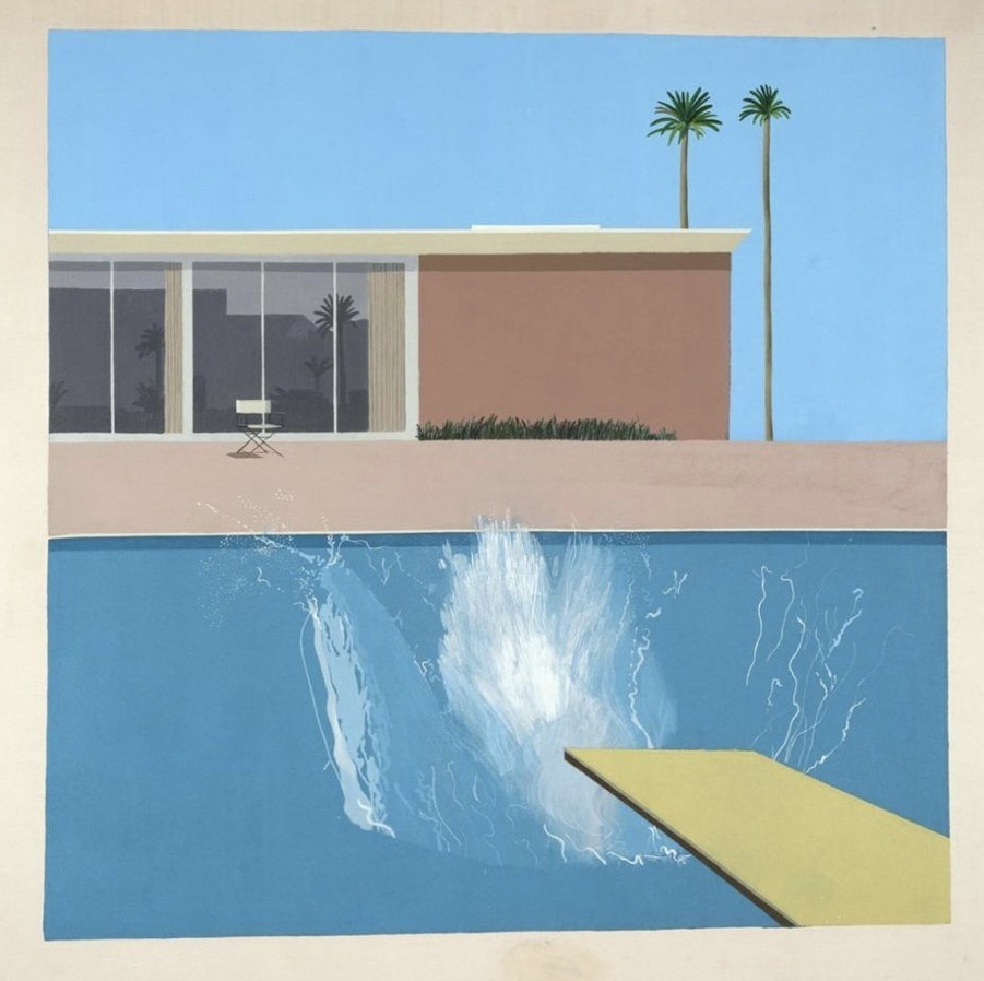
I find the Palm trees depicted by David Hockney in this painting above quite funny and humorous. This vivid pair of careless and elegant palm trees rejuvenates and livens up the flat, motionless Californian skies and dull architecture in LA. This is a very calming and harmonious composition. I really like the artist’s decision to place two palm trees within the plain blue area with no other visual elements. It brings a lot of attention to them. This painting makes me think that my intuition about the massive wrong near the palm trees in my representation is not the best compositional solution.
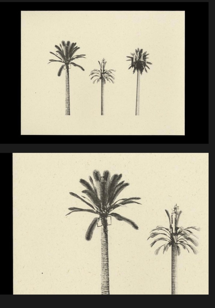
The prints from Edward Ruscha’s palm tree photographs also make me think that if I want to accentuate the palm tree with its elongated, elegant stem and aritocarpic shape, maybe I really should place it in the empty negative space. I like the prints a lot.
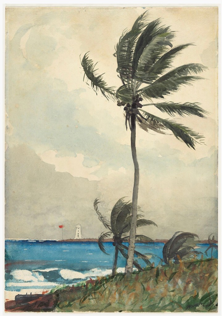
I resonate with the painting above. It is vertical, and again I see that the Palm tree, if it were to play a solo, it should be placed alone in the skies. This is an exquisite and well-thought-out composition, as well as excellent line work that effectively depicts the movement of the palm tree’s leaves in the wind. The artist also exploited the diagonal line on the front plane of the painting.
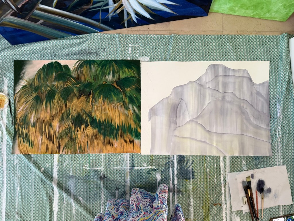
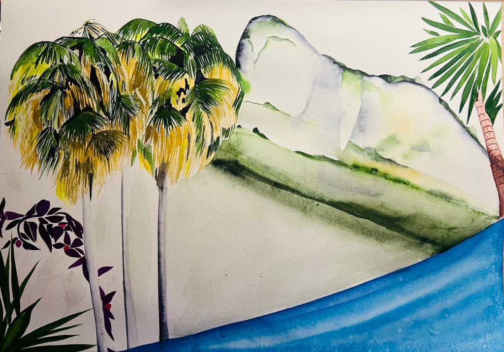
After my research, I came to the conclusion that I should abandon the idea of creating the Palm theme on the square surface of four 120*120 cm canvases, since I am very keen on accentuating the tree with its stem and leaves, and I should not squeeze in the rock, which will be over-dominating. I think I will place the Palm trees in vast skies, and I see that I should use a vertical surface, something like 120 * 30-50 cm.
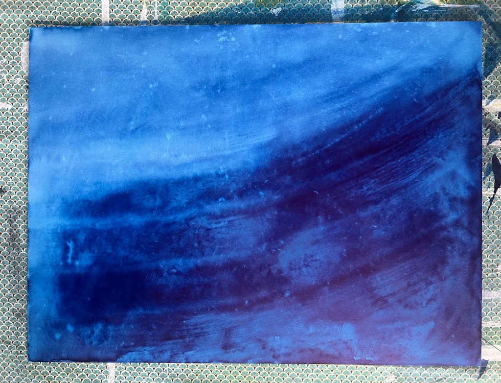
I was also trying to expand to the sea theme and connect it with the Garden theme.
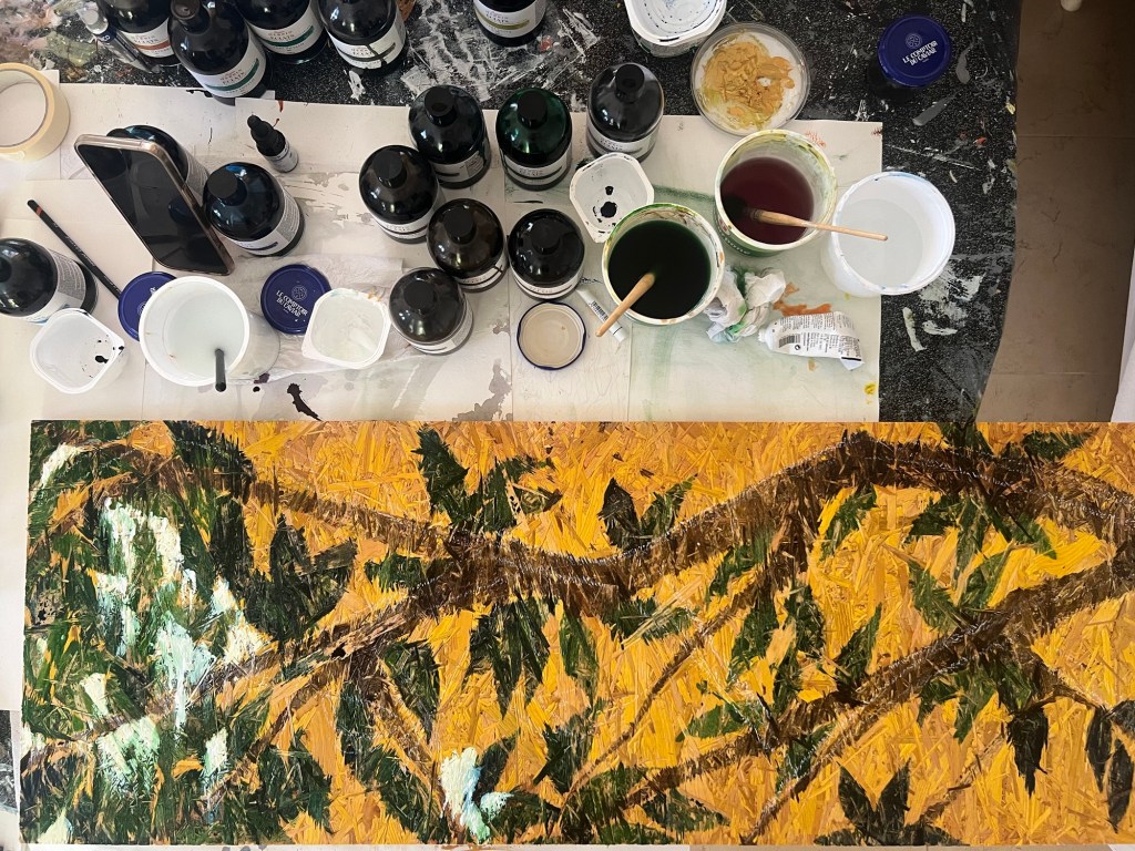
Below is a new project I have started developing. I noticed that developing two to three projects simultaneously is super stimulating. This experiment turned out unexpectedly successful. It took a while for me to decide what I should paint on this complex pattern word board, which is made from pressed sawdust.
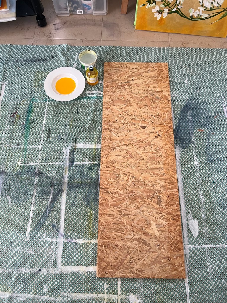
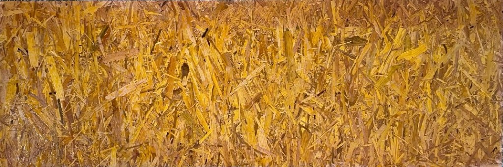
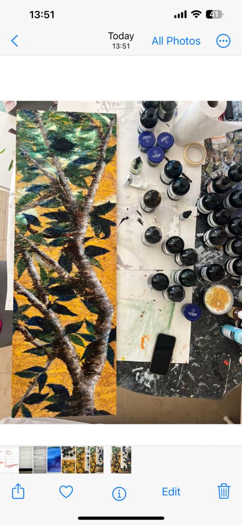
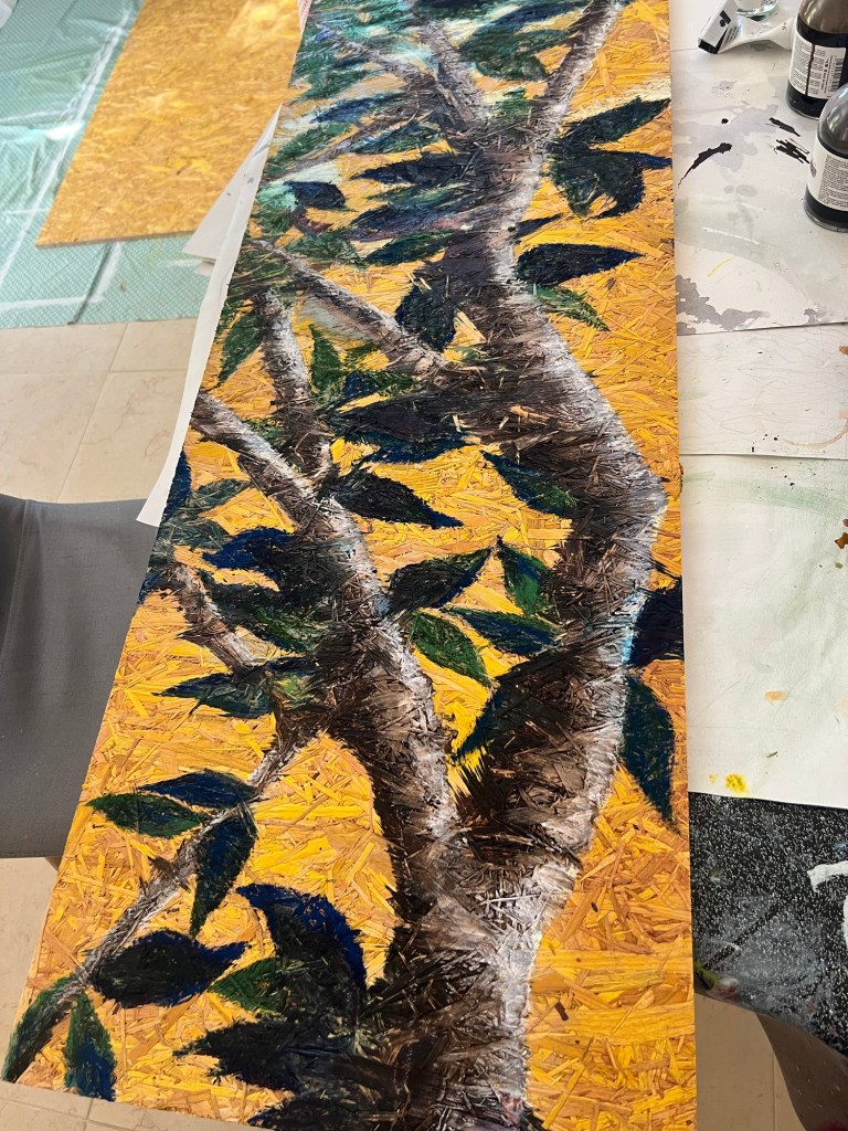
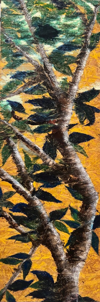
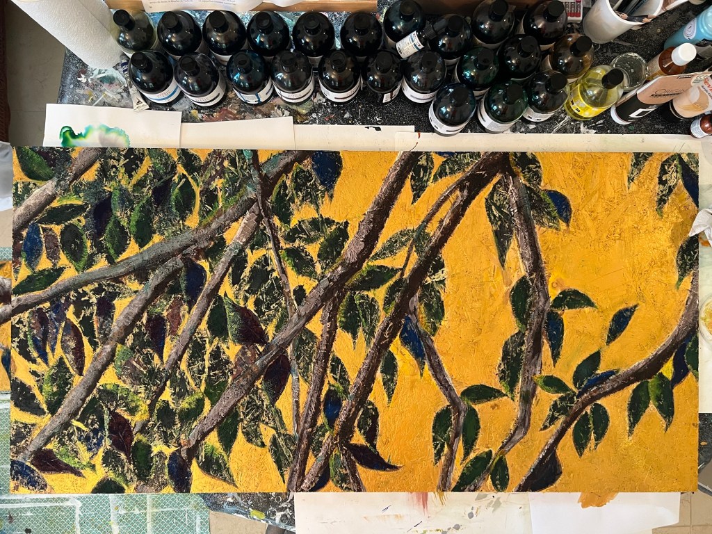
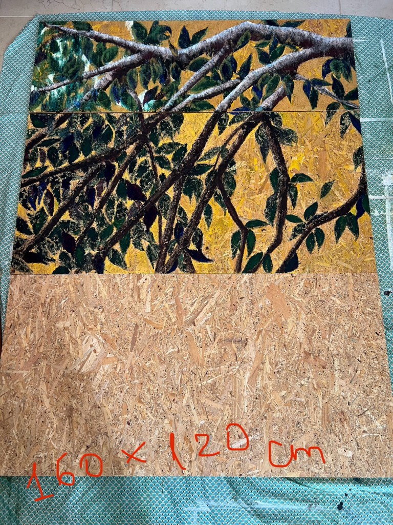

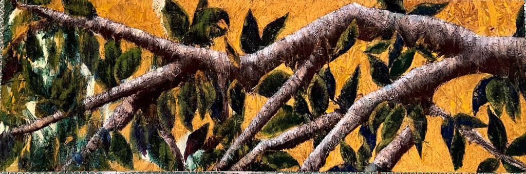
This study has evolved into a completed fragment, and I will submit it as part of my coursework portfolio. The work was engaging since it was the case when you start with timid brush strokes, testing the materials, and then they powerfully drive you to a good result, opening up an entirely new direction. This was the first time I used the press sawdust board, and now I understand its potential for my artistic style. It was a great discovery and a solid, promising addition to my style. After I finished the first narrow 30 cm board, I acquired two additional, larger ones, 120 cm x 60 cm, to expand the theme. Hopefully, it will be my large artwork, measuring 160 cm x 120 cm.
