
Here I post some ideas and trials for my parallel project.
One is about mimosa tree in blooming phase, which is always a very inspiring object for me.
Work in progress. Below is my work in progress for my initial development for this project. I have used oil paints and A3 size paper fro the oil painting from Canson. This project is very much about color harmony and detailed work. I wanted to try first how my colours will work together, trying to find good solutions for mint and yellow shades. Another task was to try painting numerous leaves and tiny round mimosa flowers. I painted the blooming mimosa earlier in soft pastels and aquarelle. This is the first time I painted it in oils. I think the oils are really good medium for my ambition here. One of the challenges were those tiny mimosa flowers, which finally appeared not bad. I used “wet on wet” painting technique placing dots of yellow paint on wet dark green surface and swirled the brush to create tiny circles. The yellow pigment was mixing nicely with the green one creating some depth and natural look for my painted flowers. The leaves are multilayered with different shades of green and white as a result of my search for the best colour here.
Mapping for the project: I think I will stay with oils for this project, because this trial I like more than I did in soft pastels and aquarelle. Next time I will make it in larger size. My aspiration here is to paint a large scale painting, something like 150 cm*200 cm.
Another option to explore and try to develop it in abstract painting. I think about different size circles, ovals and triangles.
In terms of colours I want to experiment with introducing some gold uneven patches on some leaves.
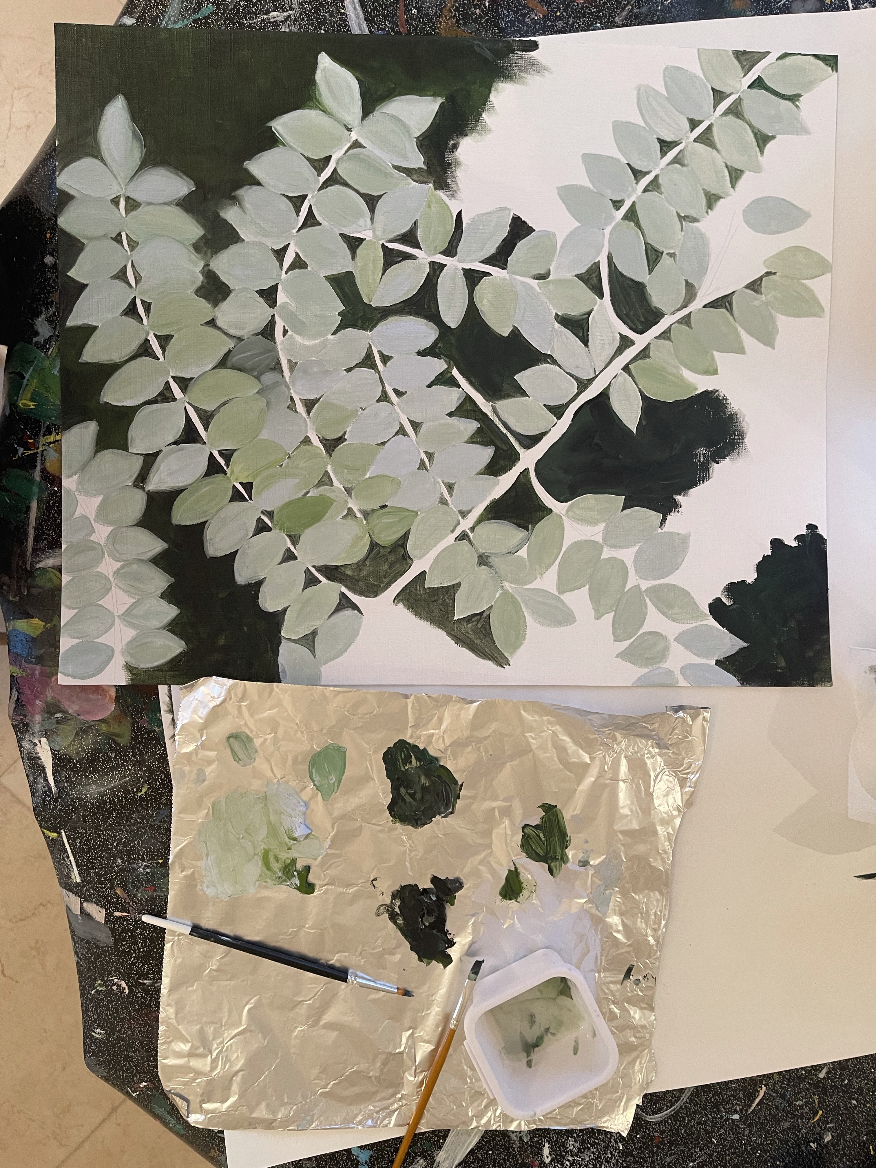

I also make collages, trying to understand how this would look in larger size painting.
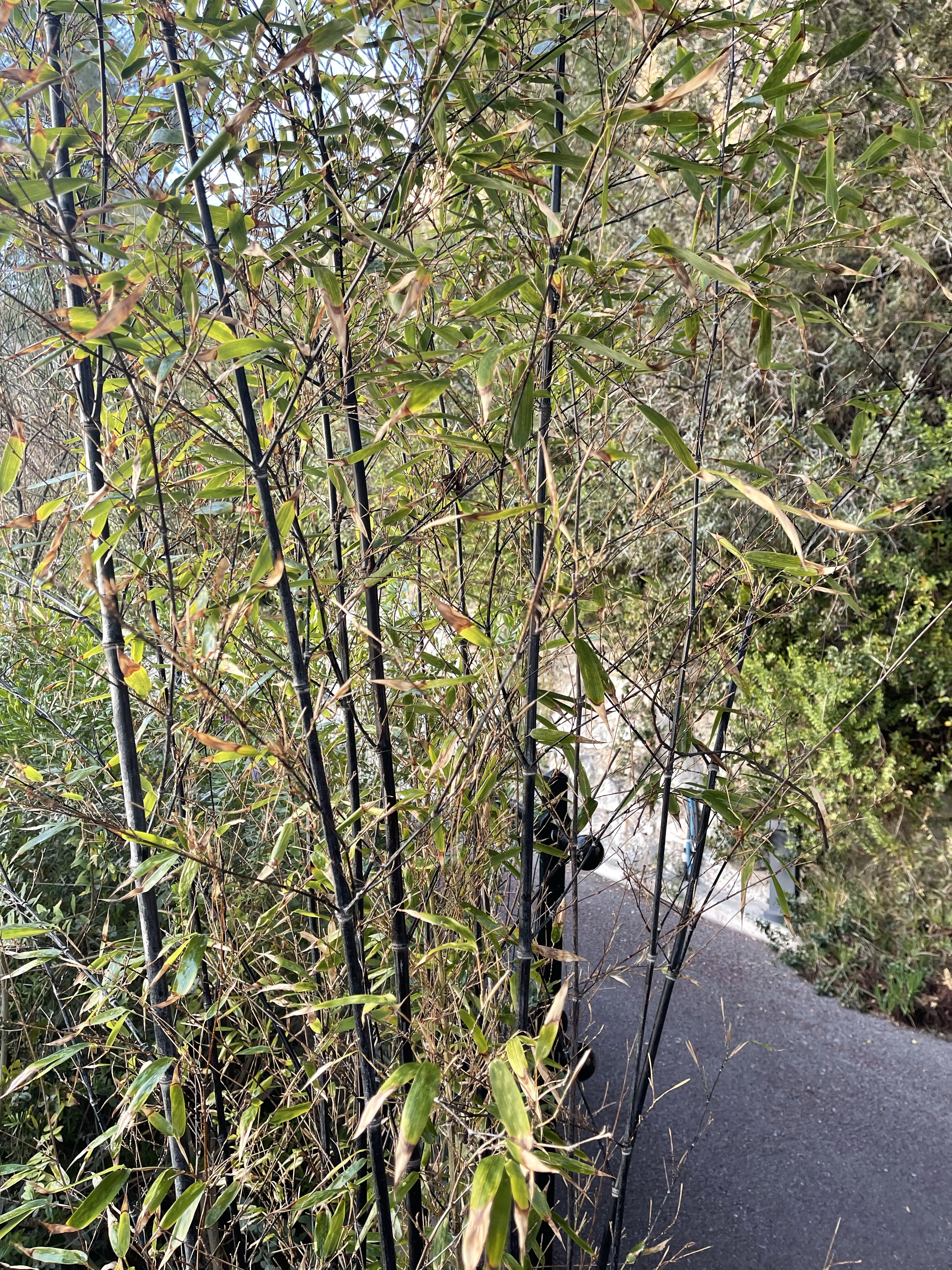
Another idea to work on for my parallel project is a black stem bamboo in my garden. I used A2 size paper from Arches and my collection on inks from Sennelier and acrylic inks from Liquitex. Below are some initial sketches for the project.


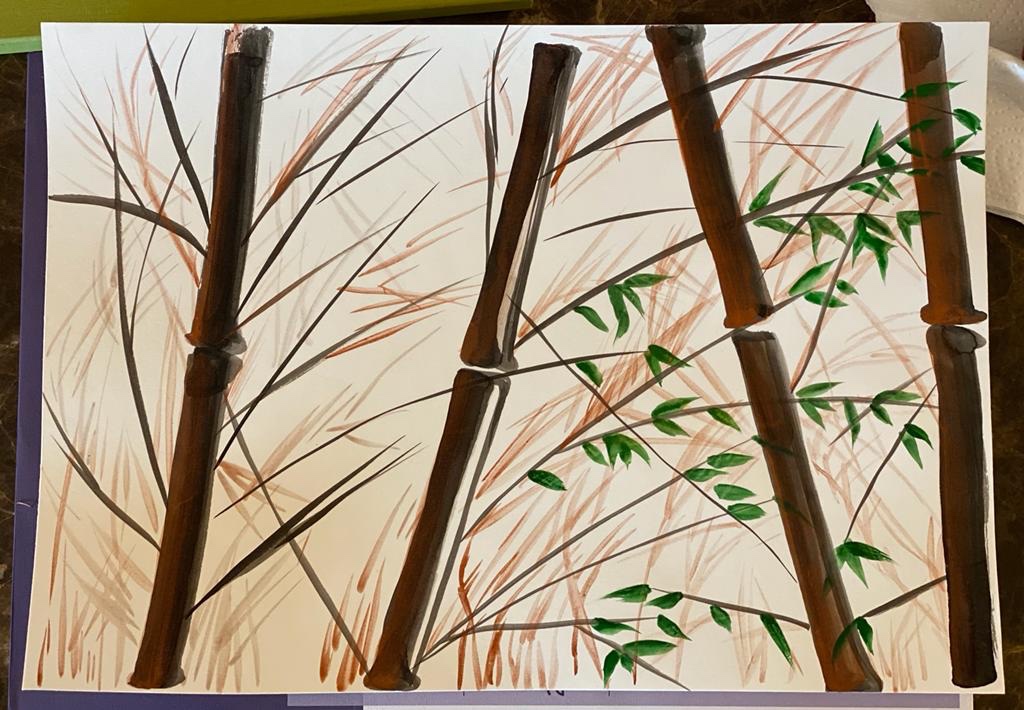


I did the required mapping for developing my project further, below is another sketch, which looks much better than the first one. I wanted to create some dimension and introduce more colours, as well as changing some details in overall composition. I decided to stay with ink as a medium for this work. Next time I will try to use my inks on canvas instead of paper to see some new nuances in overall result.
This time I used A2 size aquarelle paper from Arches, acrylic inks from Liquitex in the following shades: carbon black, bright gold, rich copper; inks from Sennelier in Yellow Green 871, Deep Green 803, Raw Sienne 223. I used the same Japanese calligraphy brushes to paint bamboo stems and leaves. I made some of them darker in black and some of them in light grey, yellow green and light brown to create a dimension of the forest and light coming from upper left corner. he same approach I used for painting leaves: some of them deep black and many of them are painted in different colours.


Here we can see how my Bamboo project has been developing so far:
