
Artist Website.
I started this task earlier and posted about it in April of this year.
I just copied and pasted the content of that post for my Tutor’s convenience. I have updated the writing below with new information and the decisions I made by the dates of my first exhibition.
My Practice Plan work: My Professional website.
I am working on my website, so I spend lots of time watching tutorials and advice on this topic made by art professionals. This particular video is very useful https://www.youtube.com/watch?v=2MfKKDw_WAA
I also keep this link below for myself and my recommendation since this is a professional overview of which website-building platforms are on the market for visual artists to build their websites.
https://www.contemporaryartissue.com/4-best-website-builders-for-contemporary-artists/
It took me a week to research and study which website-building platform I should use for my professional website. I chose WordPress, which I know very well, and Squarespace. I spent a good time checking the most expensive resource, ArtLogic, which is used by many art professionals, including large and most successful galleries and well-established, famous visual artists. It is a great, powerful platform, but super expensive; I would pay around 1600 euros annually. Eventually, I decided to buy two domains on WordPress and Squarespace and built two websites. I realised it would be the best decision for me since both platforms are suitable for creating portfolio websites, and in premium options, they would cost me less than 1.000 euros annually. I will build two websites simultaneously, exploring the power of both platforms, one website I can convert later to my photography website.
I checked the websites of two well-established visual artists Kathryn Macnaughton and Stan Van Steendam to understand the content of their websites and other details: http://kathrynmacnaughton.com and https://www.stanvansteendam.be These artists are brought as those visual artists who have exemplary profesional websites content and design.
I needed to understand their approach to the CV and art crit section. I noticed that in both cases, there are no artist statements, but rather professionally written critical articles that explain their style. An interesting detail is that on Kathryn’s website, there is no mention of the author of the text placed in the “about” section, and on Stan Van Sttendam’s website, there are three critical texts with authors’ names, but no mention of who these people are. Thus, I see that even though there is a pretty rigid approach in terms of overall style, colour palette and types of sections ( About, Paintings, CV and Contact) for the professional portfolio website, every artists place the texts about themselves as it comes feasible to them- it can be a personal artists statement as well as a texts written about their artworks by someone. The websites I am building are not yet published, as they are still in progress. I plan to activate them by the end of May.
_________________________________________________________________________________
Post’s EXTENSION for Part Four. July 5th 2025
Even though I registered two domains on two website building platforms, I have been so busy with my OCA studies and exhibition preparations that I haven’t managed to build my permanent website. I also didn’t have good digital images of my artworks in May and June, so I had to postpone this work anyway. However, the showcase time was approaching, so I had to find a solution to print my contact card with a QR code to a location where people could view my work. I have been using it so far as my temporary website solution and plan to launch my official website later this year, when I will have more critical PR information.
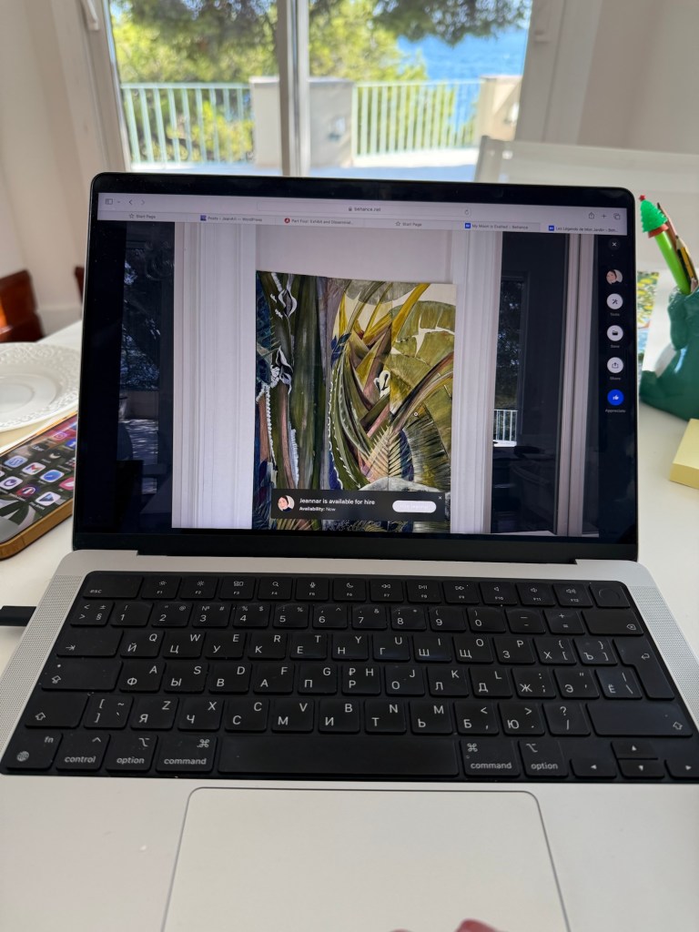
I decided to generate a QR code for my Bēhance platform portfolio page, which looks quite good. The Bēhance platform provides visualls with a high-quality portfolio as their personal account where they can showcase their work, present themselves, connect, and network. It is very popular among art professionals, graphic designers, illustrators, and interior designers.


Frankly speaking, the recommended Fraser Muggeridge studio (AKA Please do not Bend), section on website design,” is not suitable for me at all. His style is too eclectic for me and far from the refined and elegant standard typically found on an artist’s website.
I find the following phrase from Part Four OCA Learn page quite odd:
“Throughout a wide range of formats, from artists’ books and exhibition catalogues to posters, marketing material, exhibitions and websites, the studio prioritises artists’ and writers’ content over the imposition of a signature style. By allowing images and texts to sustain their own intent and impact, each project is approached with typographic form and letterform playing a key role in arriving at a sympathetic yet subtly alluring object.”
It employs aesthetized, pretentious language, lacking semantic clarity and precision within its convoluted sentence structure. I really don’t understand what the author meant by “sympathetic yet subtly alluring”. It is inappropriate to place a particular studio product advertisement in the educational material; for me, this text had an opposite effect.
It is worth mentioning that today you don’t need a graphic designer to design your website. The hallmark of a good artist’s website is that it is built around your work and doesn’t contain someone else’s artwork or graphic design. WordPress, ArtLogic, and Squarespace website building platforms offer an array of elegant, artist-centred templates, so you don’t need a graphic designer to create a “sympathetic yet subtly alluring” design for your artist website. It is clear to me that this part of the course was created many years ago and needs to be updated.
