
Research on Kawase Hasui (1983-1957).
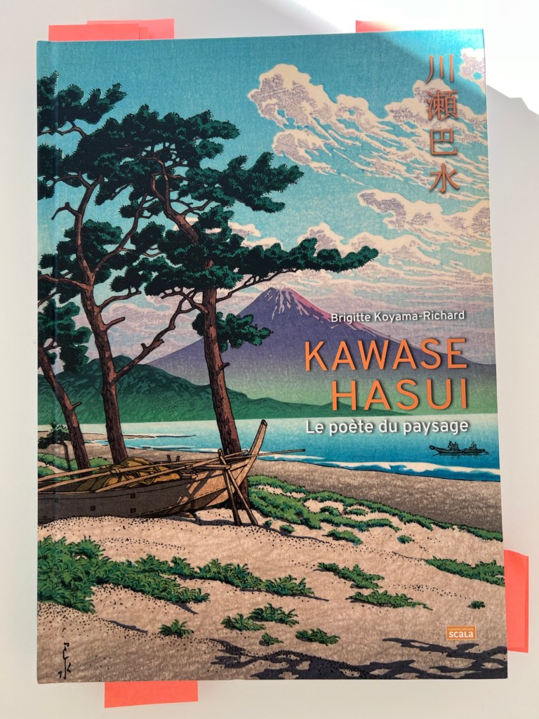
I discovered terrific artworks by Kawase Hasui, who is known as a master of Japanese landscape painting. I found a book: “Kawase Hasui. Le Poète du Paysage” by Brigitte Loyama-Richard, @Nouvelles Editions Scala, 2024. Since I have been building my collection of rare, finely published books about art, I couldn’t resist buying this one 👇.
Kawase Hasui depicted trees and different plants in his landscapes, so I was interested in learning from his artworks how he handled the green colour and painted large masses of greenery. I also had another reason to research this artist’s works: the question about negative space and compositional decisions has been following me since the beginning of this current project I have been doing for the course. Below are his artworks, which contain lots of green colour and greenery, such as various trees and flowers. I studied them to develop solutions for my project.
Below, I placed some of his works to study.

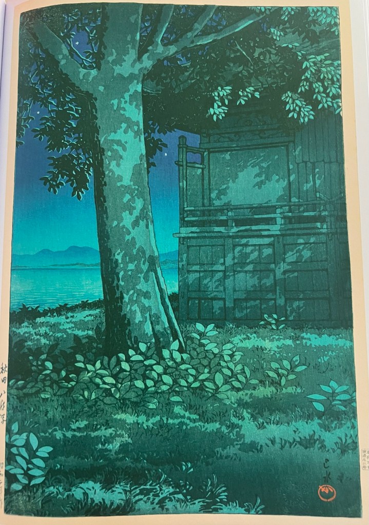
Kizaki Kohan [Le Bord du lac Kizaki], Kawase Hasui, 1941, Ota City Fold Museum, image from “Kawase Hasui. le Poète du Paysage” by Brigitte Loyama-Richard, @Nouvelles Eitions Scala, 2024, p.17).
In this landscape above, the artist emphasizes the details of the building rather than the greenery, which is depicted merely with minimal shades and different hues of green, just some symbolic strokes. He also introduces the diagonal line of the hill and the road above the building. The space above the green hill seems untouched by colour. It looks like he left the natural colour of the paper.
In the landscape below, I notice three uneven lines as structural elements of the entire composition: one at the top of the mountain, the second at the top of the middle hill, and the third as a sea border line in conjunction with the bottom of the model hill and the sea. This third line looks very unusual to me. It adds to the overall softness of the mountains and gives a strong feeling of moving heavy waters. Another interesting detail for me was his use of intense blue colour along with a massive green area. In my project, I also painted large regions of green and blue alongside each other. To find an example from a landscape master was encouraging.
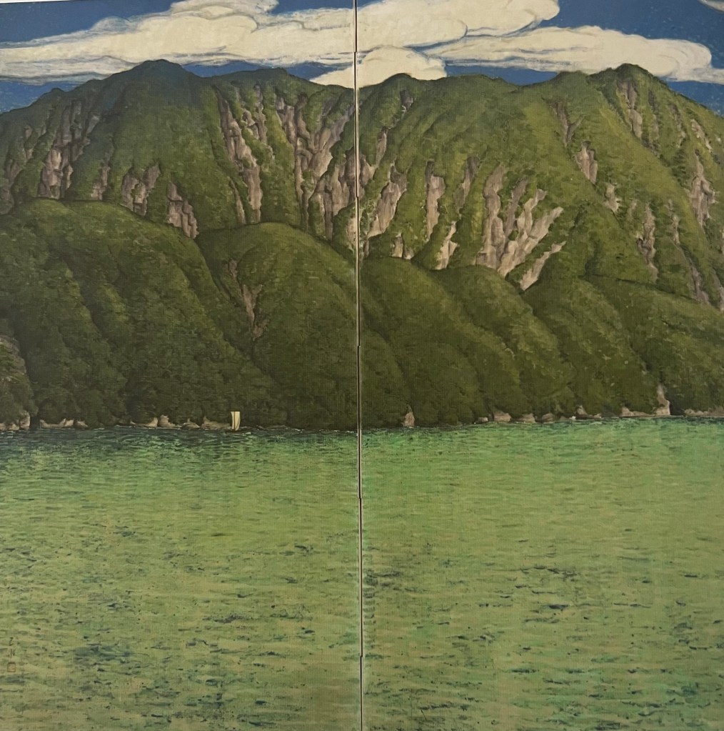
Towada Ko [lac Towada], Kawase Hasui, 1919, a pair of folding screens, inks on paper, John C.Wever Collection, image from “Kawase Hasui. Le Poète du Paysage” by Brigitte Loyama-Richard, @Nouvelles Eitions Scala, 2024, p.20).
I could not pass by the irises below without noticing them. Again, the artist is not afraid to place lots of green and blue colours, introducing dark red to live among them. I find this painting perfect from the highly refined flower details and the colour scheme point of view. This painting helped me understand the red shade I can use in my project.
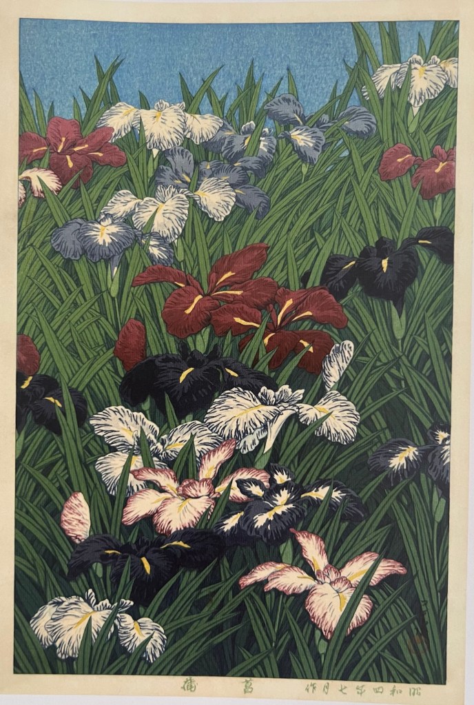
Ayame, [Iris Japonais], Kawase Hasui, July 1929, aquarelle on paper, Ota city Folk Museum, image from “Kawase Hasui. Le Poète du Paysage” by Brigitte Loyama-Richard, @Nouvelles Editions Scala, 2024, p.33).
The painting below strikes me as masterful of the aquarelle technique. It takes a lot of talent and technical skills to apply Aquarelle smoothly. The skies behind the tree are obviously done with an aquarelle wash, which is perfect. I see again the diagonal line of the soil going towards the horizontal line as a foundational feature of the compositional decision. The squareness of the building is elegantly offset with a tree’s curved stem. In general, the neighbourhood of square rigid lines of the building and curved, uneven lines of the tree create an intense dialogue.
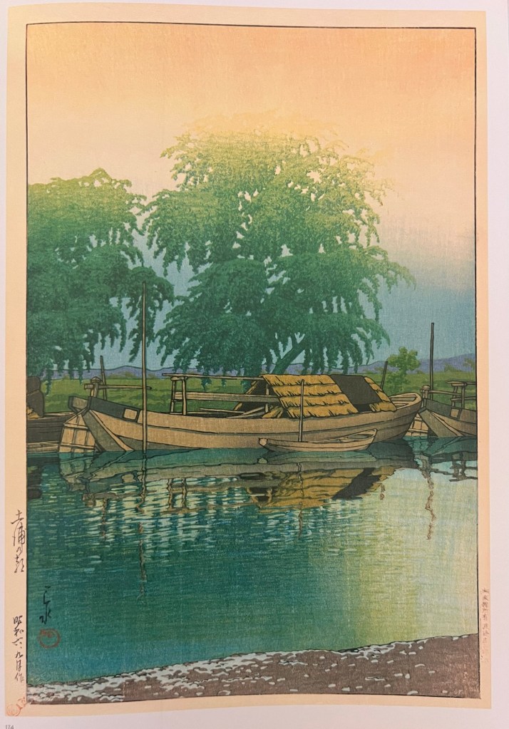
Tabi miyage dai san shû, Akita Hachirôgata [Souvenirs de voyage, troisième sèrie. Le Lac Hachirôgata à Akita], 1927, Tokyo, National Diet Library, image from “Kawase Hasui. Le Poète du Paysage” by Brigitte Loyama-Richard, @Nouvelles Eitions Scala, 2024, p.106).
The artwork below again is a great example of aquarelle technique mastery: the skies with a very complex gradient from the peach colour on the top to a blue shade below is just mindblowing to me. The soft merge of the tree’s crown with peach skies is fantastic. The trees are depicted in a very soft manner; they look fluffy. It is again interesting to see that all lines are curved: curved lines of natural objects dominate the painting, but even the straight lines of man-made objects – masts are not that straight, and boats’ lines are also very curved.
Tsuchiura no asa [Matin à Tsuchiura], Kawase Hasui, September 1931, Tokyo, National Diet Library, “Kawase Hasui. Le Poète du Paysage” by Brigitte Loyama-Richard, @Nouvelles Eitions Scala, 2024, p.137).
Kawase Hasui’s artworks encouraged me to continue my intuitively perceived strategy of avoiding very straight, rigid lines. They also supported the direction of many green and blue colours scheme. Regarding compositional decisions, I see now, after my research on Vincent Van Gogh, Paul Cezanne, and Kawase Hasui’s artworks, that I should not hesitate to introduce diagonals.
