
Project One. Body of Work.
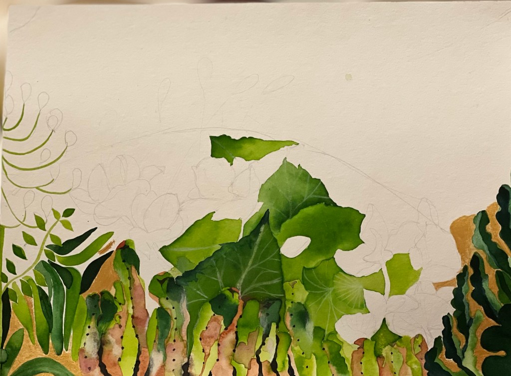
I continued to work on the elements of my project, “Riviera Flowers.” As you remember, I was unhappy with the red flowers in the central part of the composition. They didn’t work out in terms of shape and colour, and I closed this part of the painting with white paper, as you can see in the photo below on the left. So, I developed a new piece—yellow flowers—which came out well. At this point, I started to enjoy the process of failure, which is a primary condition now for upgrading and succeeding. The yellow flowers below have different leaves and are surrounded by cactus plants, which I tried to depict.


You can compare these two pieces now:

It was exciting to put the new piece in the composition; see below
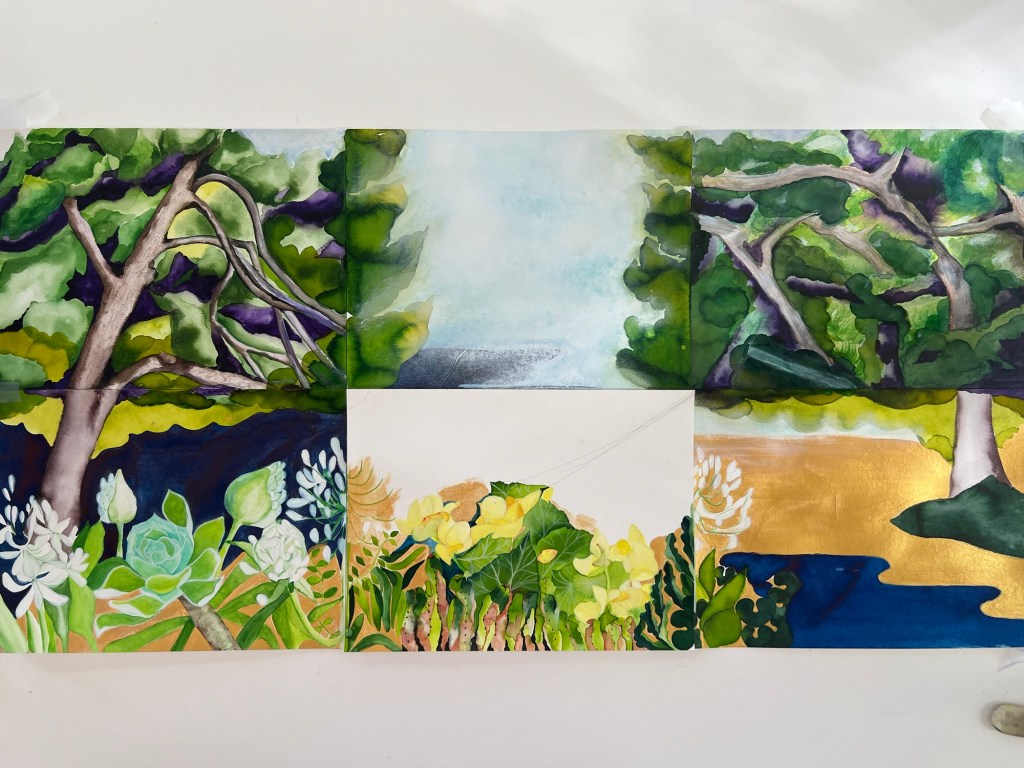
I find working with fragments which I can move around the entire composition engaging and helpful to understand my project. I have developed four variants using the pieces:


My analyses of the outcomes and options have resulted in the following thoughts and conclusions:
- The red flowers and leaves in the original “old” composition ( option 4) must go away; The yellow flowers with different foliage and cactuses stay since they appear much better how I made them from a technical point of view and combine well with each other. This combination looks much more interesting than the original red flower bouquet.
- The right side of the painting won’t stay as in the original “old” solution in option 4. Because the right side under the right tree of Option 3 looks much more appealing than in Option 4. In Option 4, this side under the tree looks awkward; the large gold area seems very unnatural and irrelevant, strangely empty. Also, the line between the gold and light blue areas doesn’t look good. This entire area looks unfinished. Thus, this side must be filled with another element if I keep the yellow flowers and +catuses at the centre, as in Option 2.
- In Option 2, I inserted a steep diagonal line, placing a large area of dark blue at the centre of the composition. It was interesting to see how it would impact the whole painting. I could not say that I really loved the change. It is difficult to see in the photo, but in real life, I see a difference in shades of blue, which allows us to think that there is a hill above the sea with a vertical line. I can transform that area into a mountain, but it should not be blue. I must say I am still thinking about the central part. Option 4, in this sense, doesn’t look bad at all.
