My Tutor asked me to repost some photos of my PP’s development work I did since April this year. Though there are two posts to review all my preliminary drawings and research for the PP I did. Another link is submitted for the Assessment as well.
Below are my preliminary flower sketches with inks. I try different inks, black, purple and green colours, as well as brushes and techniques. I am working in shapes, at this stage I didn’t have a clear idea about which flower I will finally paint for the PP.
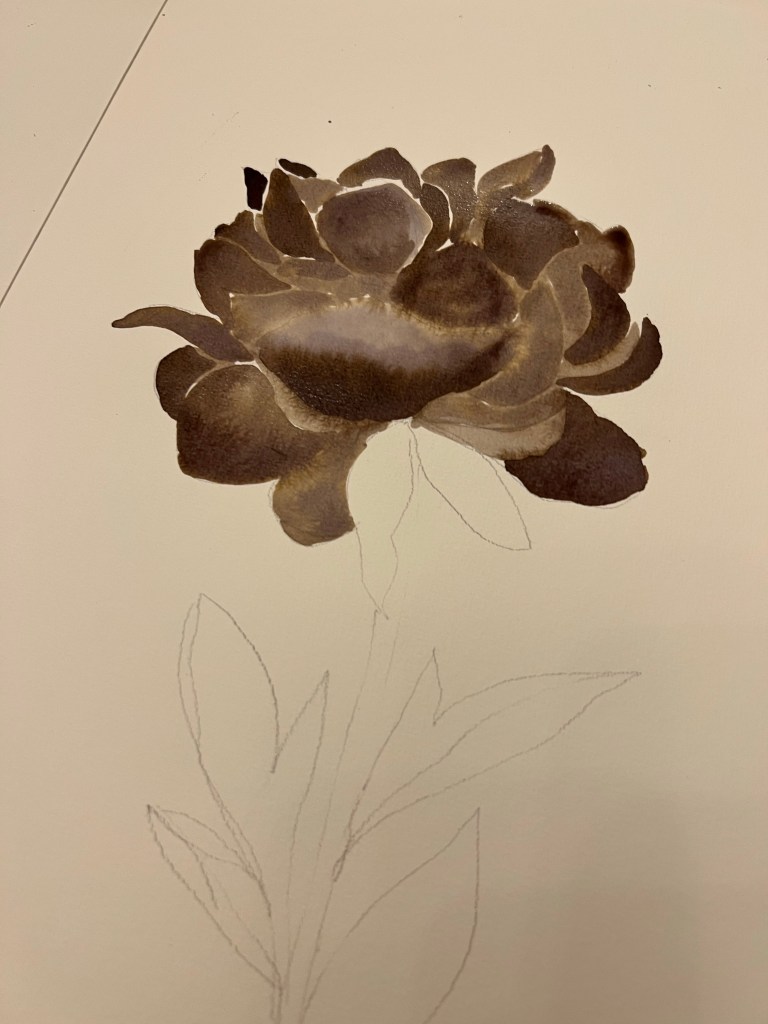

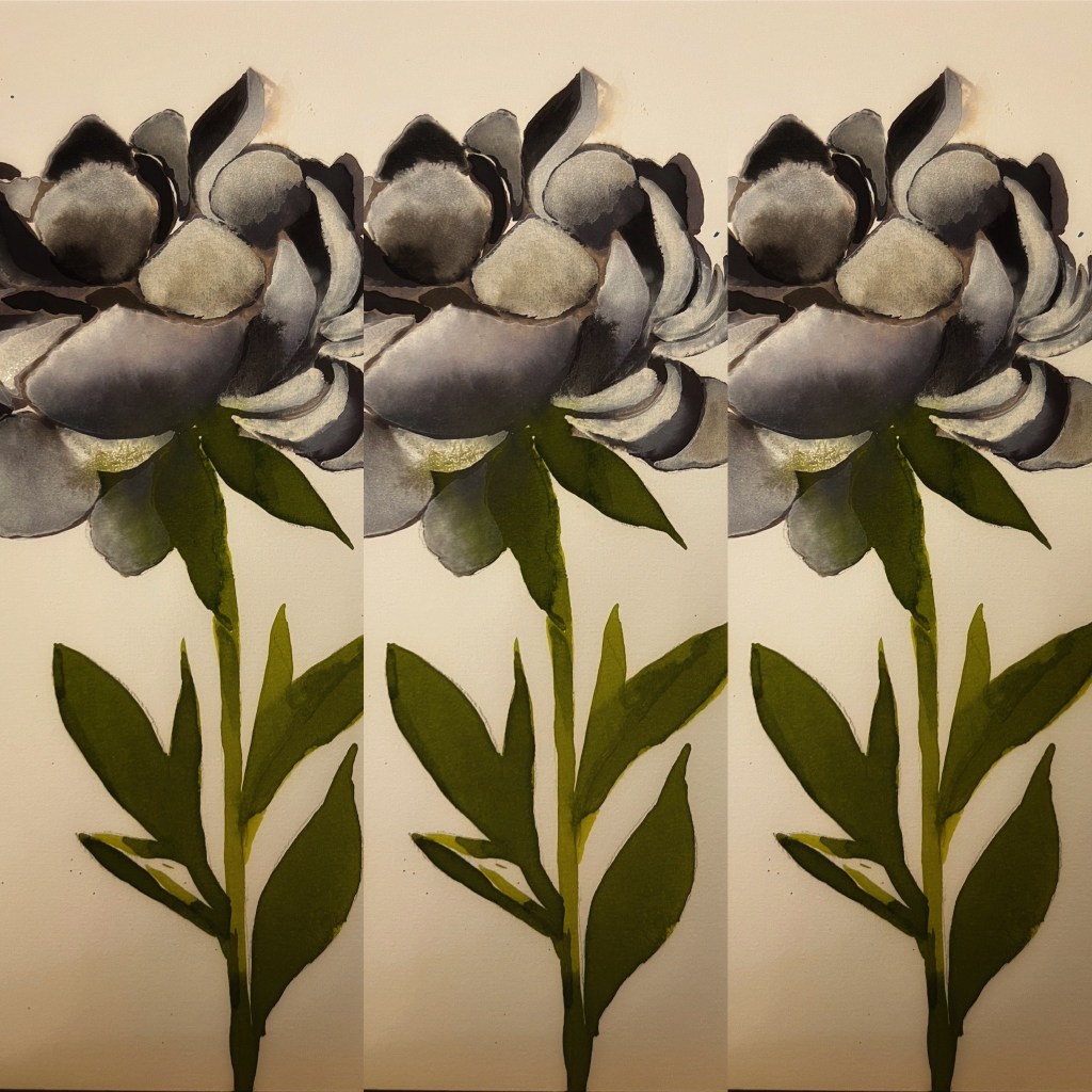

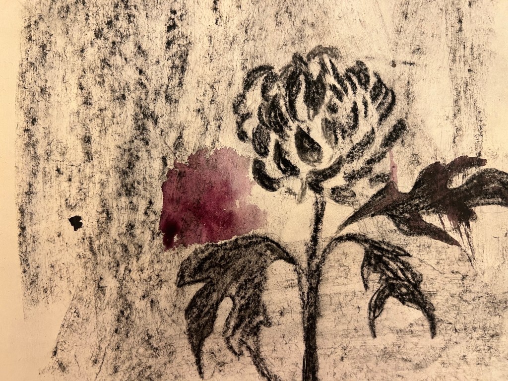


This is a continuation of my preliminary work for the PP. Below there are some more sketches of flowers, stems. I also continue to think about the colours I will use in the PP drawings. I find the dark blue color as engaging. At this stage I see that I should go with a dark blue inks for my PP.


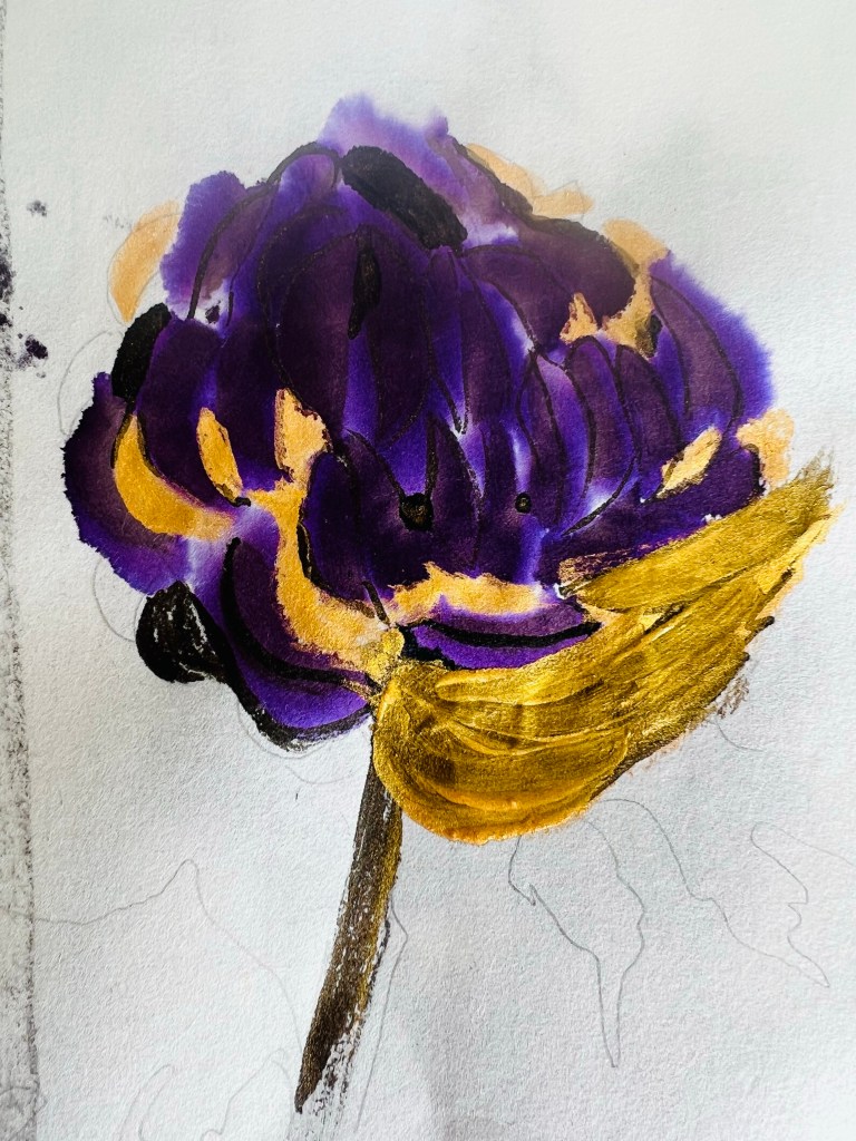
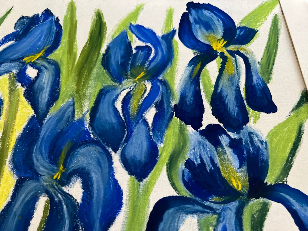
Below is another trail work before I start the final drawings for the PP. I decided to paint Irises, because my Critical Writing piece will be about two traditional Japanese artworks depicting Irises. Another reason is that I am very satisfied with dark blue inks with gold/yellow, as I tested them in previous sketches above and earlier. Below I am thinking about the shapes, colours and overall composition. I understand that the composition should be different: I should allocate more negative space at the background, otherwise the painting would look as overcrowded by the iris bulbs and flat. The green stems also must be done differently. I didn’t like here the sides of the painting. The stems, especially on the sides, look weak and unattractive, they don’t speak out. The petals seem flat and boring, I most work more on their shapes and details.


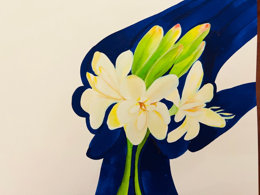
Here is my additional work I did with inks.
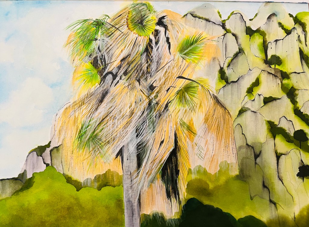
This is very different object by mood and technique. Here I tried to paint the palm tree, which naturally has a good structure . I was attracted by its sharp geometric long green and dry leaves on the wind.
I used gold shade aquarelle inks for dry leaves. Another new task for me was to paint large mountain rocks. The mountain appeared as stylised, a bit soft; I used a black ink pen to work on edges and then worked over it with a wet brush to create transparent vertical lines. I also did the green part in the bottom of the drawing in a different way. The ink worked perfectly in layers, creating a complex visual effect.
Suddenly and unexpectedly this drawing came out as not bad, and my Tutor also liked it. He recommended I would develop this theme further.