
For this Assignment, we are asked to produce drawings to explore motion and time, and we are allowed to use any photographs, film, video or anything else as our source material. We must reflect on the following questions:
- What was our experience of representing motion and time with drawing?
- Comment on the drawings and how they compare with our intentions?
- In what way did they meet our aims, and in what way did they not?
- How would we do things differently?
I have reviewed the Part 5 exercises and my drawings about the concepts of Time and Motion and concluded that Time and Motion are one concept for me. Any motion is unfolding within a framework of Time, and I am interested in the primary type of Motion- Time. We feel and observe Time because we see how all things around us go under transformation; the change is a sign of Time-its main feature. Time is a major vibration in our material world, a powerful divine force we are all subject to. Thus my drawings are about this vibration on the cosmic level.
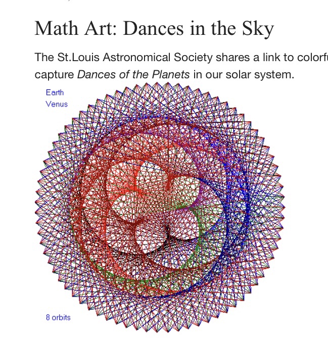
Below is a representation of our universe’s celestial bodies trajectories; the images are from https://www.math.wustl.edu/News2015/News2015_Mar_Dances.html
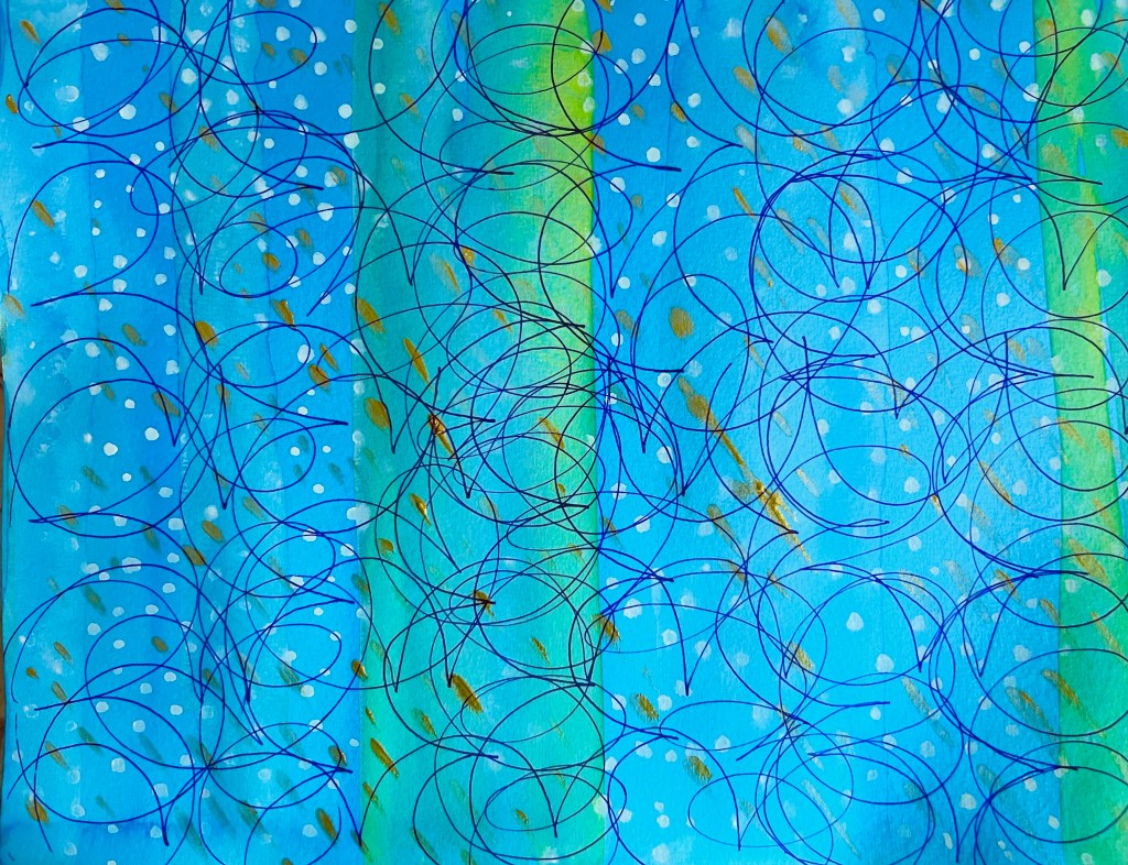
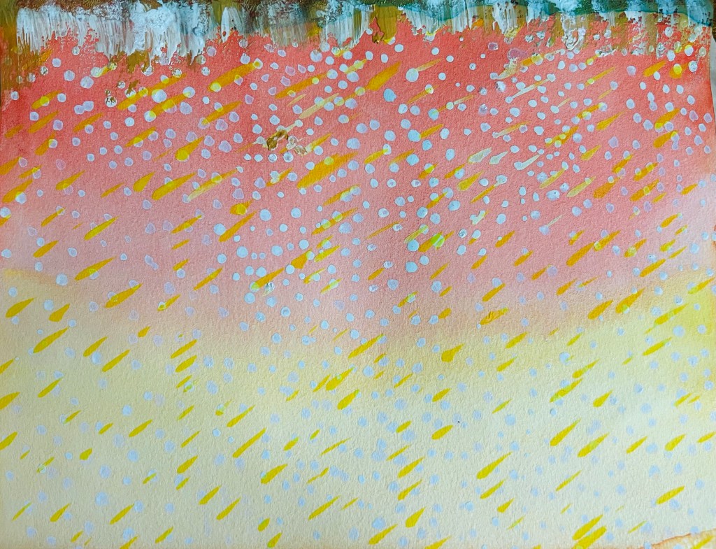
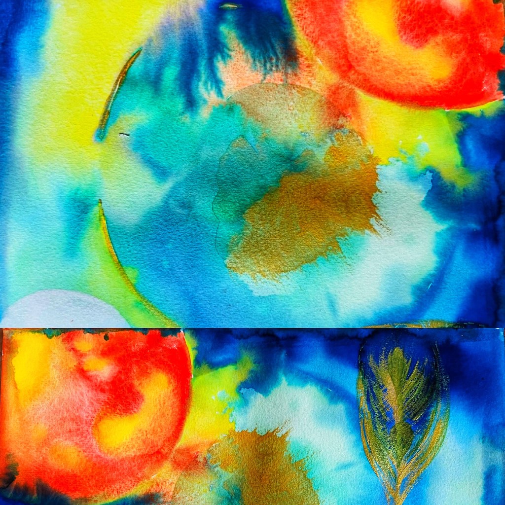
Below are my drawings for this assignment. I used inks and aquarelle ink pen, working with the “wet on wet” technique.
My understanding of Time and Motion is revealed through the following:
- Uneven, fading colouration and vertically placed streaks of colour to show the change.
- Multiple layers of colour.
- Different patterns, such as dots and lines to show the movement as the simultaneous existence of different elements.
- Overlapping colours and elements as a constant and simultaneous interaction/dialogue of different elements.
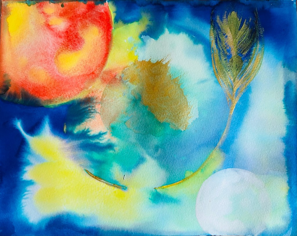
I liked the last of the three above-placed drawings depicting celestial bodies. I worked with ink pulling technique to create the effect of moving energy as planets interact in the Cosmos. You can see a peacock’s feather in gold ink as a symbol of Divine Order. I like this image because the ink allowed me to reflect the power of supreme energies by creating uneven dissolving patches of dark and light shades. The Moon in the lower right-hand corner is a notable good element in this drawing. It is transparent and airy. I also like the overall contrast between the Sun – an orange/yellow large body and the pale, though complex Moon. Another feature I am happy with is that the inks allow me to create not flat images; there is a sense of endless perspective and Space.
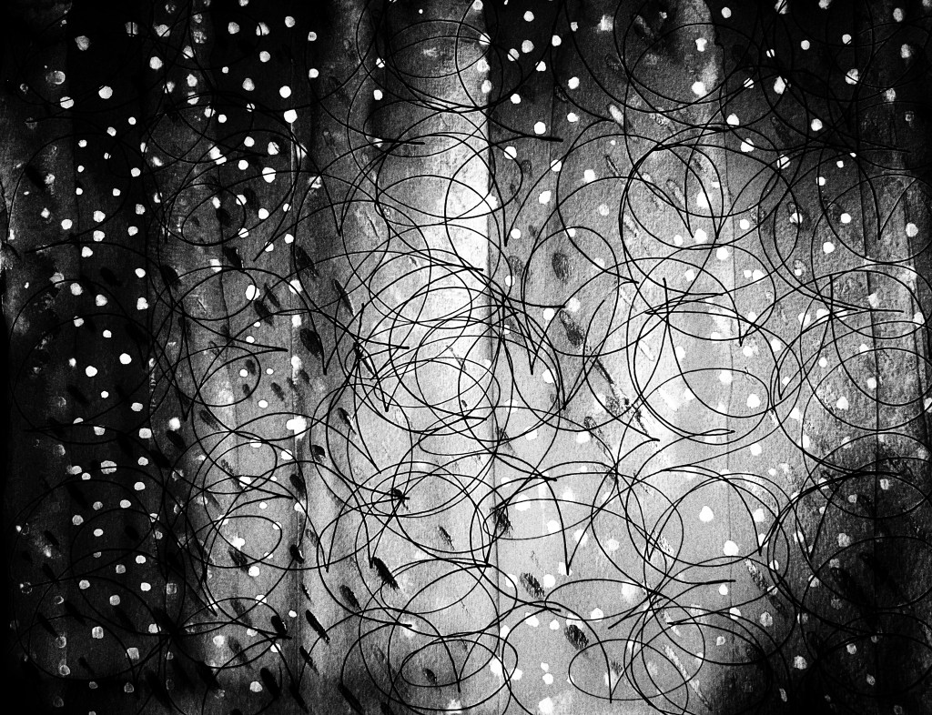
I would do the first image with line patterns with ink pen differently to make more structured lines, but I need to use the ruler or print the complex line patterns over prepared layers of colour with a printer using the algorithm. This image turns into something very different and much better if I work it out in black and white with my SnapSeed application. You can find it below.
I have developed the initial drawings into the following images using the apps.
With accentuated colours: I observe a “more drama” effect. I find the Cosmos super intense and dramatic.
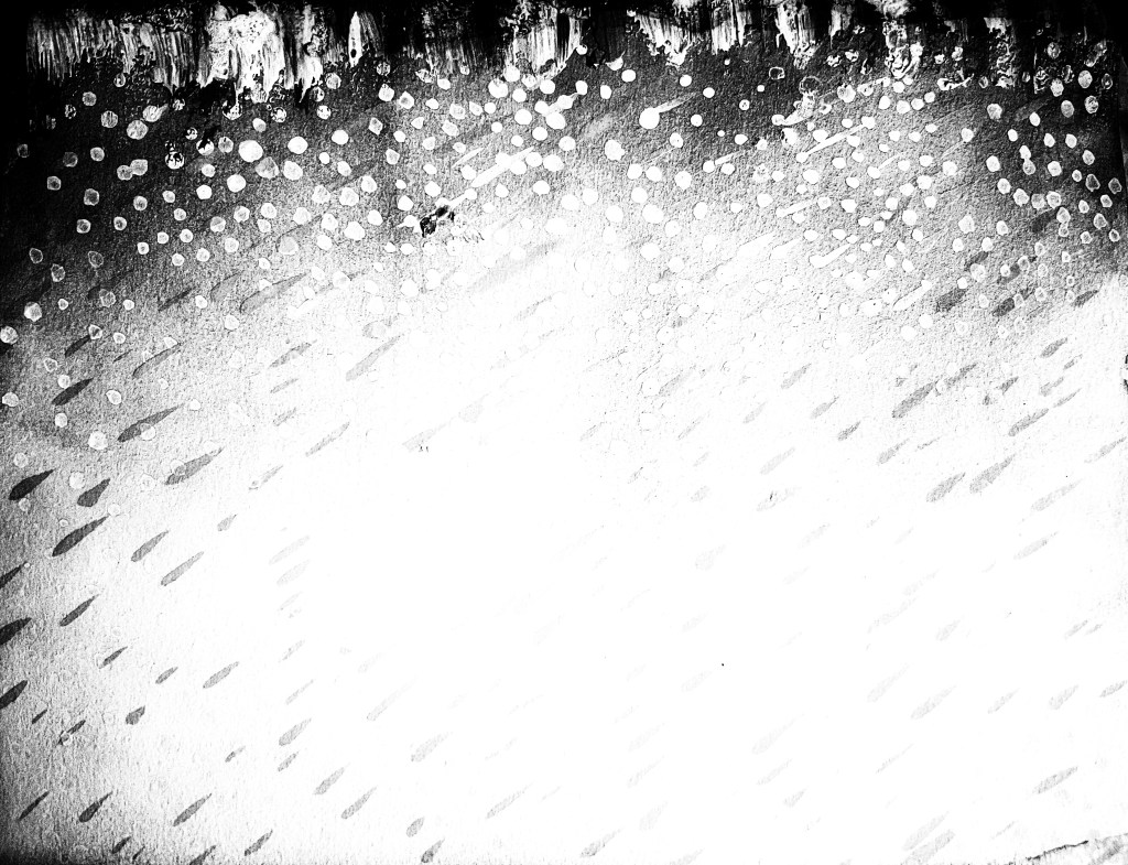
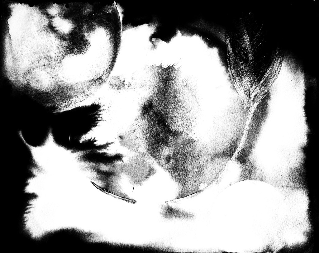
Below are the initial images transformed into black and white.
The images I have drawn and developed gave me the idea to return to the previous exercise of Part Five and create three short stories, arranging some images I did for the different assignments in Part 5 into a story to explore movement. You can find it below. I used the application InShot.
The music is from Music: Views.
Musician: @iksonmusic
Musician: ASHUTOSH
