
This page is dedicated to development of my PP.
My Tutor recommended that I connect my Critical Writing work with my actual Parallel Project, which was a great help. My interest in Japanese art has always been reflected in my artistic style: I appreciate the high decorative effect of the artwork, I tend to work with inks and watercolours, and I am inspired by nature; usually, I paint plants and flowers, which are typical subjects in Japanese artworks. Thus my Tutor’s advice was an excellent chance to deepen my knowledge of Japanese visual art traditions and work for my Parallel Project in the style I resonate with. Also, after an extended reflection on the theme for my Critical writing, I followed the advice given in most critical writing books: write what truly interests you and makes you ethusiastic.
Below I place some reference materials for flowers, which I used to develop sketches and ideas for my Parallel Project. I will paint irises and peonies, and if I am lucky and have time, I would like to paint Chrysanthemum flowers as well, creating a triptych.
Reference material.
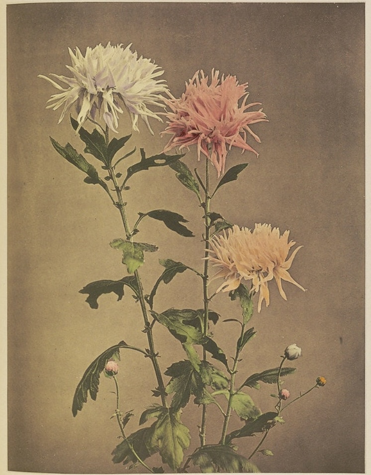
Below are photos of tinted chrysanthemum and peony flowers created by Kazumasa Ogawa (1860-1929), a Japanese photographer, painter and publisher. Images via http://www.publicdomainreview.org; I am attracted with the natural shapes of the flower buds, the petals. Usually, petals are made by Nature in very symmetric order, but these flowers look wild and free, some kind of “undone”. I also like the contrast of greys and pastel hues. I find the background tone in |photographic” colour innovative and unusual.
Hokusai’s painting below is another approach to peony painting and the colour of the background. The dialogue of green and blue hues in his painting is unusual, and seems brave to me.

Below is a painting of famous Chinese artist Gal Fenghan (1683-1749). This painting was made by his left hand, since the right one was not functional after his many years in prison. I admire the limited colour palette and the brushstrokes. I picked up this painting as a reference material, because it doesn’t represent classical peony, which often looks too groomed and sweet to me. Here I see a different peony, which I can describe as rebellious and unruly, while they usually are symbols of peace and good, calm, happy life.

Another painting I couldn’t stare at is Irises (1889) by Vincent Van Gogh (1853-1890). I marked in the red circle the earthy colour at the bottom of the painting, which looked engaging to me. The colour studies of his iris paintings have become iconic. The image is via http://www.metmuseum.org;

The Irises from Ogata Kōrin (1658-1716) are painted in Classical Japanese Byōbu (folding screens) style. I find interesting the contrast between the blue flower petals, which are painted in different shades of blues and a quite even, homogeneous green for the stems.

Below you can see my preliminary sketches and trials for elements and mediums.


Trials for peonies. I wanted to develop my way of painting peonies and irises.


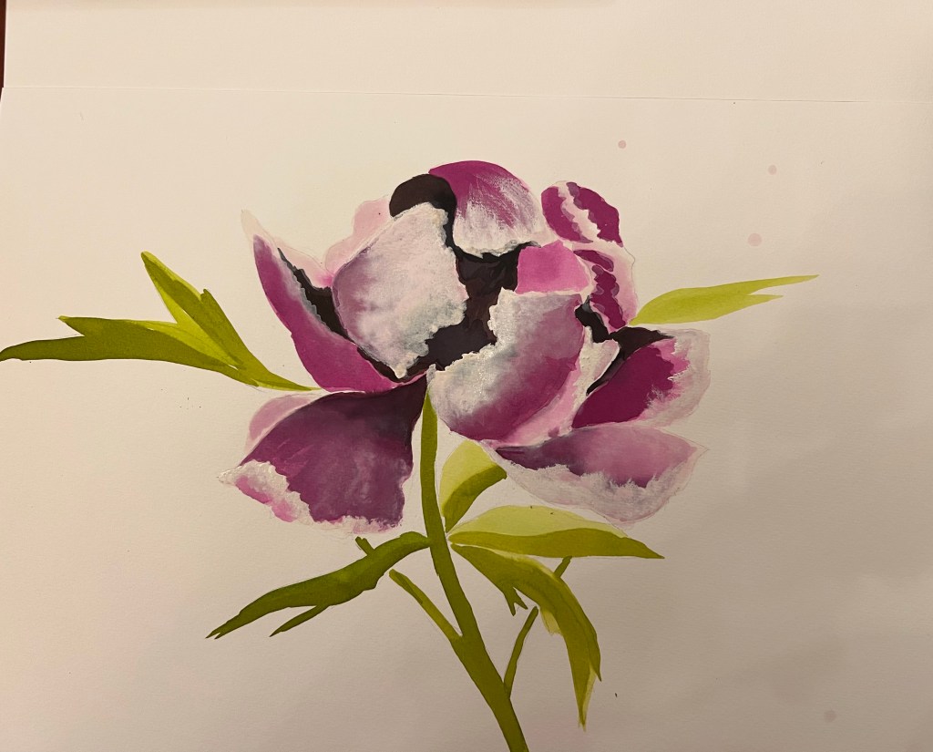
I didn’t like the peonies sketch above I made in colour. It looked very conventional and overly “sweet”. However it was a good starting point to understand what kind of flower I don’t want. I t was also useful to warm up with drawing and try the colours of my inks.
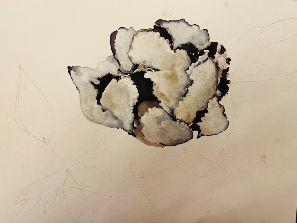
Below is another sketch of peony flower. I used black ink and white acquarelle paint in the tube, it is thick and convenient to use, it works well with inks. I did two versions: one is more black and another one is more white, I painted white layers on top of the black ink. I didn’t like both of them. The peony ended up looking as a cauliflower.

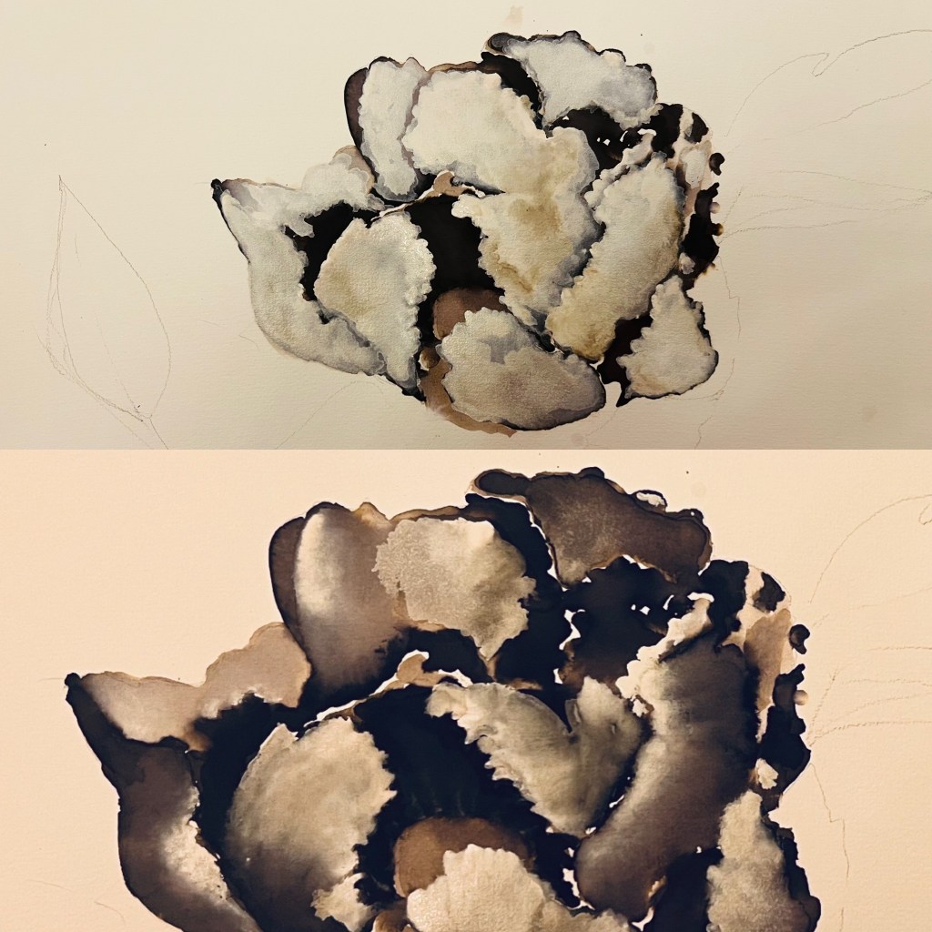
Another set of trial sketches for peonies is below. These ones are closer to my idea. I tried different ways of using inks and the white aquarelle pigment. The method I used here allowed me to achieve some interesting visual effects.


Some collage trials for composition and further development ideas:

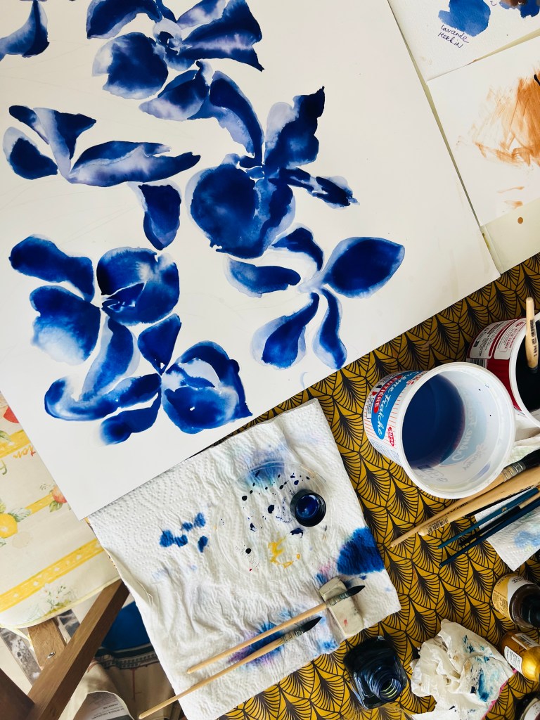
Below is my experiment for my irises painting.


In the trial above I started painting irises with soft pastel sticks on paper. They looked kind of flat. I tried to work with blue ink over the pastel layer -that created an interesting effect, producing more finished look. Inks work well on top of pastels, the go in smoothly, giving a sort of soft, ‘fabric” look and adding the depth to overall image. I haven’t decided about the colour for the background yet, just tried some brown and yellow, leaving some space blank for further development.
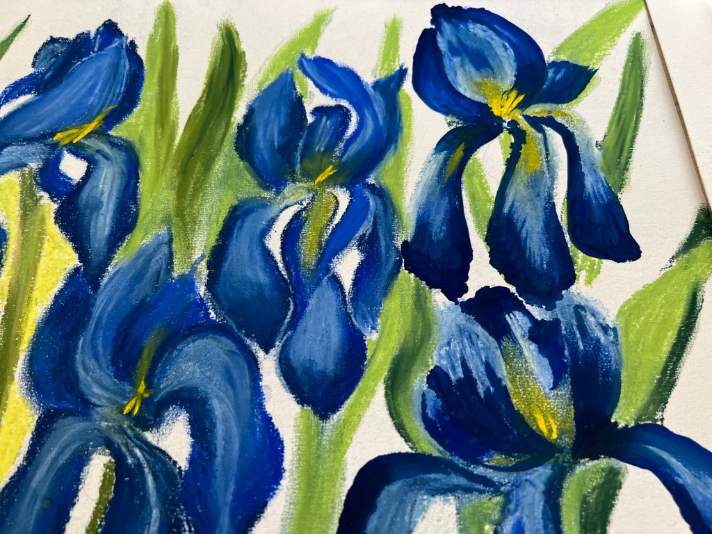
Another trial for irises with inks only. I think I stick to this shape of irises and to inks, which I multilayered.


Below is a continuation of my trials for the PP, which I made during the Part Five of the PAD course.
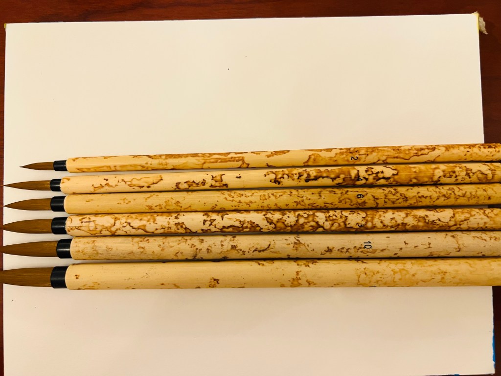
I was further practising my liner skills checking new brushes for other flowers besides peonies and irises as candidates for the PP .


However, the monochrome version of the same image below looks different and more interesting, there is some power. That made me think to develop more sketches with black ink. I turned the image clockwise and collaged it, obtaining inspiring and interesting results, which you can see below. When I do collages I can better anticipate the direction for further development of the image and its elements into a larger scale work. I was amazed how powerful the monochrome version can be- below.

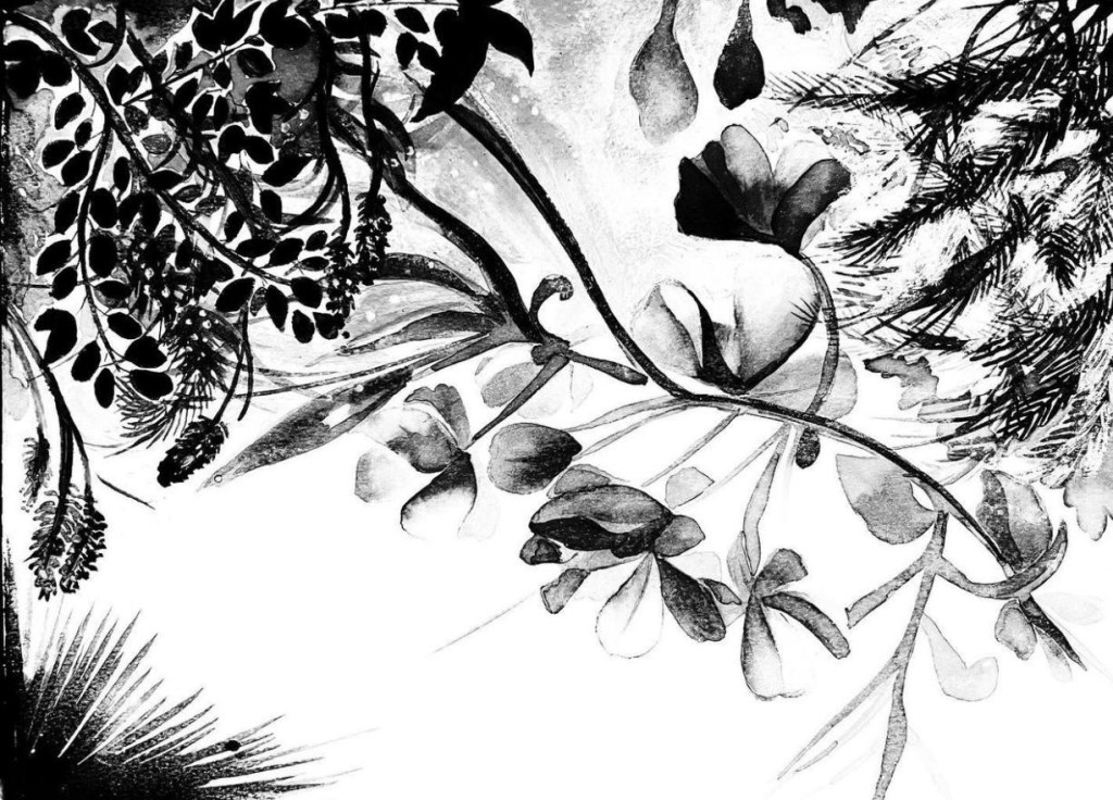


This collage above is a good starting point for a PP project in black ink on large canvas.
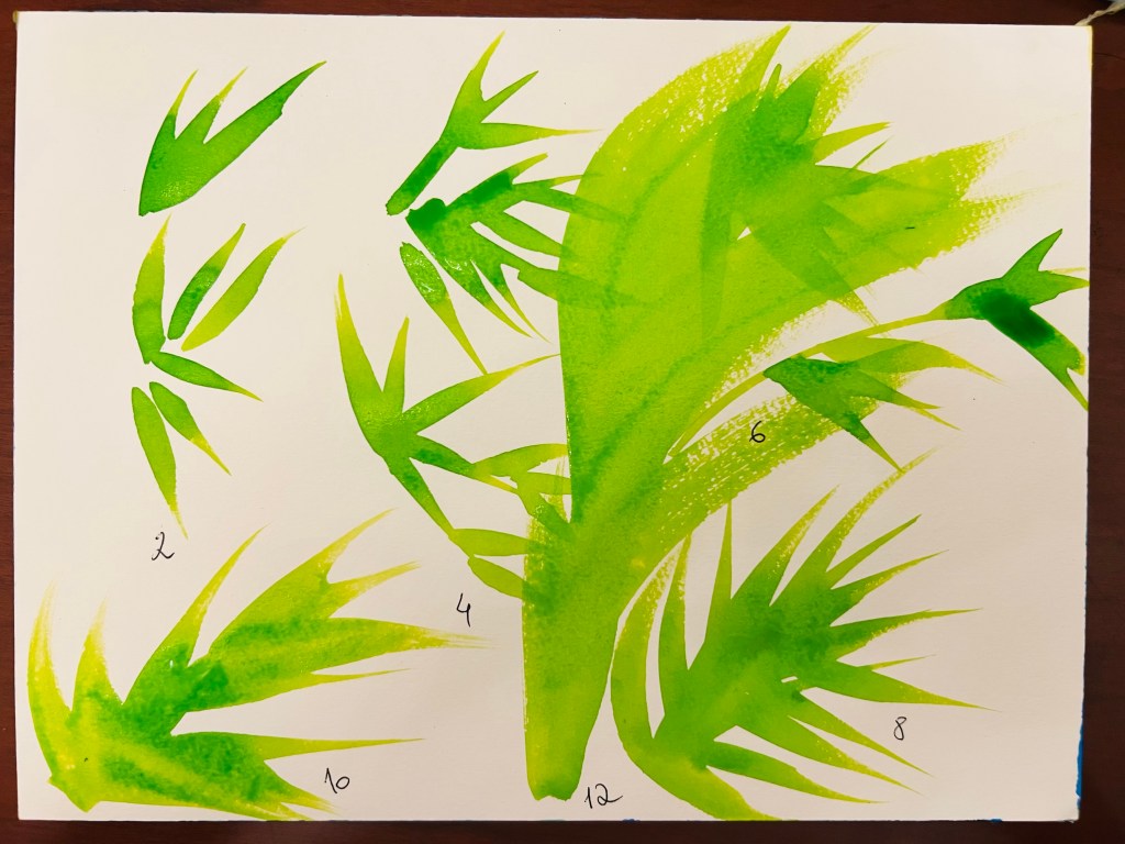
Below is my continuation of testing inks and green shades for the plants’ (probably irises’) stems.


Below is a new trail for the PP, if I will do it with Irises.
I used a rectangular thin wood board and covered it with Fevicryl acrylic paint in gold shade. Then I painted irises using oil sticks, which created a new surface for inks. Painting with inks of oil sticks gave an interesting “impasto” like effect and allowed me to create a complex texture, which I liked. The image below shows how the blue ink is engaging with a surface – it stays in liquid patches and dries out with a time, the surface absorbs some ink. The flower gets a dimension and looks not bad at all. The green ink, placed right on acrylic surface also stays in patches which dry out, leaving interesting marks on the foliage. This experimental technique is very time consuming but it is worth it to continue.


