
Exercise 2: A changing landscape. We have to produce a compositional studies of an interior/exterior landscape when it is empty and when it is crowded with people. We are recommended to observe the movement of people. crowd and “embrace” it, experimenting with mediums and markings to exploit the action in the depicted landscape.
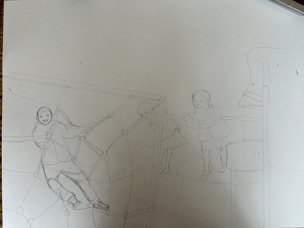
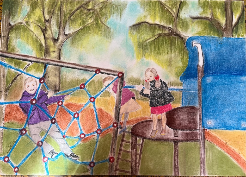
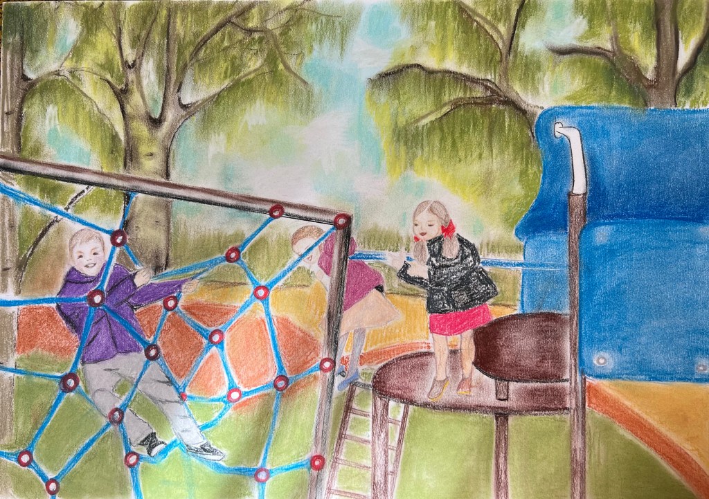
I decided to draw a landscape which was a playground in Regents Park, London. I was attracted by the forms of the objects installed at the playground as well as by the park’s atmosphere. However, the cityscapes with skylines and busy streets overcrowded by buildings didn’t inspire me. Below are my studies using Giokonda soft pastels pencils, soft pastels from Jewel and A2 size multimedia paper from Canson. I opted out of using soft pastels because this medium has a certain “kids” vibe, which I found and felt appropriate to use to depict the details of the playground. The playground’s items, which children use for their play, have distinctive shapes and colourful appearances. So ink or aquarelle won’t bring the mood of the playground how I wanted it to be.

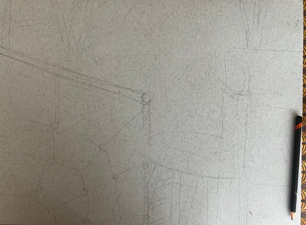


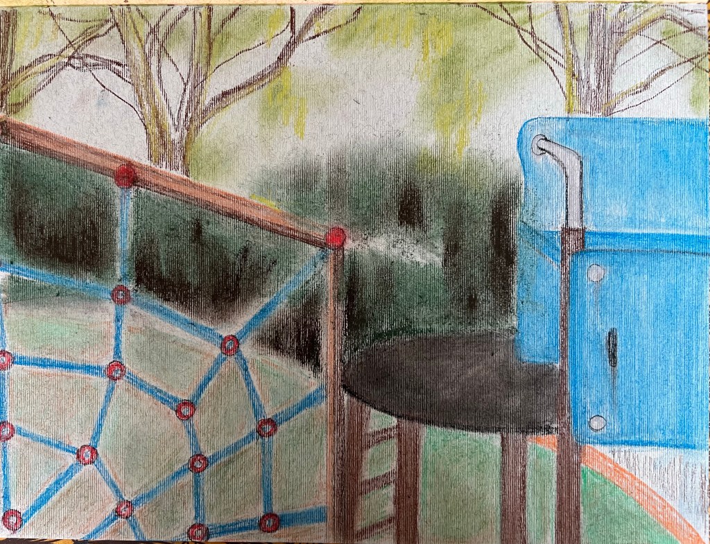
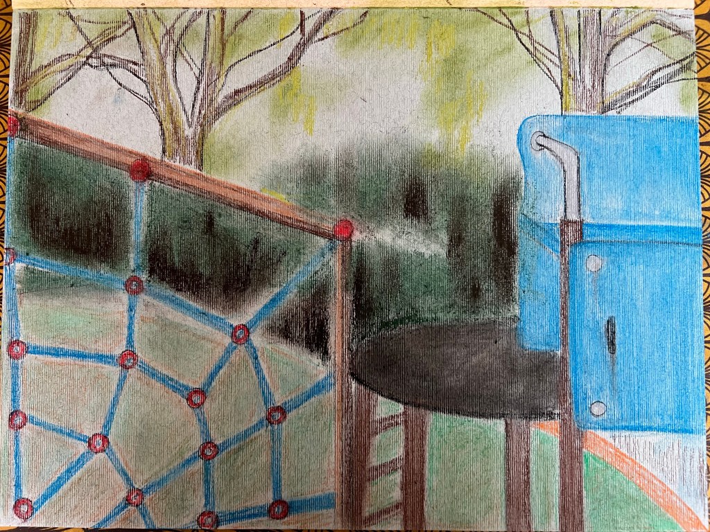
Above is unpopulated scene at the playground. Below is my study of the same scenery with figures of children.


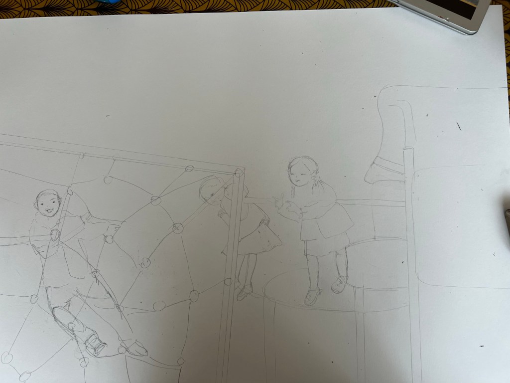


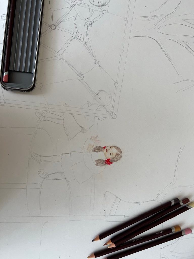
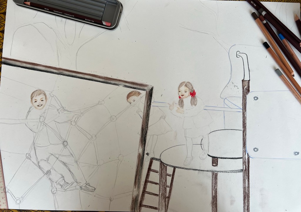


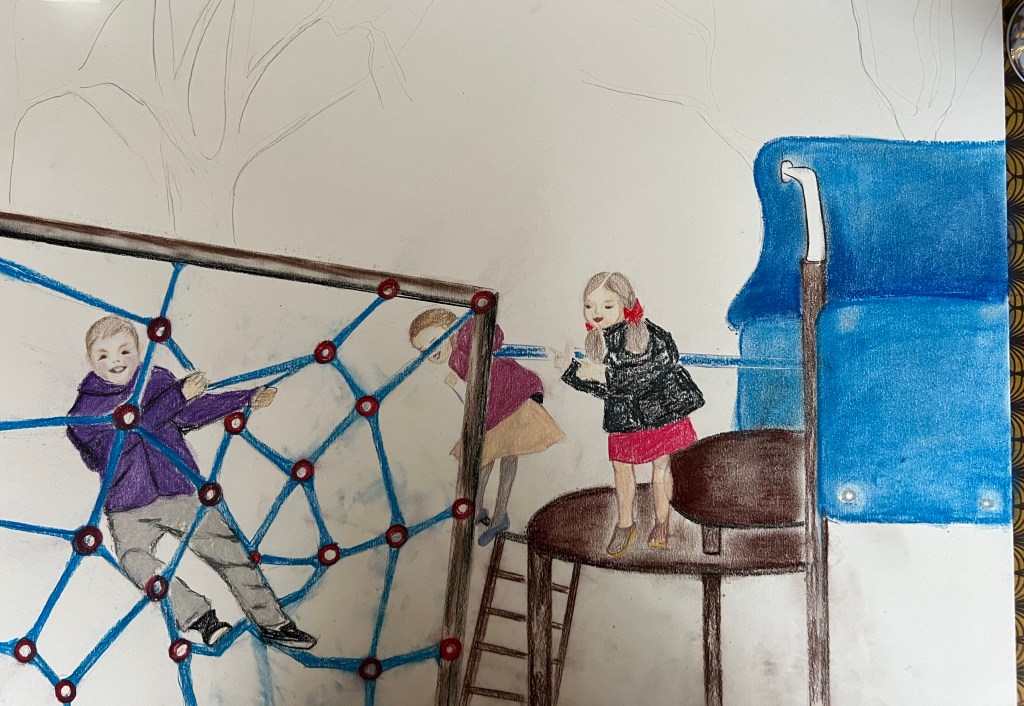
In order to paint kids’ faces and hair I used my set of “colour soft skin tones” pencils from Derwent. The photos below are made in next several days. I was thinking about how to depict the trees and decided to continue with pastels, but experimented with strokes and applied the pigment in different way. It is always a great challenge for me to draw human figures. This drawing didn’t come as an easy one for me. It took some time to develop kids’ moving figures. I like how I did the boy and the girl bending from the slide; you can’t see her face. The other girl in the black jacket didn’t come out well; I struggled with her pose and right leg positioning.


Another changing landscape study is below. I picked up a scenery of small promenade in my living area. That was a good opportunity to work on linear perspective. I also wanted to work with a different medium and opted for aquarelle to bring the February mood, when everything around is a bit pale. As usually, it took some time for me to construct the lines for perspective .


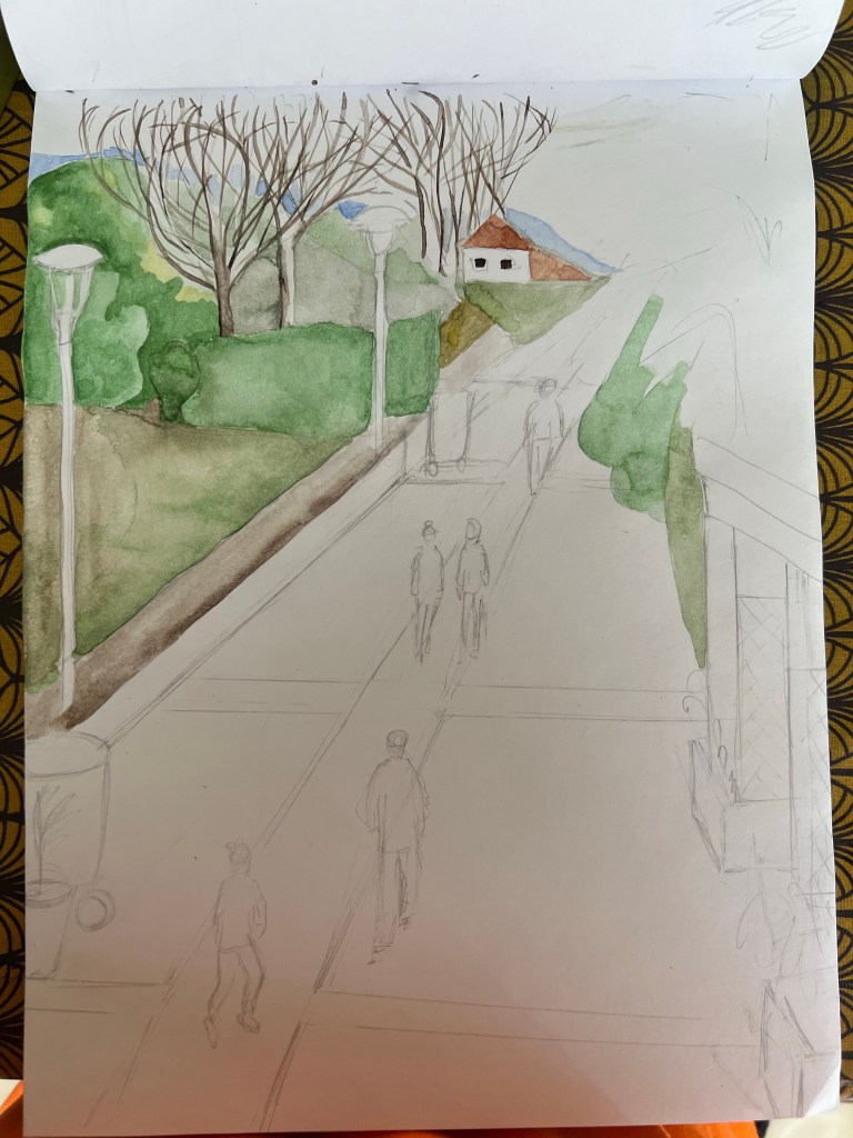
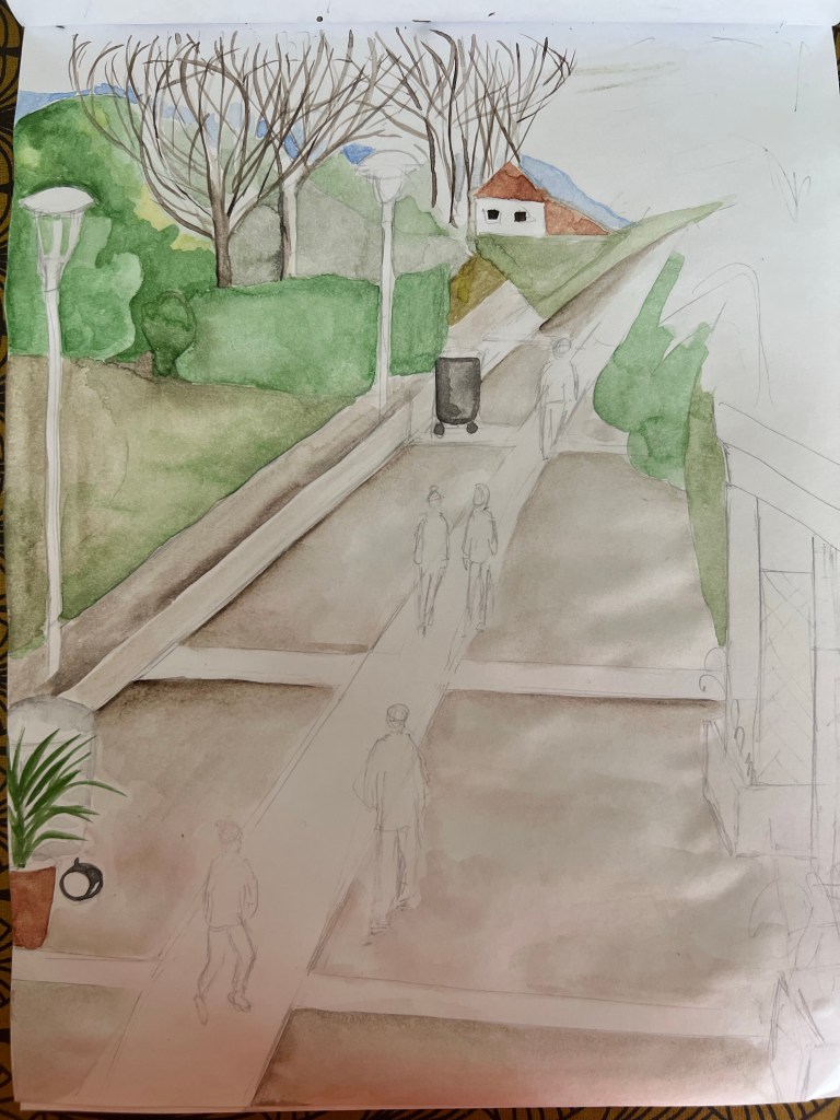


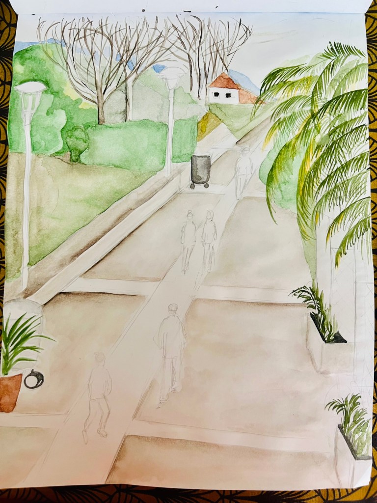
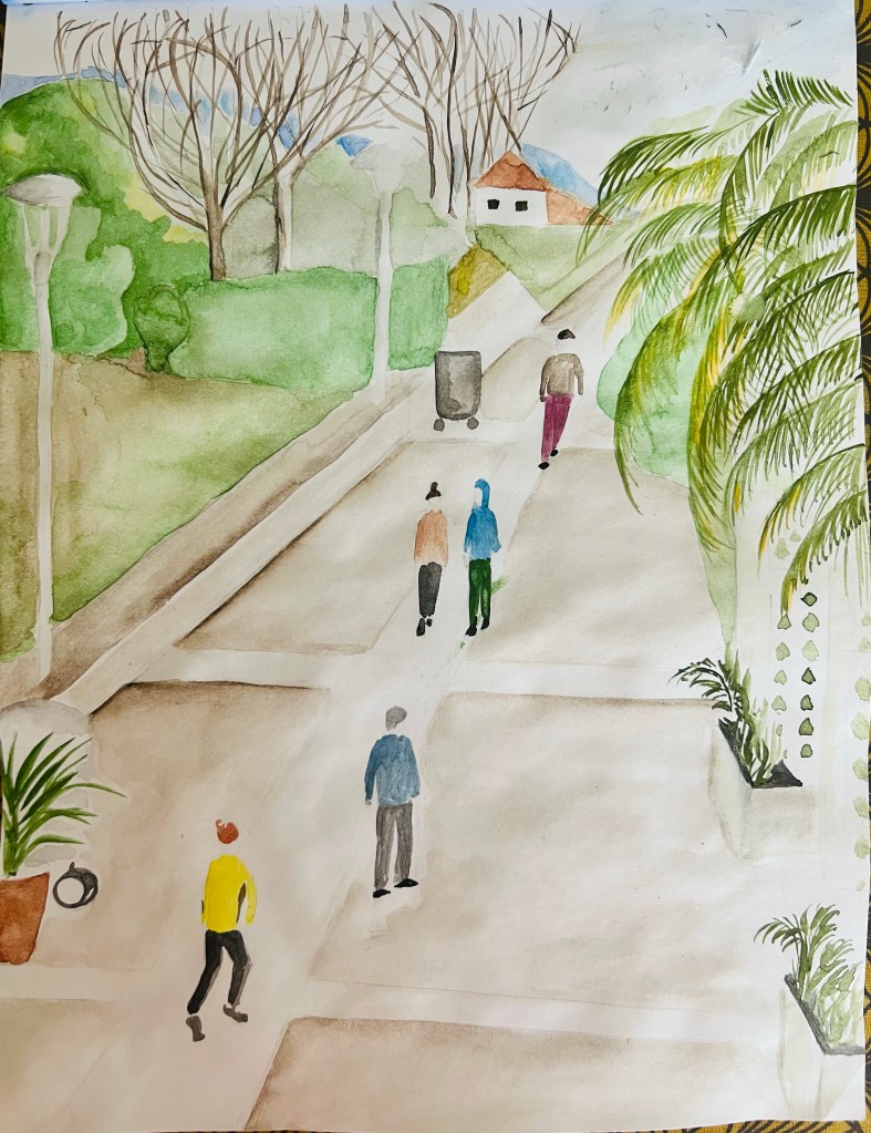
I wanted to create an atmosphere of peace, when everyone is relaxed. I think I did not bad with human figures, they look subtle and the viewer can see that everyone is engaged in pleasant activity, having a relaxed, peaceful time.
Research Task: Joy Gerrard (1971-)
Joy Gerard is an Irish contemporary visual artist. She has got her formal training in visual arts at National College of Art and Design in Dublin and received her MA and MPhil from the Royal College of Art, London. She lives and works in Belfast, Northern Ireland. Joy Gerrard is famous with her Japanese ink drawings and paintings, depicting images of political demonstrations from around the world, she investigates “physical and psychological relationships between human and buildings” (www.chritsearoberts.com).
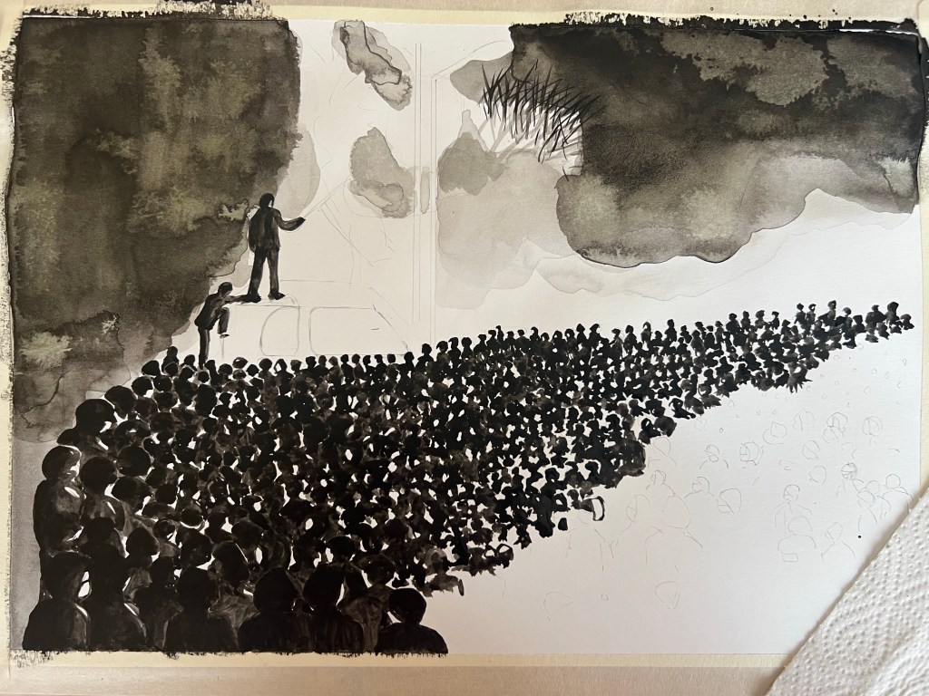
Reflection: When I research artists, I always feel fortunate if they have their own Instagram accounts because this is a unique way to connect directly with them, reading and listening their thoughts they share about particular drawings/paintings they produce, about their artistic experience. I looked at her Instagram profile and understood that she was greatly inspired and influenced by the artworks of Paula Rego. Joy’s drawings and paintings of women share the same dynamic, drama and sentiments I saw in Paula Rego’s paintings, depicting the same womanly physical experience. Joy Gerrard connects her pro-abortion rights movement drawings with Paula Rego’s drawings. Her artworks are mostly done in monochrome, black and white colours, which, to me, makes them look powerful, accentuating a mass protesting crowd. The crowd she depicts is in unity with the cityscape dynamic. If I look at her painting “Women’s strike, Warsaw, Poland”, it is hard to distinguish the limit between the crowd and the buildings. Everything appears as one massive object. In her short films at her Instagram account, she says, commenting on this particular artwork, “…in order to visualise and think about the energy, anger and dynamic of the protesters“. She channels the protestors’ state of mind really well: her paintings are very psychological. They are not about the architectural beauty of the buildings but about feelings and deeply emotionally driven events. She does her paintings on a large scale and she is wonderfully meticulous in detail. It is obvious she strongly refers to helicopter assisted photographs from mass media. Besides her unique ability to be meticulous in numerous details on large-scale surfaces, I was struck by her ability to present her art. She is incredibly well-spoken about her visual representations. Her superb ability to tell about her art is an acquired and highly mastered skill originating in her natural talent harnessed with her Master’s Phil. degree. Besides the abovementioned, I resonate with her artistic taste and technique because she is a big fan of black ink, as well as I am. In addition, she generously shares her painting technique and daily studio practice in her videos. She demonstrated to me another potential of black ink. Before researching her artworks, I didn’t know that somebody could use black ink so powerfully to represent a crowd. I got inspired by her style and produced some of my versions of protests in Kazakhstan in January 2022.
Below are some of her artworks:


Bibliography: Joy Gerrard, online on http://www.christearoberts.com, [accessed on March 10th 2023]; @joygerrad, Instagram profile, [accessed on March 10th, 20223]; “Precarious Freedom”, @joygerrard,Instagram profile [accessed on March 10th, 2-23];
My study of crowd, painted with black ink: January 2022 protests in Kazakhstan. Ink, ink pencil, soft pastels on paper. Reference photo is below


Below is the finished outcome. Mixed media: black ink, soft pastels;


Reflection on the viewpoint. In the drawing above, my viewpoint is partially determined by the perspective of the photo. There are no photos of those events made from a helicopter, providing an above general outlook of the scenes. However, I set up the viewpoint for my drawing slightly differently: it is higher. It has a more “observational” effect than the viewpoint on the photo, which the protest participant clearly made. I placed the viewpoint higher because I wanted to try Joy Gerrard’s technique and show a large mass of people. Thus the higher the viewpoint – the larger crowd you can depict. At the same time, when the viewpoint is not high as a helicopter view, you can create a sense of personal connection with an imagined viewer of the crowd, standing behind the public on some bench and thinking whether to join the process or not.

[…] Continue to develop the Parallel Project (PP) and connect it with my Critical Writing piece (CW) I must submit by the end of the course. In part Four, I devoted more time to working on my PP and followed Tutor’s advice to connect the PP and CW. His advice made me take a different direction for my PP, so I opened a separate page, leaving the first drafts I submitted to my Tutor in part Three. To submit more developing sketches and reflections on how the outcome matches my expectations. I worked more on developing sketches for the exercises and PP and included more of my thinking. Though, I must say that not all my works “ask” me to create different sketches for a particular project. Sometimes I really go with the flow: I start and don’t know where I will end up. This approach is also fair and aligns with previous instructions for other courses I did. I prefer this approach because creativity is very much about exploration. However, I understand that a complex compositional and detailed project requires many preliminary sketches. We talked about my attempt in Part Three to work in the style of Jay Garrard. Here is my Tutor’s feedback quote: “What is similar, and what is different? It doesn’t matter if you feel you are behind her; even if you are hard on yourself, this reflection is essential – critical analysis. The final thing you do in your blog post – you take this step back and review it in writing. For example, her viewpoint is much higher than yours in most of her works. Talk about why it is so. How changing your viewpoint affects the viewer depending on where you put the viewer. Think about similarities and differences. Where do you want your viewer to be?“. I added my reflection to the relevant blog post and marked it in blue. Here is the link:https://zhan-art.com/2023/02/25/drawing-two-project-2-landscape/ […]
LikeLike