Below on this page you can find my ideas – trials, experiments and work in process photo for my PP -Parallel Project.
Project 1: Blooming mimosa.
Mimosa tree is an ever inspiring tree for me. I have been painting it from the start of my OCA studies. Below are my previous Mimosa paintings I did so far, earlier at Level 1. in oils (from the left) and in aquarelle (right).
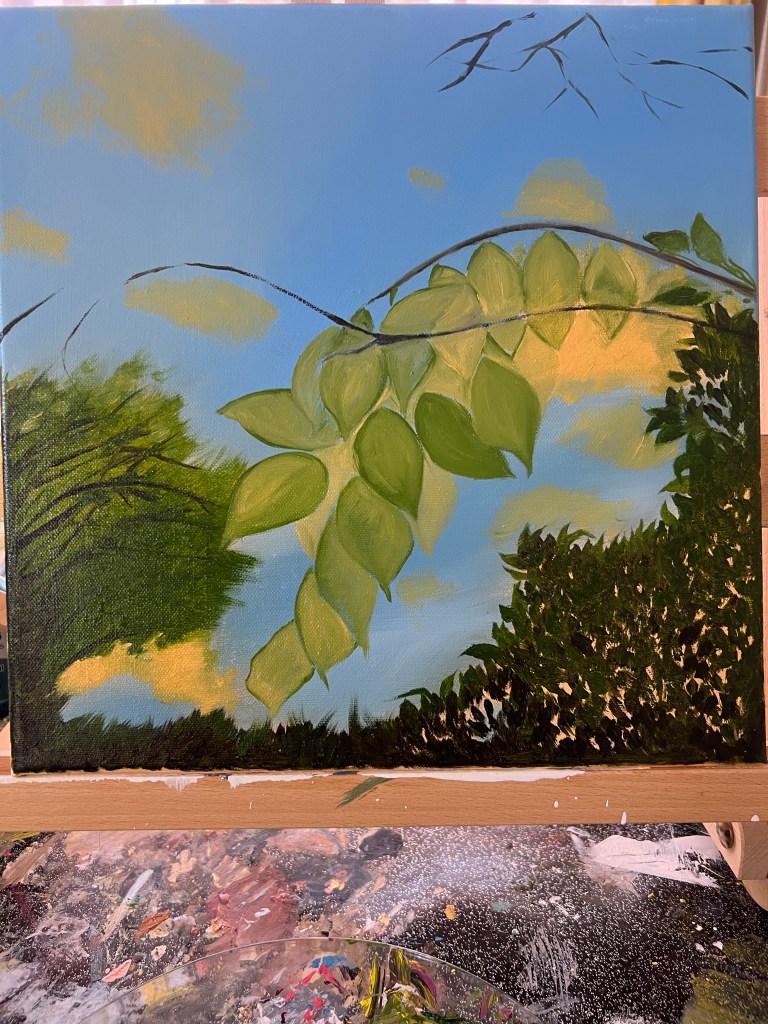
Below is the beginning of my new Blooming Mimosa painting for the PP, Level 2, Drawing 2: personal approach to drawing course. You can see the resources I used and the preparation of the canvas – creating the red-brown undertone with Ocre d’or shade and sone turpentine.


After my undertone was ready and dried, next day I started to create the blocks of colours for the greenery and the skies. Using the shades below on the photo for the trees, and the blue hues above for the sky. I made preliminary traces with brown shade for the branches and started to build up the leaves’ mass, as well as tiny mimosa flowers in bloom. I naturally arrived to using small round brush to create tiny dots, it was quite pointillist method.

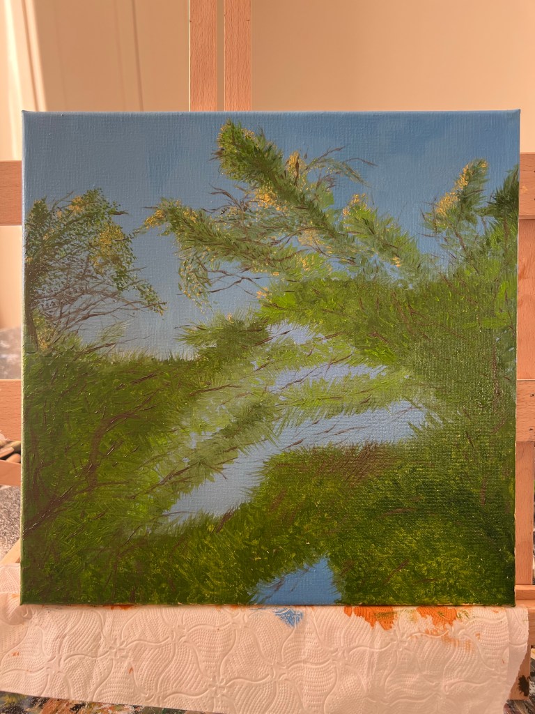


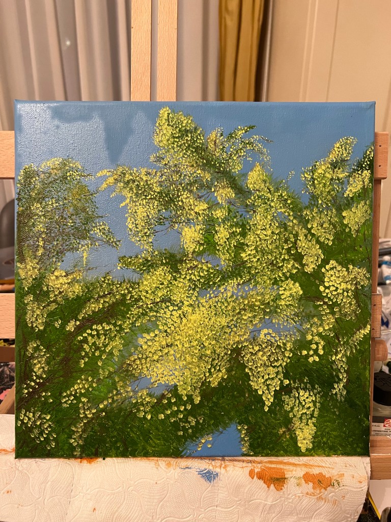

Below is my finished painting. I have been working for a week, because it contains lot of layers of green, white, brown and yellow paints and shades, it has some impasto effect. The colours of the photos are a bit different because they were taken at the different times of the day- with natural day light and in evening time with electric light.


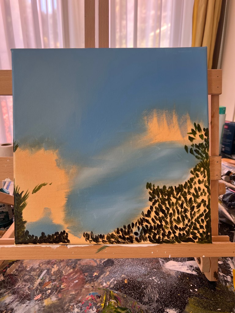
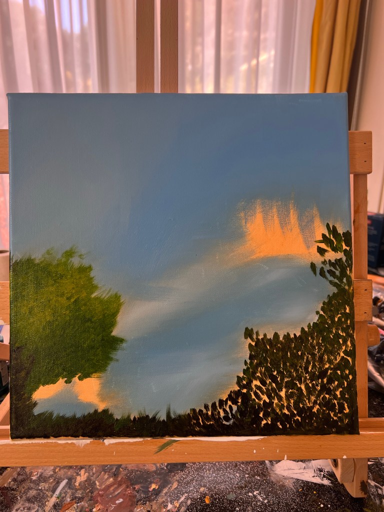
Below is another idea for my parallel project. The same size canvas, as a second piece for the diptych.
The project is in progress, it is not finished yet.


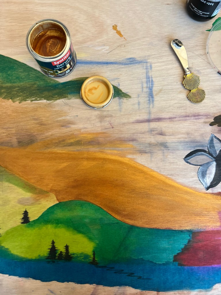
Project 2. By pure accident, I have discovered another option for a Parallel Project. I use a wooden board to protect my table when I do my studies with paints, pastels and inks. I spilled some black ink on my board while wrapping up after a session. I liked the spot it left on the surface- you can see it below, marked with a red arrow. That black spot instantly reminded me XVII and XVIII Japanese painters’ works. I placed a fragment of one below as well. That accident made me to make a whole series of experiments with different mediums and the wooden board.


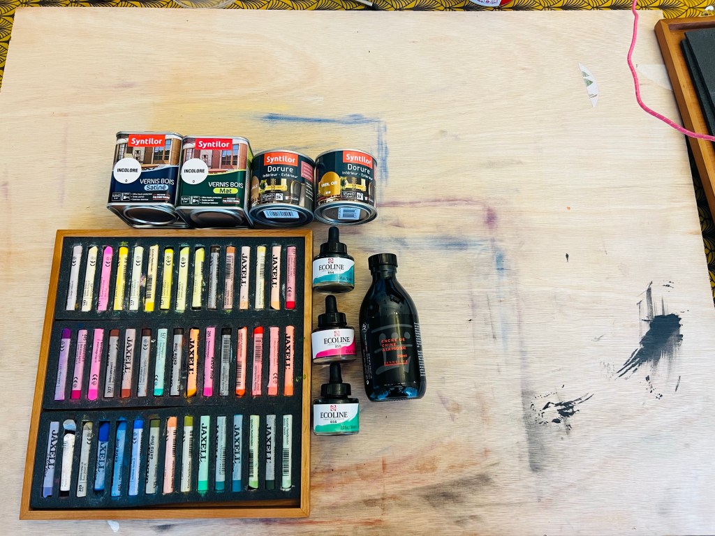
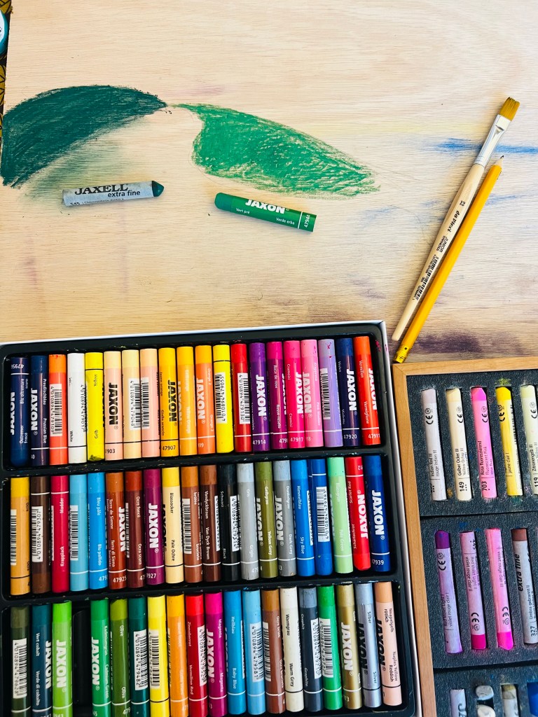
Experiments with a wooden board: wood lacques, soft pastels, oil pastels sticks, inks and liquid aquarelle – trying all of the on the wooden board.


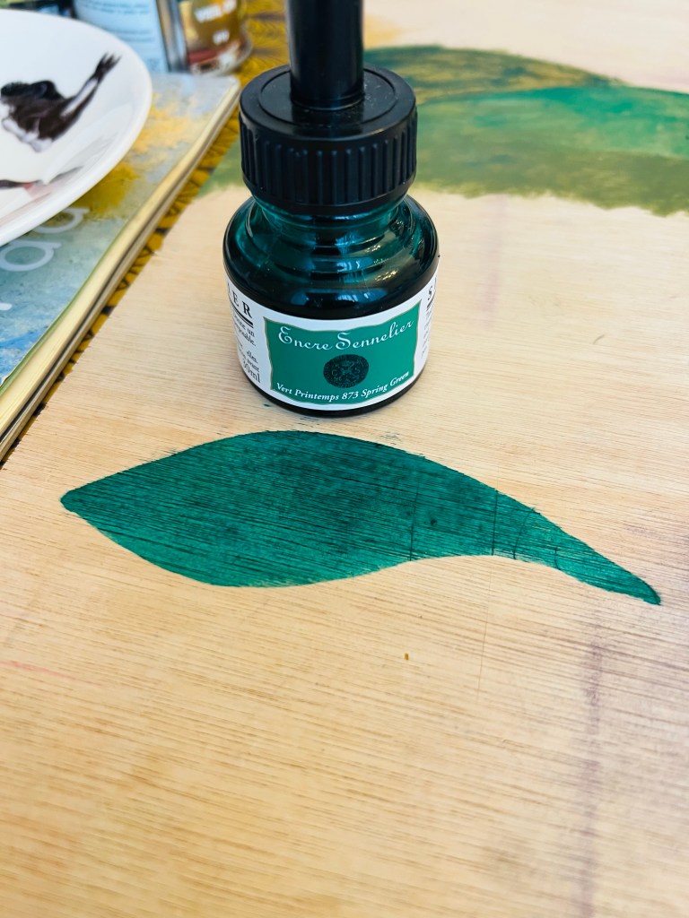

The unexpected and interesting outcome of printing the wooden board with coloured ink is above. If I use any colour except the black one, I can get nice effect: the ink pigment goes inside the wood piece’ structure, creating new short pigmented lines on a smoothly coloured area.
The oils stick don’t go well on wooden board, they are difficult to spread over the surface. I used some sesame oil to spread it, but I didn’t like the effect.
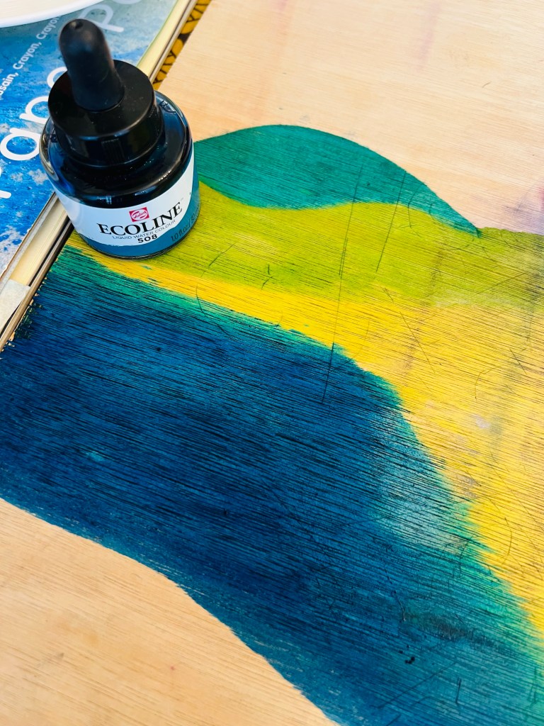
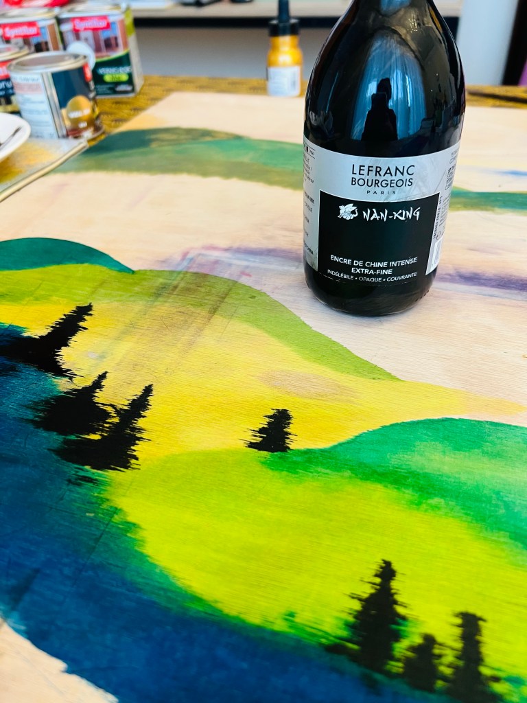
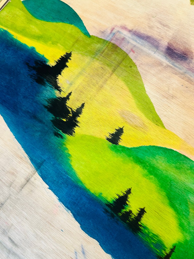
Below is a Black ink in on wet liquid aquarelle. Black ink is just wonderful on board. It goes in nicely. If I use the black ink on wet area, the ink moves around the line, so I can easily paint trees.


Oil sticks on liquid aquarelle painted board- another trial. The coverage is not amazing again.


Golden shade laque on aquarelle testing.
For a long time I have been trying different mediums of golden colour in order to find a perfect shade and texture for the golden background. For this experiment and research I bought some golden shades laques in the DIY home and garden repair store: the upper row of cans on the photo below.


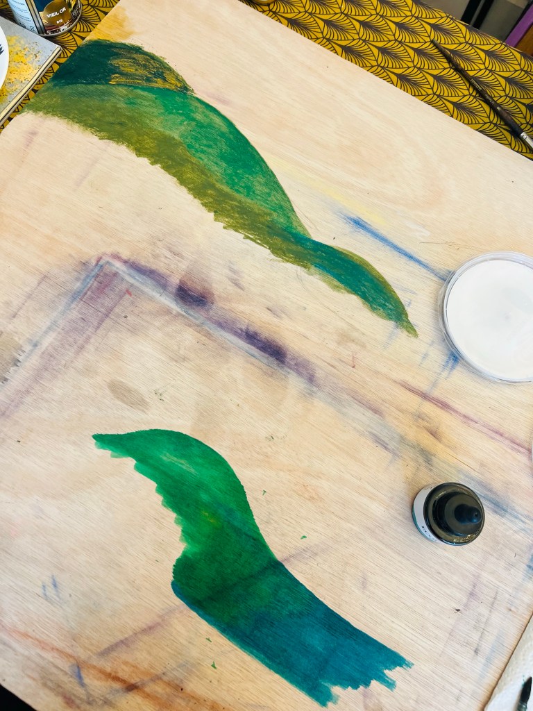
Golden shade lacque on aquarelle painted board. On the photo above you can see the gold shade lacque finishing on the bare wooden board. The gold lacquer finishing appears as not very gold, not rich, comes out as very pale. So I decided to use a pigmented ink as an undertone for the gold lacque finishing – the photos below. The Jacques Herbin watercolour ink in Eclats 135 Sanguine shade is just perfect undertone for gold lacquer to create a smooth, rich golden surface.


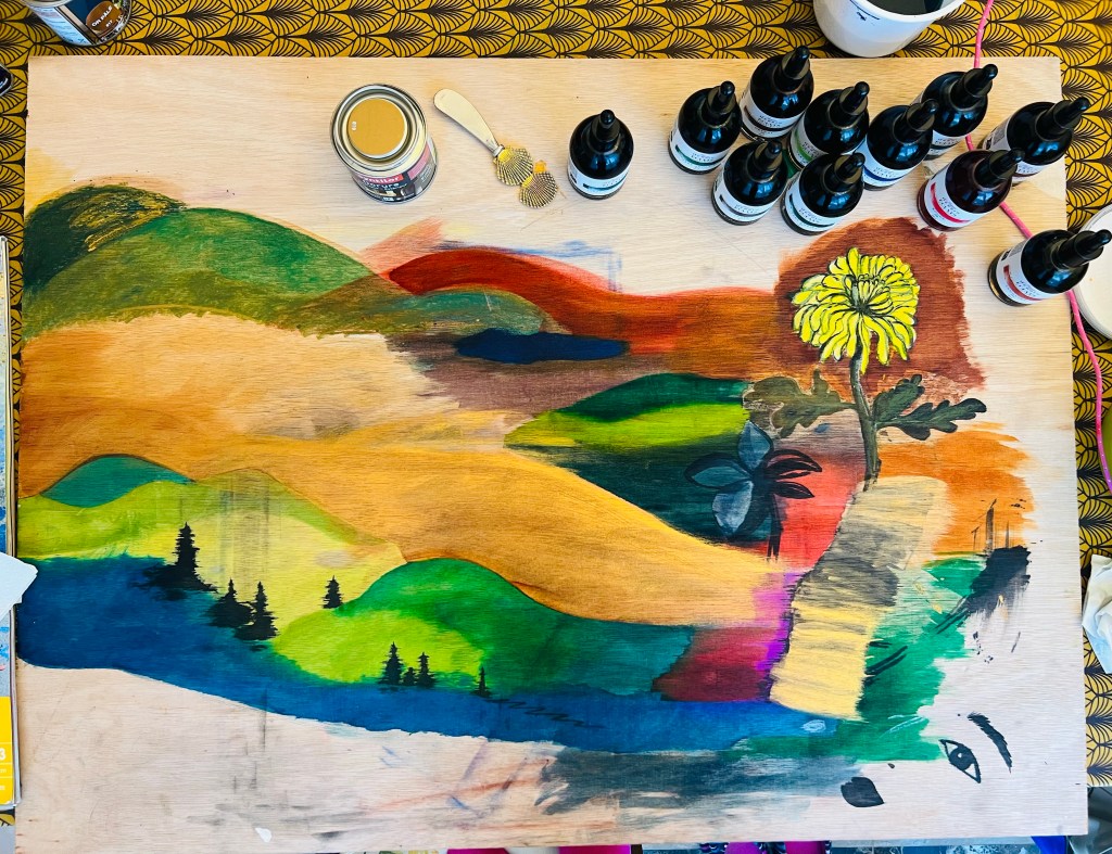
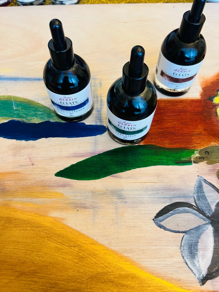
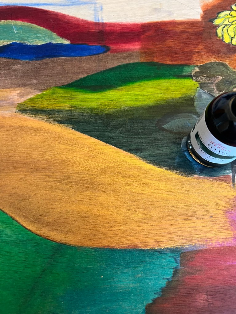
Another set of liquid aquarelle painted on board with Jacques Herbin Èclats watercolour inks.I wanted to try all shades for my PP idea – wood board painting, probably landscape. The red, green and the blue inks are just super.


Interesting outcomes:


My board after testing all mediums