
For the final assignment for Part Two we hare asked to “take a piece of text , a sentence or a few words that mean something to you and write it approximately 10 times.Do this at least twice using different materials each time.” We must reflect on different versions and select our materials to produce a piece of text that communicates, as far as possible, in the way we want it. In our reflection we have to think about: 1) does your piece communicate in the way you want it to? 2) How did you find communications through writing as image? 3) Was it liberating or frustrating? 4) To what extent did you rely on the words themselves or the visual treatment to communicate your meaning? 5) what you’d you do differently?
For this Assignment I did the projects below. I wrote the phrase “Your Death is No Mercy for Me” which is my main thought about the death of my close relative. It is a heavy thought which is left for me as a deep feeling of enormous guilt. I am sure this is a common bitter sentiment for all people who shared the same traumatic experience as me at some point of their life. Among all the options in terms of the medium to write the phrase, I think the black ink and a thicker calligraphy brush are the ones which help to communicate the idea in a best way. The mediums were: red ink pen, black ink pen, black, violet, red and blue ink, dark brown and black soft pastel stick. The paper I used was a mixed media paper from Canson. For the final result I also used new set of aquarelle shades “Infinity. You can see all materials below on the photo.


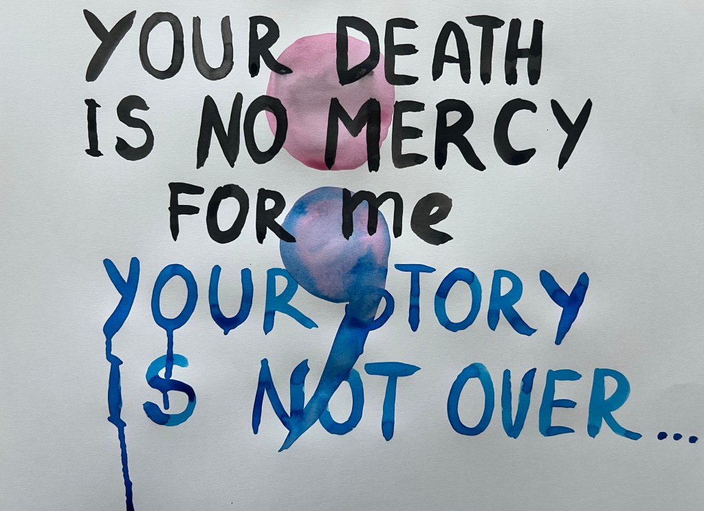
The final outcome is below. To make letters more expressive I used the painting knife, pulling down the wet black ink, creating large stripes on each letter. To make them visible and emphasise them I put another layer of black ink and when it got dry I used the white soft pastel stick. I didn’t see this message to look as a neat calligraphy work. The letters look chaotic and messy, I have made them looking uneven and sharp.


In regard to negative space, I added flowers and leaves on each side, as well as a blue stripe on the top of the drawing to show that the news about the death was unforeseen and unanticipated, totally shocking. I received the news on sunny beautiful day, and it teared my reality abruptly and cruelly. The white, empty negative space around black letters symbolises the shock and overpowering emptiness you feel when you meet the unthinkable. The semicolon “;” is a symbol of “Project Semicolon” – a movement which helps people to be aware of the fact that suicides are so common and can be prevented. As I reflect on the final outcome and questions in the exercise, I think I managed to communicate with a viewer the shock and trauma. The chaotic, uneven, black and messy letters do pass the feeling of being shattered by the news. The world was literally falling apart into pieces. The empty white negative space delivers a message of intrusion of different and harsh reality into my peaceful and careless sunny day. The drawing didn’t bring me any sense of liberation, though sharing my pain, communicating my persistent thought had some, very little, therapeutic effect. It is hard for me to distinguish to what extend I relied on the words themselves or the visual treatment to communicate the meaning. Though I think the words, their semantic load is a dominant factor, because without them there would be no message at all. I can write these words every single day and every day I could make them look different. I would not change the way I wrote them – the font and the colour, but the negative space, of course, can be different. Another way of this message could be adding large transparent semi colon sign on the letters, or adding Project Semicolon slogan: “your story is not over”. When I think about my experience, I imagine writing letters to that person who passed away with black ink on white empty space.

Below is another project I did for this Assignment. The first work appeared as sad, so I wanted to develop a text as an image in an opposite direction – happy and full of hope. I picked up a saying in Sanskrit language “Om Shri Krishna Arpanam Astu” which is from holy scriptures Shrimad Bhagavad Gita (Part 11, Chapter 3, verses 1-10). The wording means that all our actions should be devoted to God. For this project I used brown Pastel Card rough pastel paper from Senellier and my set of soft pastel sticks from Jexell. In my previous exercise for this Part Two I liked how the blue soft pastel shade looks with a gold pigment. It looks royal, vibrant and fresh. So I didn’t have any doubt what medium and colour to pick for this phrase.

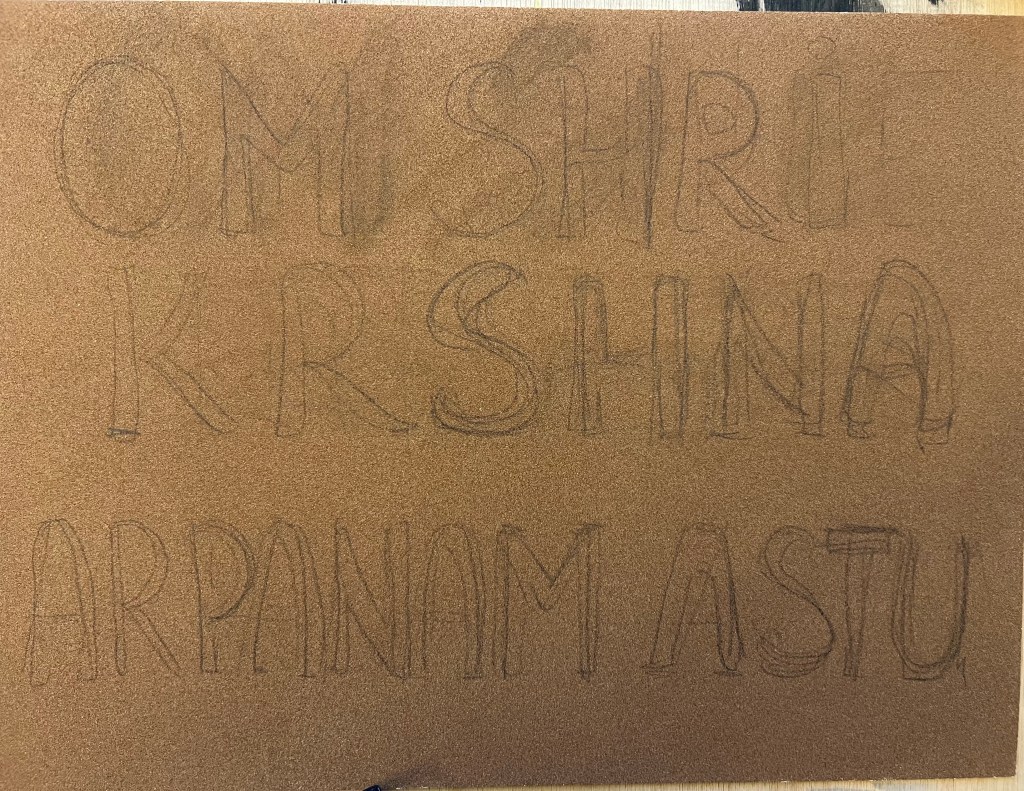


I think this drawing delivers an idea of joy and celebration of eternal existence through bright colours and flowers. I used soft pastel stick because they contain a super rich pigment, and allow me to draw with large, fat, expressive strokes and lines. I didn’t do tiny, tender and delicate flowers as they tend to appear in aquarelle, because I wanted to emphasize the strength of eternal vibration and God’s creative force which is abundant and overwhelming. In this drawing I used a phrase, written in Sanskrit not in English, so the unprepared viewer would not understand the meaning of the phrase. This is an important difference comparing to the first drawing. Though, I think, even if people don’t understand the meaning of the words they see, I think they can feel something unusual and grandiose coming from the words. This phrase can be written in endless different ways.
This drawing is a part of my spiritual serie:


Below I put both works for this Assignment to compare the different mood.


