Research Task: Axel Malik
Axel Malik (1953-)
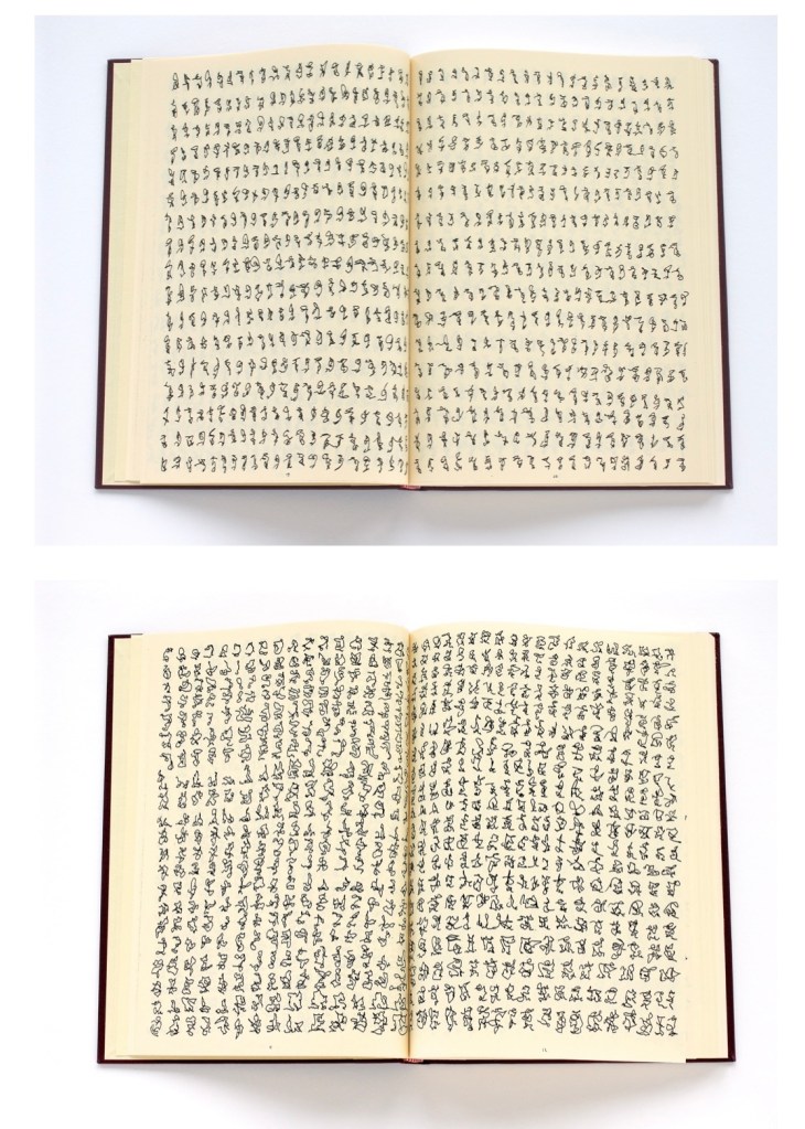
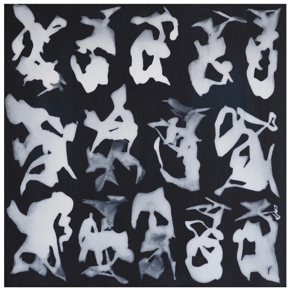
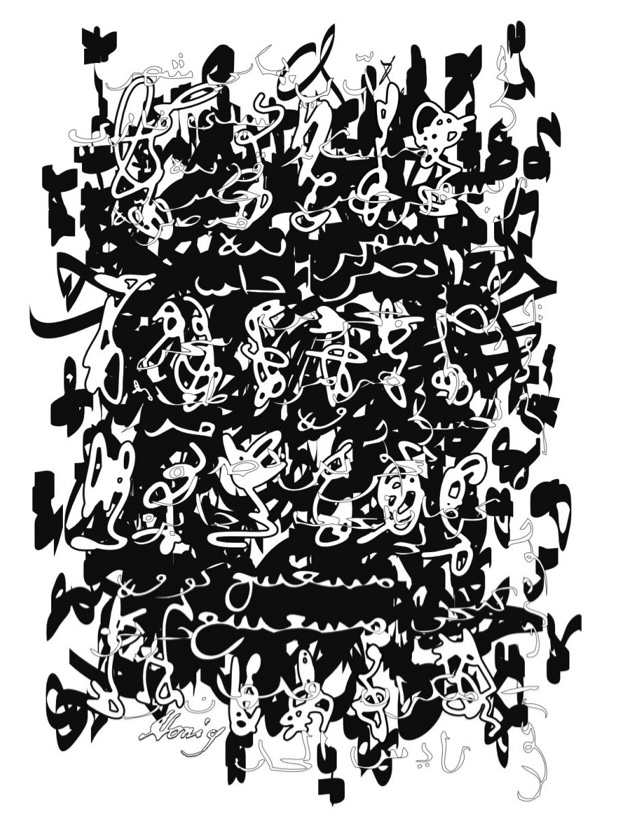
Axel Malik is a German artist who is famous with his unique “The Scriptal Method” he employees for creating his artworks. He studies the process and essence of writing as a complex phenomenon, he describes it : “When script is divested of its semantic core, the motion of writing instantly implodes … an expanding intensity of the moment. It is all about unobscured reality of the bare and sheer motion of writing.” (Axel Malik, On My Work, http://www.axel-malik.com). On his website http://www.axel-malik.com you can find a video of his writing process. He is not focused on producing phrases and words, he immerses himself into the pure action of writing. Below are some of his works, from left to right:
Diaries 1989-2021, Axel Malik, image via http://www.axel-malik.com; Signs, 2009, Axel Malik, acrylic on canvas, image via http://www.axel-malik.com; Palimpsest 020, vector file, Axel Malik, 2019, image via http://www.axel-malik.com;

Further reading: Nigel Holmes, Information without Language, chapter 7, in Drawing – the Purpose
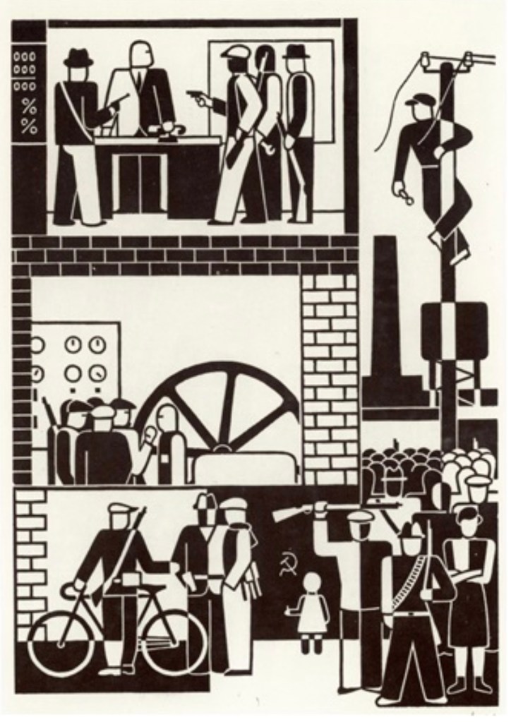
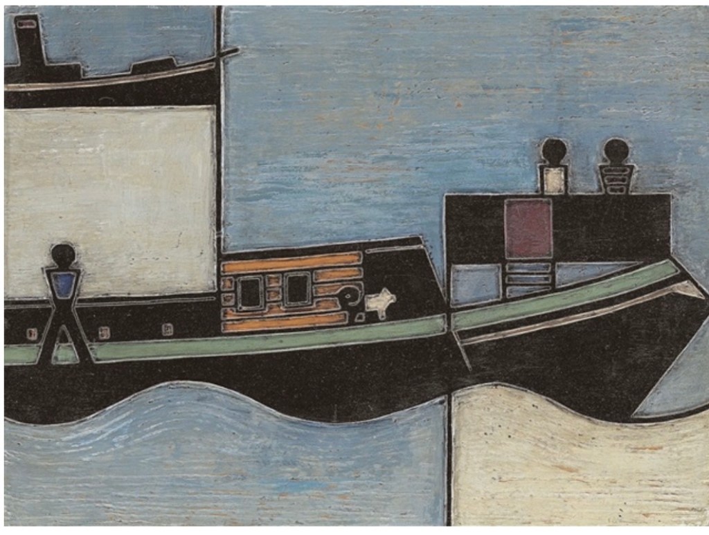
I have read a recommended writing by Nigel Holmes, “Information without Language”, chapter 7 in Drawing – the Purpose, about the concept and history of diagrams as a type of visual language. So I got interested in the drawings of a graphic artist Gerd Arntz (1900-1988), who “… revolutionized the field that is now called information graphics…Just like the images from 32,000 years ago, Arntz’s drawings were not literal; they were based on good observation, reduced to a few lines or shapes that captured the essence of whatever was being drawn. Arntz generally followed Neurath’s theory that the most recognizable view of an object or animal was its silhouette. ” (Drawing : The Purpose, edited by Leo Duff, and Phil Sawdon, Intellect Books Ltd, 2008. ProQuest Ebook Central, http://ebookcentral.proquest.com/lib/ucreative-ebooks/detail.action?docID=415349. Created from ucreative-ebooks on 2023-01-30 16:40:45.
Below I put some of Gerd Arntz’s artworks, from left to right: Fabrikbesetzung, 1931, Gerd Arntz, original woodcut, image via http://www.artnet.com; Schleppkahn, 1924, Gerd Arntz, block from wood painted in colour, image via http://www.artnet.com; Avondvaast, 1937, Gerd Arntz, woodcut, image via http://www.artnet.com;

Bibliography: “Unendliches Alphabet/Liturgy Specific Art mit Axel Malik, online on Liturgy Specific Art, Youtube, [accessed on December 12th, 2022];”On my work”, by Axel Malik, online on http://www.axel-malik.de [accessed on December 12th, 2022]; (Drawing : The Purpose, edited by Leo Duff, and Phil Sawdon, Intellect Books Ltd, 2008. ProQuest Ebook Central, http://ebookcentral.proquest.com/lib/ucreative-ebooks/detail.action?docID=415349. Gerd Arntz, online on http://www.artnet.vom, [accessed on January 29th, 2023]; “Bob and Roberta Smith RA (b. 1963), RA, online on http://www.royalacademy.org.uk; (accessed on January 25th 2023]; “Bob and Roberta Smith, born 1963, Tate, online on http://www.tate.org.uk [accessed on January 25th, 2023]; “Bob and Roberta Smith – Look, Listen, Make Things”, The Harris Museum, online on http://www.theharris.org.uk;
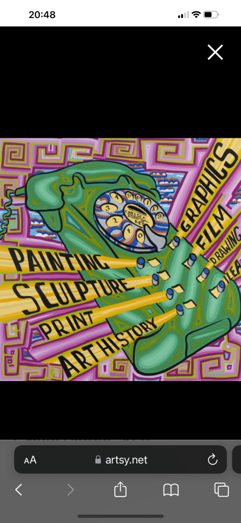
Research on artist “Bob and Roberta Smith” – Patrick Brill ( 1963-) (sources in the bibliography above).
Patrick Brill is a British contemporary visual artist, writer, musician and author, known as “Bob and Roberta Smith”. He had his formal training in visual arts as a sign Painter in New York. He also studied at the University of Reading and Goldsmiths College. As it is said at the RA website article about Patrick Brill, he :”…uses text as an art from, creating colourful slogans on banners and placards that challenge elitism and advocate the importance of creativity in politics and education”. His artworks have been presented in numerous solo and selected group art exhibitions worldwide. He is well known for his art education advocacy. Some of his artworks are below from left to right: Green Phone,2021, Bob and Roberta Smith,Sign-writers paint on wooden panel, image via http://www.artsy.com; Art is your Human Rights, 2021, Bob and Roberta Smith, Sign-writers paint on wooden board, image via http://www.artsy.com;

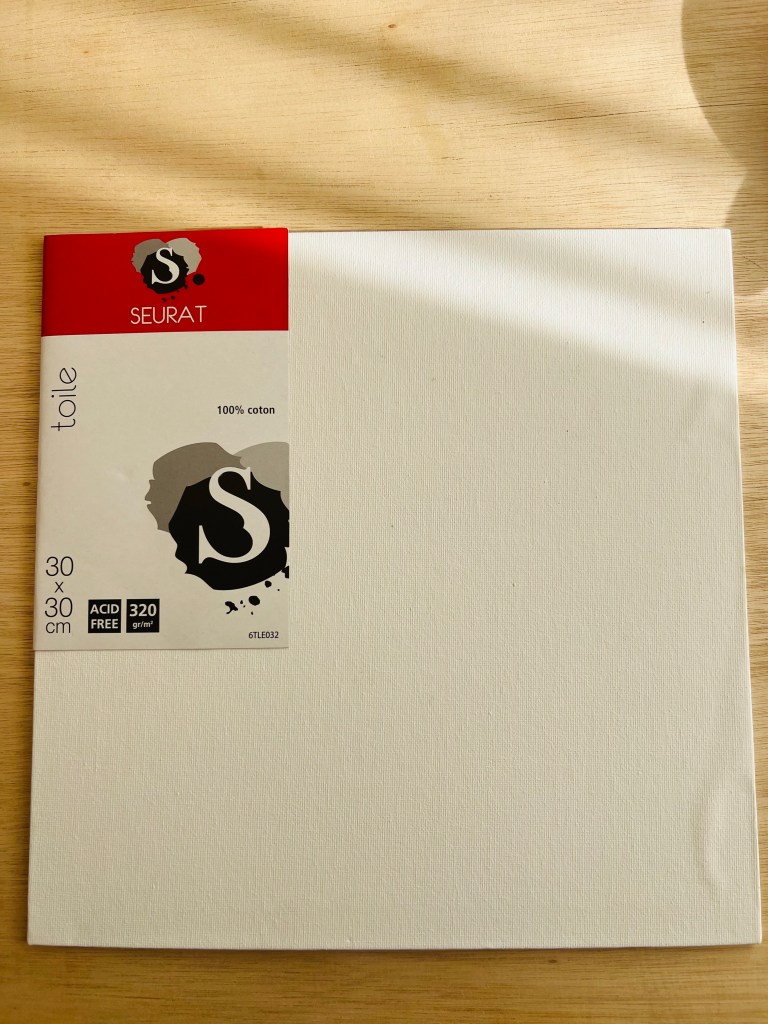
Exercise 3: Listening and Drawing.
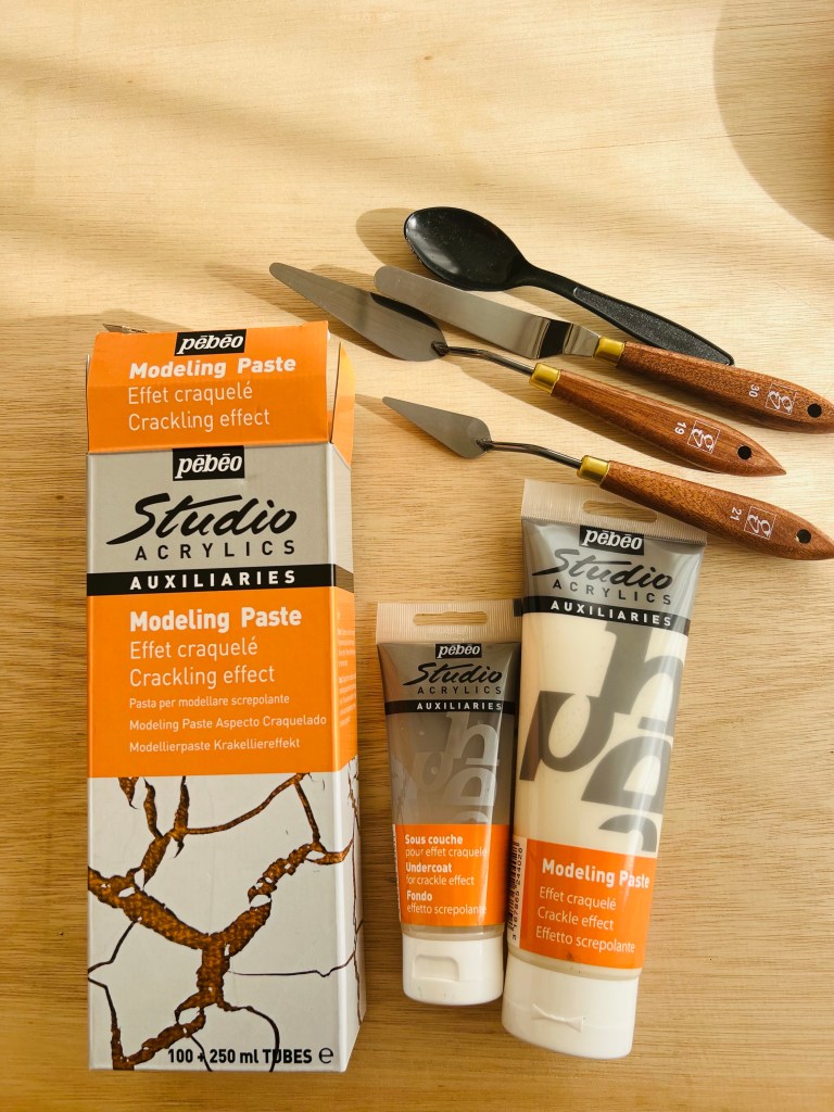
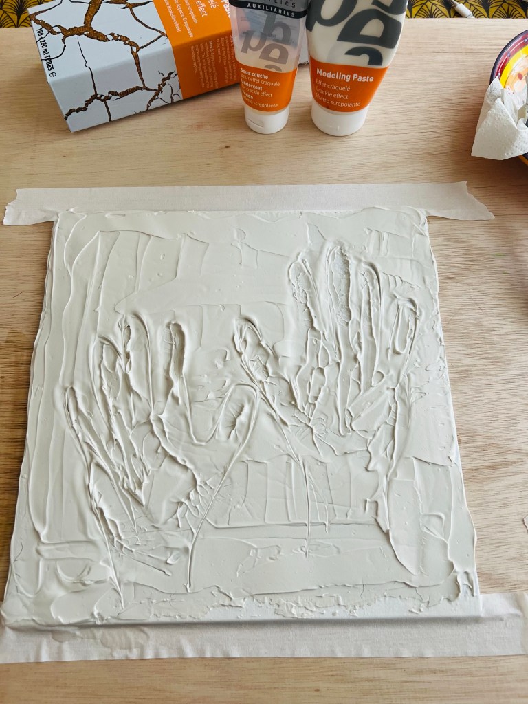
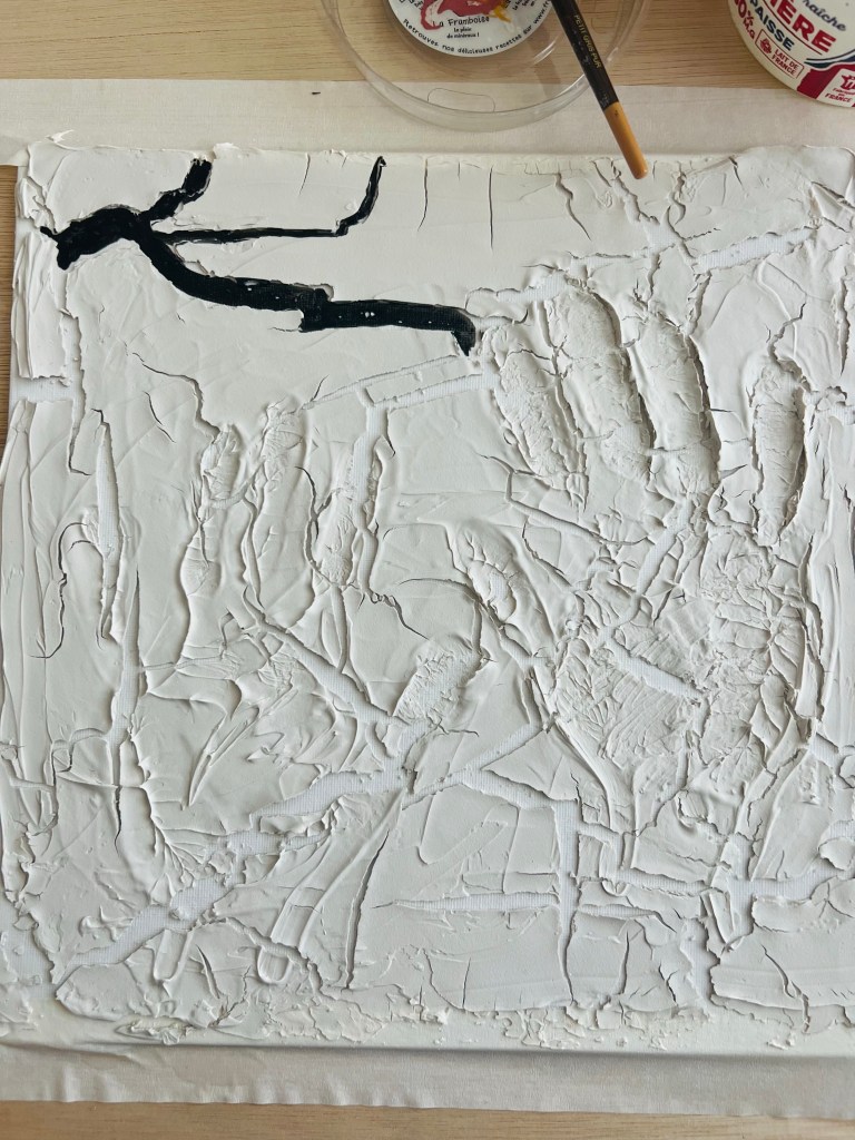
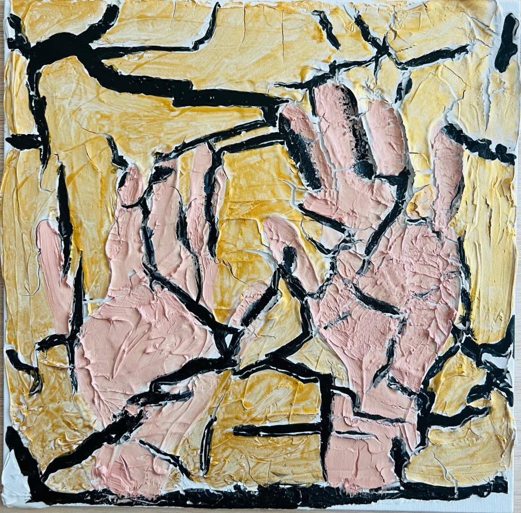
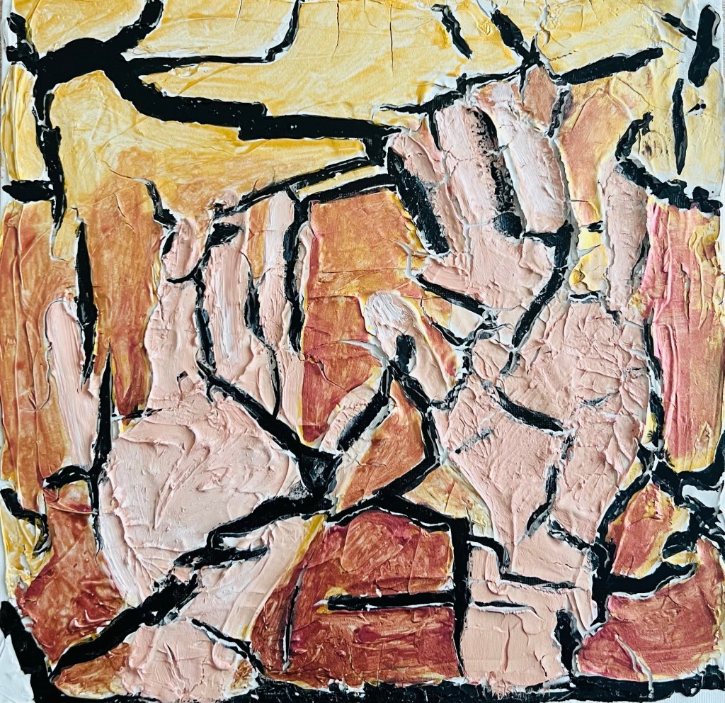
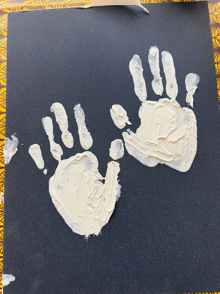
For this exercise I decided to use a new material and a new approach/technique, trying the Pebeo modelling paste with the cracking effect. Below is my work in progress. I applied the modelling paste and left traces of my hands. The cracking effect looked engaging. I those cracks all over the surface I saw the unmanageable reality when my efforts to control or change it just fall apart – cracking hands. To emphasise the drama of being helpless I added Nan King black ink (Lefranc Bourgeous) into the cracks. For hands I used oil paint #577 from Daler- Rowney.


Another project I did for this exercise.
The project above is giving a sense of sadness and frustration. I wanted to communicate the sense of being helpless in the situation you can’t change.
Then I wanted to develop my hands’ traces into something opposite to frustration and anger, to something happy. I ended up with a quite spiritual work. I was listening to Hare Krishna mantras. Listening while painting is my usual practice.


Then I felt I must add blue and gold. The hands’ traces on the top and bottom part I transformed completely using an amazing shade of blue soft pastel and applying on the modelling paste pieces a gold colour ink. The drawing was transformed dramatically and looked much better. The blue hands are God’s hands which support and guide my ( human’s) hands. The idea and its implementation came out just very intuitively, suddenly upon my mind. I was listening Lord Krishna mantras while working. I think the drawing below is one of my best works so far.

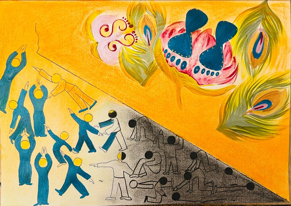
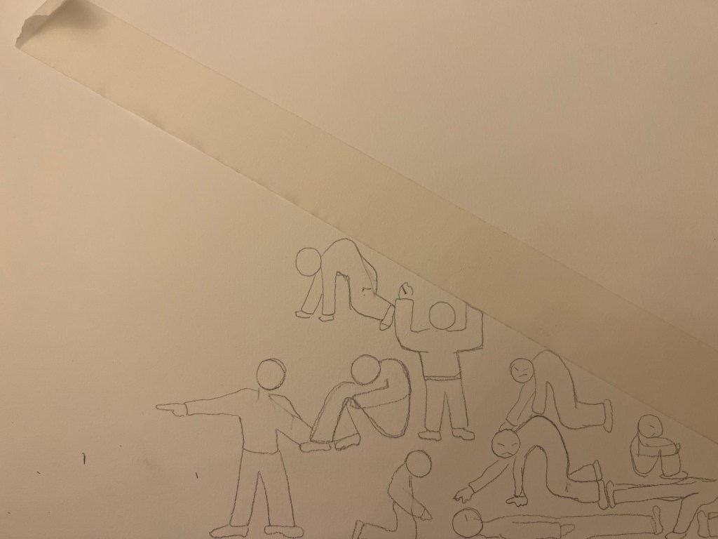
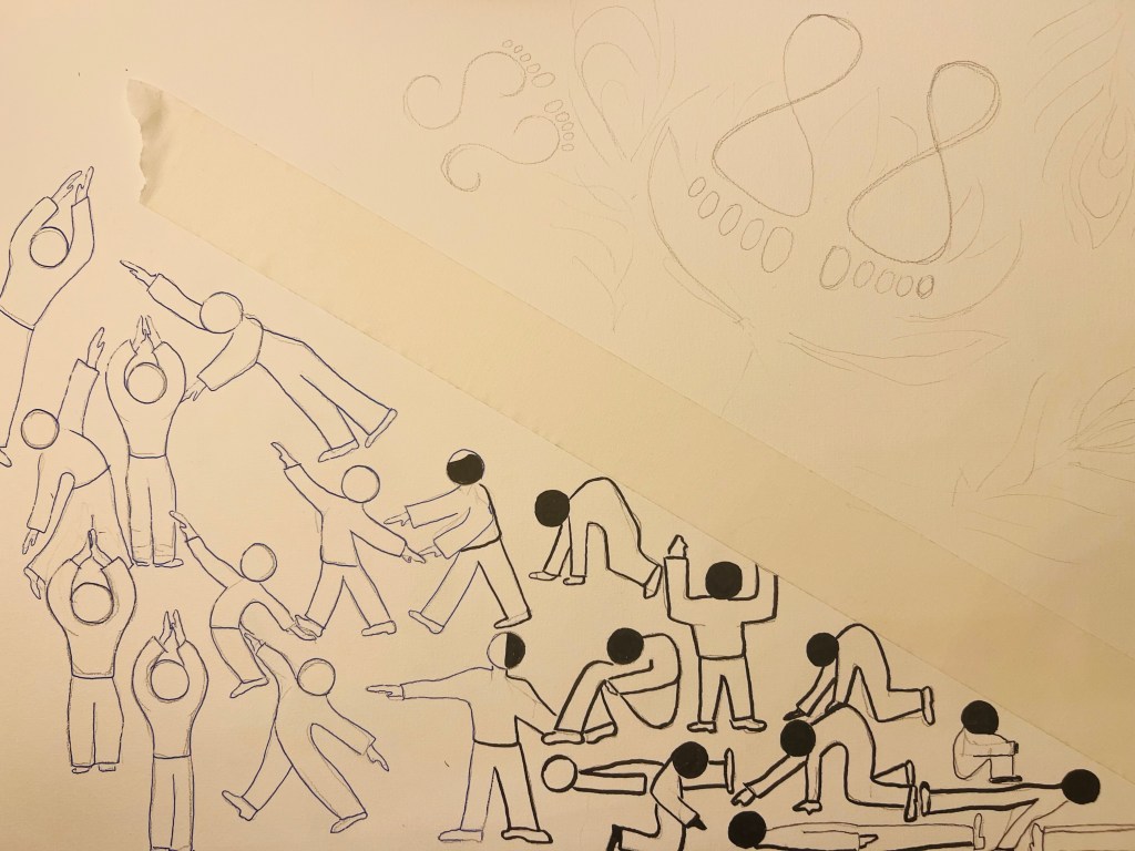
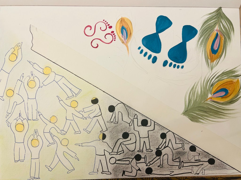
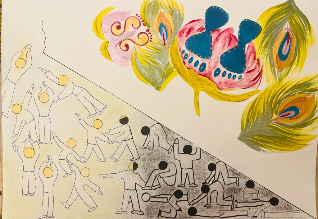
Below is my another project I did for the Part Two of the Course. I got inspired by Gerd Arntz’s diagram drawing and came up with the project below. It was very interesting to work because I never did diagrams and also I wanted to test my new extra fine velour emulsion paints from Lefranc Bourgeois. First I made up a compositional planning, dividing the A3 size paper into two parts in diagonal, separating spaces. I wanted to draw to realities – the Lower one and the Upper one. In the Lower reality you can see simplified symbolic human figures engaged in different poses- activity. Some of them are passive, depressed and ignorant, and some of them are happy and dancing, aspiring to leave the Lower plane. Nothing separates human figures what is my designation of our “free will” factor, given to us by God. First I strated to outline some “depressed” silhouettes with a black ink pen from UniPIN. I wanted to bring a difference among human figures because that was important for my message. So I outlined the “happy” figures with a blue ink pen. But that was not enough comparing to the Upper Space vibrant colours, so I felt that I had to balance both parts of the drawing. So I used the shiny blue paint to designate “happy”, enlightened and self realised people.
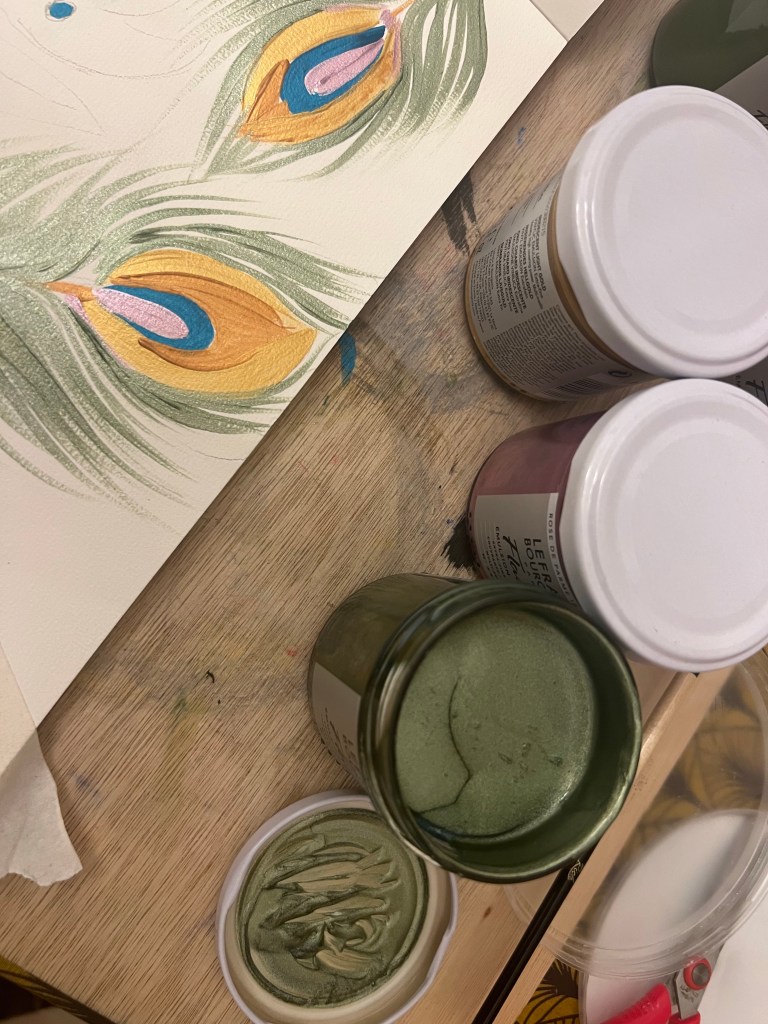
The Upper plane is God’s reality. To designate God’s space I used symbols of His Lotus Feet – you can see them in dark shiny blue. There are also Lakshmi’s feet or Radha’s feet – the eternal beloved of God. These feet symbols are common for “rangooli” patterns people in India draw for their religious festivals, specially on Diwali and Janmashtami. Thus I borrowed them into my drawing, which was appropriate since the whole idea was to communicate with a viewer through the diagram. For the Upper Plane space background I used orange pigment soft pastel stick because orange in Hindu and Buddhist tradition is a colour of God, a holy and powerful colour.
I find the drawing communicating some sense of humour. It is a bit naive because it is a simplified drawing. Standardised human figures create a kind of amusing effect. Though it is interesting to stare and try to read the message.


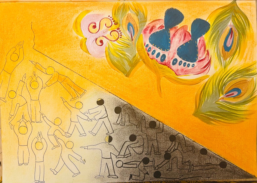
The final outcome: