
For there final project we have to develop a series of pieces, based around the ideas, approaches and reflections, we explored in Part One.
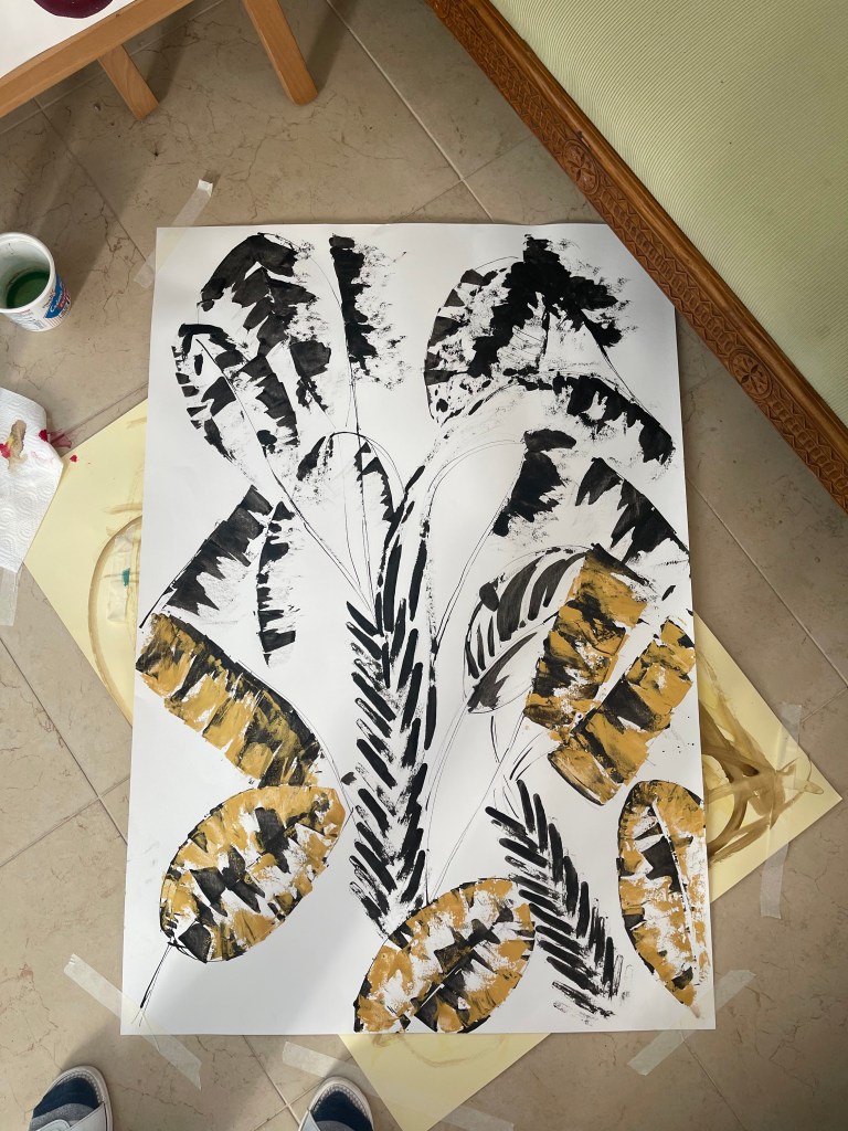
Below are my sketches for developing the idea and final project in this Assignment. I decided to work in abstract manner with my set of painting knives, using different strokes and gestures. The black ink was very engaging for me because I had obtained interesting results when I used it for painting with different painting knifes. I liked a lot these thick complex lines I could develop, using a narrow plastic painting knife. I also used metal painting knife as well. My inspiration often comes from plants, trees and gardens. Flat surface of painting knives creates perfect leaves, the ink is soft and rich in layers.

Inspiration 
Sketching set 1 
Sketching set 1

Sketching set 2 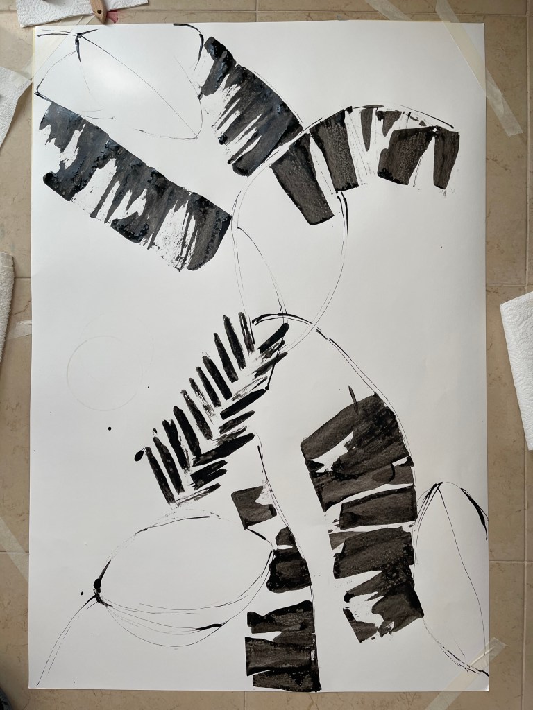
Sketching set 2 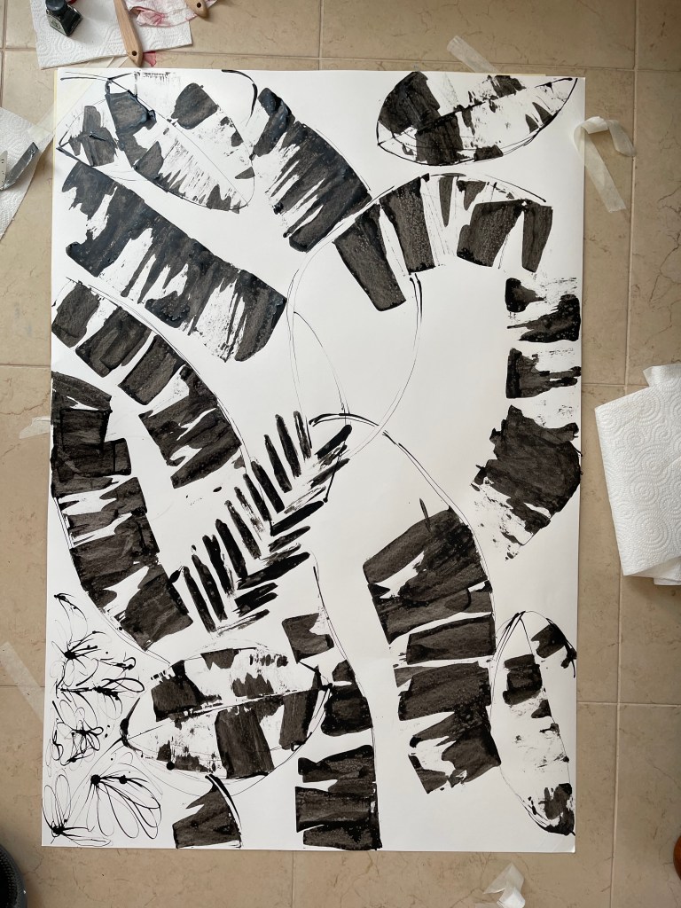
Sketching set 3 
Sketching set 2
I really liked the way my painting gesture with a painting knife produced the strips of ink. I found them as rich and interesting. Ink dries up quickly on paper and that is why I could also add more layers of it, obtaining new effects. Then I started to introduce colours. I picked up gold and blue. I used gold acrylic paints and mixed oil paints for different shades of blue to try them in my sketches. Also, black ink goes nicely on top of gold acrylic paint, creating unexpectedly engaging patterns.
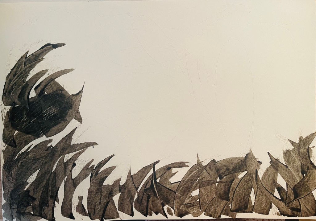


Ink and acrylic paint in layers with a painting knife
Developing color concept 
trying different blue 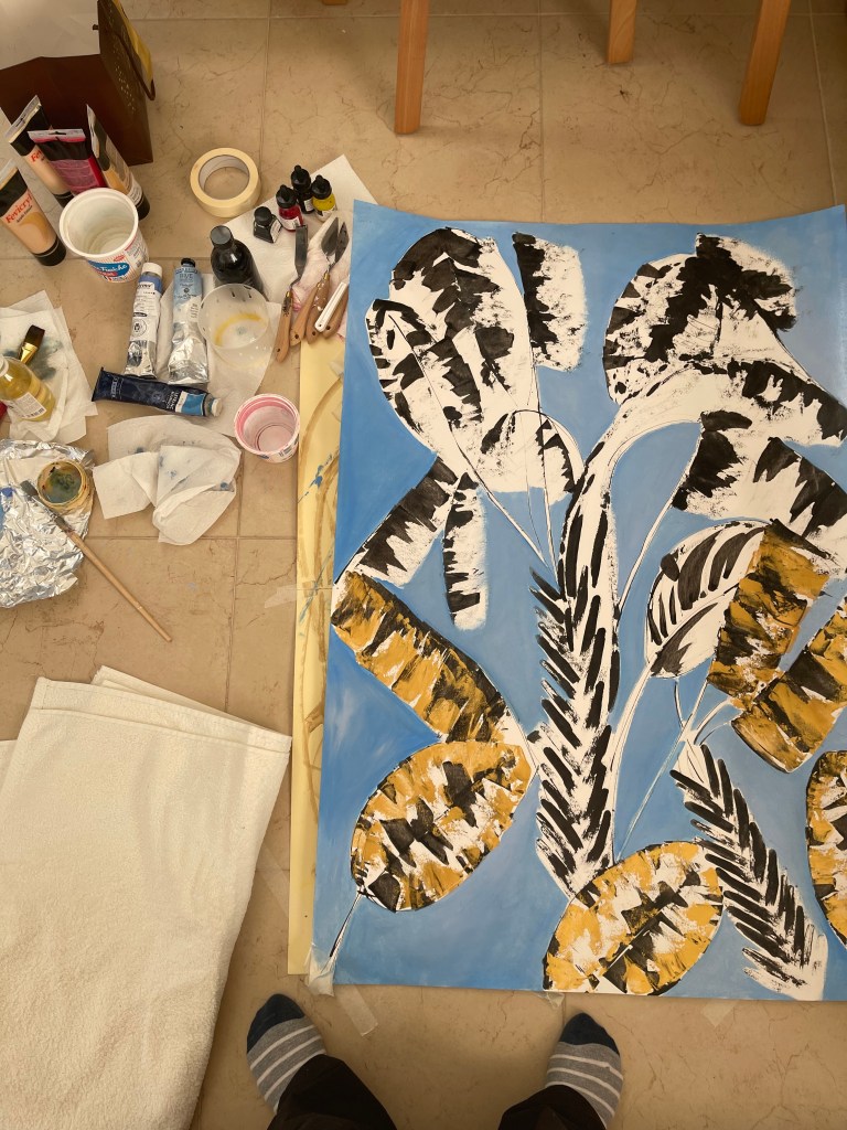
3 different shades of blue 
3 shades of blue color to try and mix 
developing colours 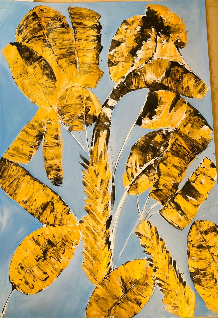
developing colours
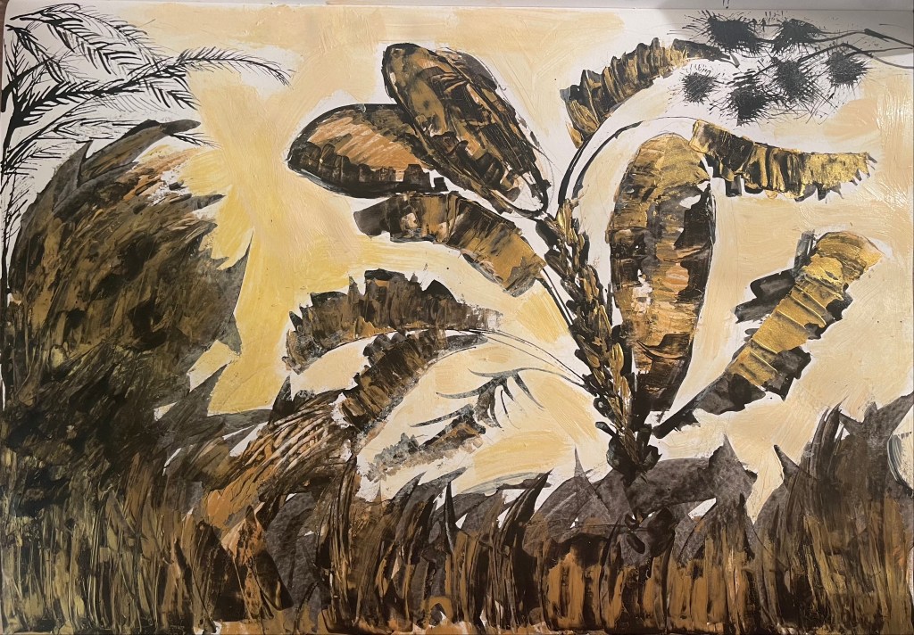
Above is my first full sketch towards to my final project. I can summarise the results after analysing my sketching:
- I decided to stay in this direction in general. I still liked the results of my ink +painting knife work.
- The blue and yellow colour stay, but I see that if I use less intense blue colour, which is Bleu from Lefranc Bourgeois, but the #301 Bleau Gris from Rive Gauche, the painting looks more elegant.
- I also see that the blue shade works better if it is not evenly placed over the painting. So I decided to create some areas less intense blue.
- Some parts of the sketch came out as below my expectations and some parts appeared as good for me. The dull and not engaging parts of the sketch are those, which are on the left side (looking at the sketch on the screen). I put too much of gold pigment. The right side where there are more black and white colours looks much better.
Below are fragments of my sketches which I consider as not bad
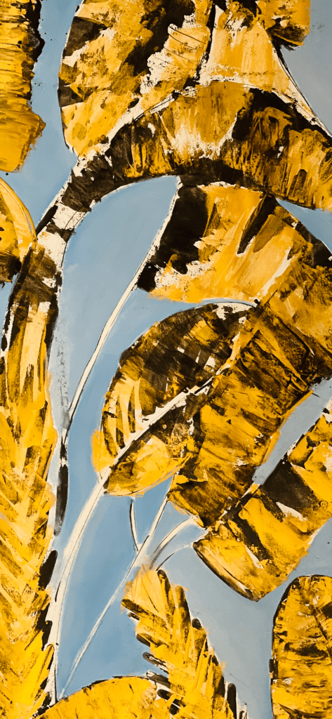

Fragment
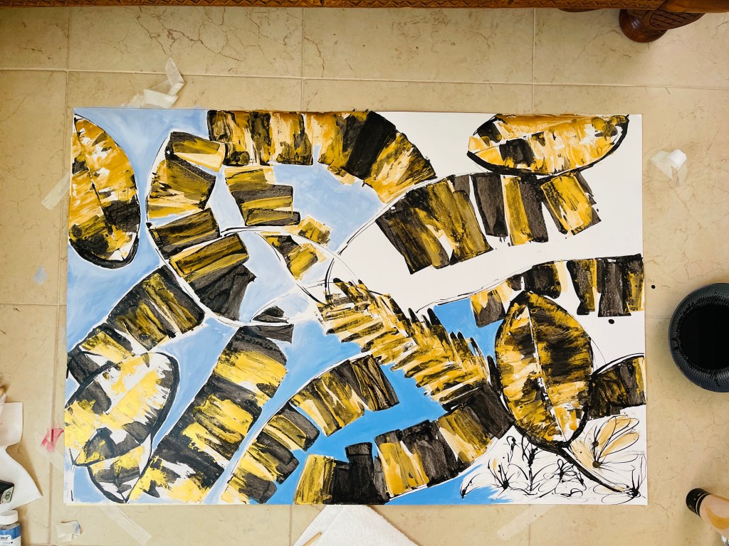
Below is my final work in progress. I used large paper by Canson (75*150 cm). First I thought about my overall composition, thinking about how my sketches above came out and the large size of the painting. I decided to place the elements of the painting in way, which would allow to turn the painting around and enable a viewer to look at the painting from different aspects.

starting with ink on paper 


Acrylic paint in gold and my painting knifes 
Introducing gold to black 
Bringing blue 
Below is my painting from different aspects.

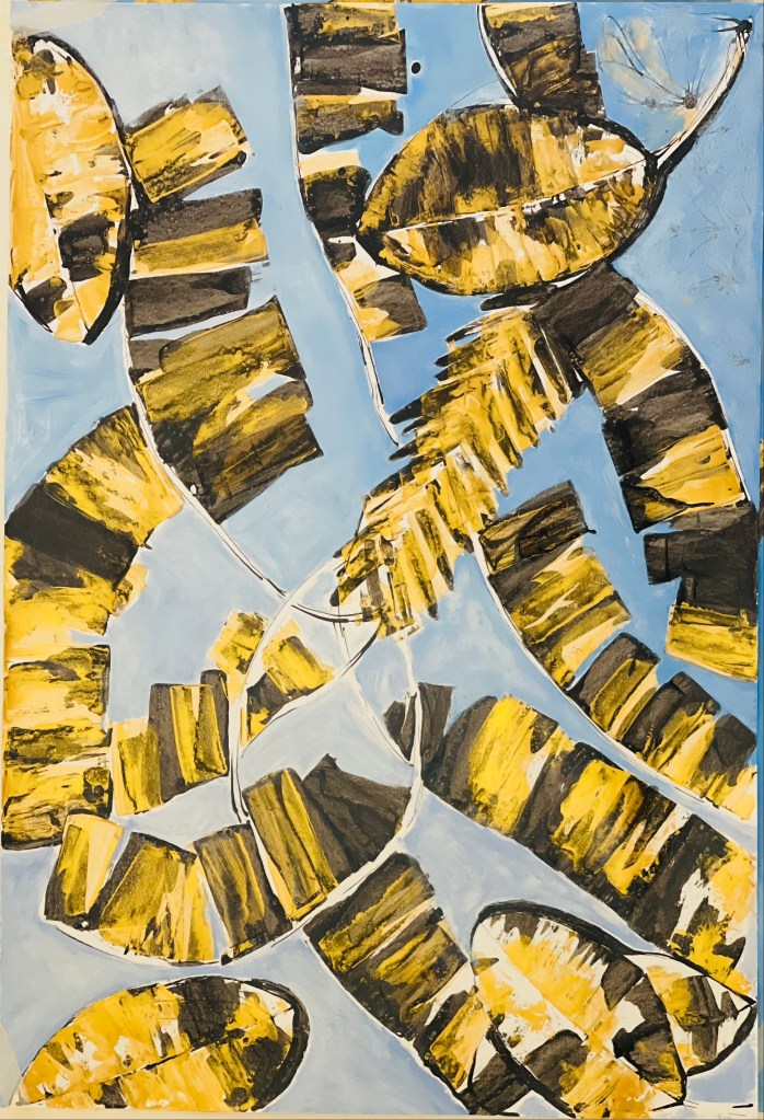

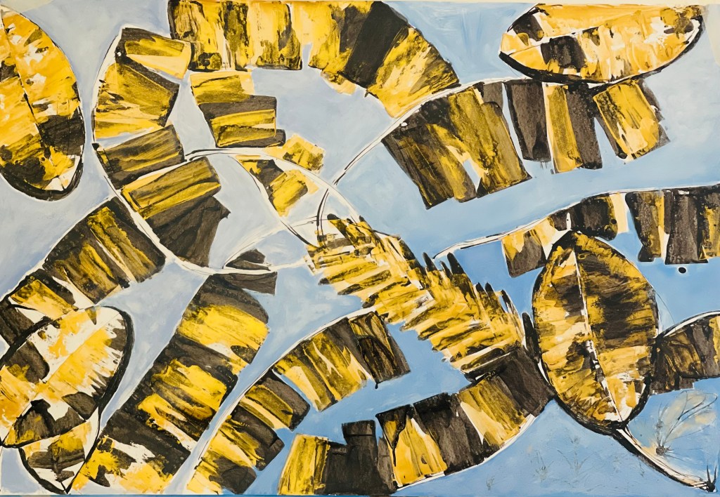
A Tree (ink, oil, acrylic on paper)
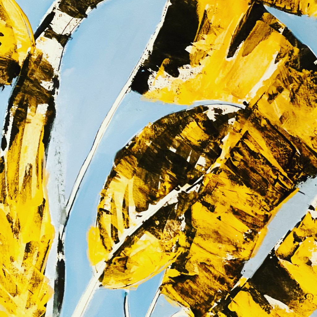
I also always play with filters for my paintings because it helps me understand the result better and improve it further. Below there are some results, which I like most. The primary outcome is that I can develop the image further and make a new painting if I use yellow instead of gold.

Part One of the Course had a groundbreaking effect on me because this was the first time when I didn’t use the brush for my painting and worked in a large scale format with the painting knife. Another crucial aspect was that this was my first more or less serious attempt to explore abstract painting, further developing my personal artistic style and voice. I enjoyed the whole process of learning in this part, even though dripping and scattering of paint at the beginning seemed kind of boring. Another self-observation was that I had to master my skills of an intellectual approach to my artwork, developing the concept from inspiration. The large size format required me to reconsider my understanding of my artistic gestures and their productive effects. It also made me rethink my composition skills in a new way.
