As a final project for the course we were required to create a series of 3-5 paintings which would have a common feature we pick up entirely by ourselves.
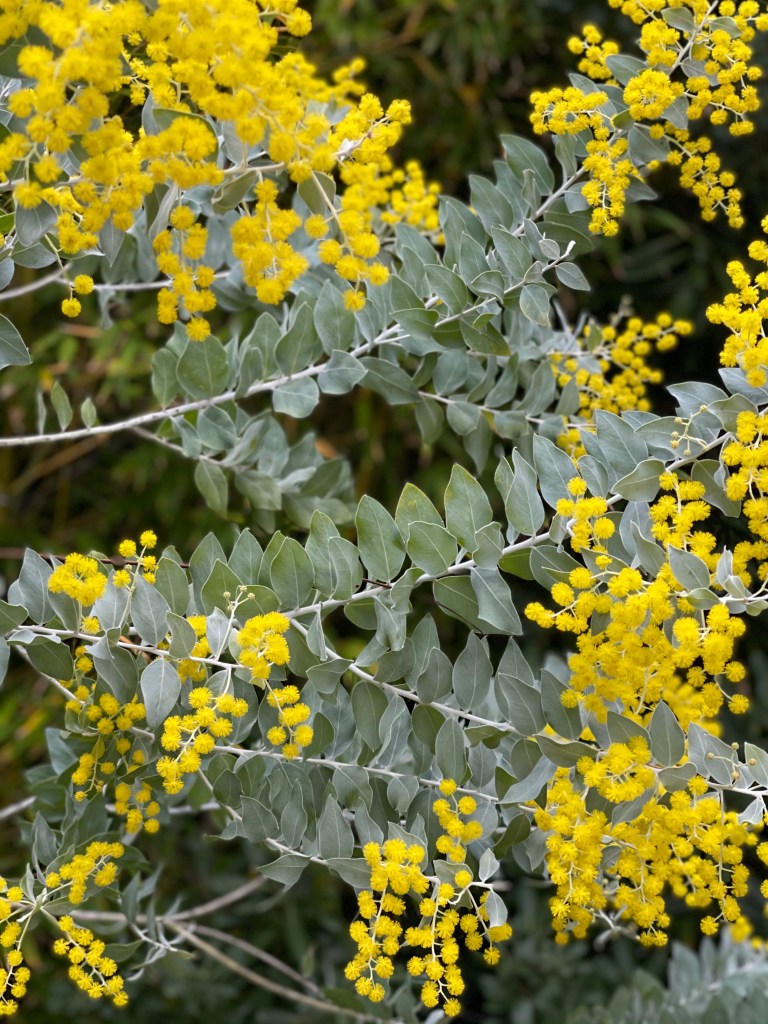
I have decided to work on a still life using different techniques and mediums. I get very much inspired by the plants, by their forms, shapes and colours, as well as the harmony I observe in nature around. I often take photos of flowers and leaves so I can refer to them while working on my drawings. Below is my photo of mimosa tree which started to bloom a month earlier this year, becoming my inspiration for the this project.
I have decided to paint the theme of mimosa tree for this final assignment of the Painting 1 course, in aquarelle, acrylics, acrylics in impasto technique and soft pastels.

Painting 1: Aquarelle
Materials: I used a special A2 size ( 18 in – 24 in) pure cotton paper for aquarelle painting from ARCHES; my set of aquarelle paints from Senellier and brushes for Japanese ink painting.
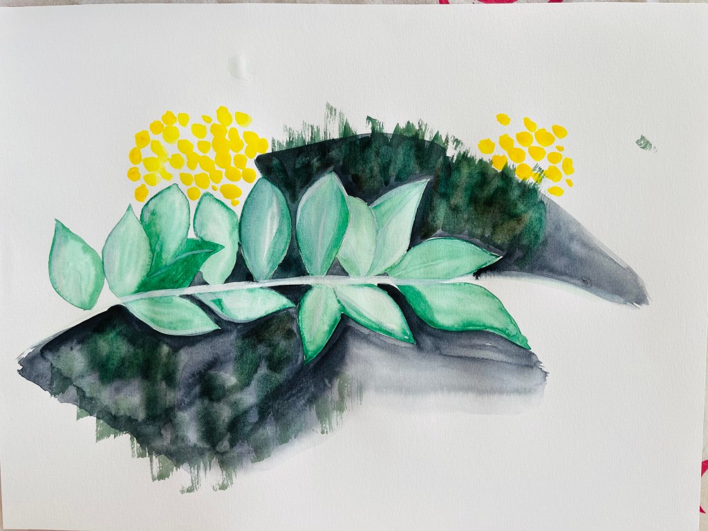
My general idea was to bring viewer`s attention the freshness of the colours – white, yellow and mint while showing the constant dialogue of the particular tree with the surrounding environment. I started my composition pencilling the brunches and leaves; I also did some preliminary sketches to try the shapes and mixing the green shades to obtain the minty green. For the shade of green I was looking for I had to mix Vert Hooker 809, Gris de Payne 703 and Vert Anglais Clair 805;
My main challenge for this project was the background. I opted to not doing a wash before I do the green foliage and bright yellow flowers because I wanted to keep the colours clean and fresh. I also wanted to do a complex background to show the depth and enrich the painting, avoiding it to appear flat and unfinished. Thus, after I did the leaves and the stems, I started working on the background adding dark green working from the center of the painting, going to lighter gray shades toward the edges what created a perception of moon light. While working on the background and thinking about the whole outcome, I understood that the painting was appearing and evolving as a quite impressionistic piece. Blooming mimosa flowers and tender leaves were the perfect subjects for impressionist painting because I had a strong sense of them as a “living” things and the moment of divine blooming was very touching. At some point I realised that I must incorporate another subject to the painting because the brunches looked lonely and even though I was planning to add a substantial amount of yellow as blooming mimosa flowers – something was still missing. My Japanese ink painting brushes brought me the idea quite naturally – I incorporated the bamboo with stems and leaves into the painting what upgraded the whole image, helping me to introduce the dialogue I was looking for to depict.
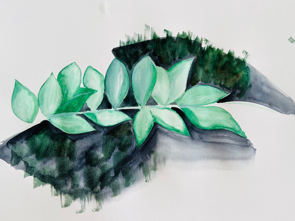
My admiration with mimosa flowers required me to think how to bring them onto the paper. In this painting with this medium I coud not just paint them realistically as tiny yellow dots, this just would not work. The only way I saw I could do it – it was to make myself loose and follow with the flow of the aquarelle, creating the flowers in absolute impressionist way what I eventually did. I used the yellow shade of Jaune Citron 501. Below is my final work and my work in progress. By the end of the process, working on details of the foliage, stems and flowers I got lost myself in different parts of the painting, “travelling” from one corner to another point. I ended up having different type of strokes, lines and shades of colour. Lot of colour shades and variety of soft strokes and lines are typical for impressionist way of painting. I think I managed to depict a moment of the sweet conversation between the flowers, air, light, leaves and stems.


Painting 2. Acrylics
I developed the subject into very different direction using acrylics which was close to traditions of Japanese paintings of Kano school.
Materials: I used a special A2 size ( 18 in – 24 in) pure cotton paper for aquarelle painting from ARCHES it worked well for the acrylics too. I also used acrylic paints below on the photo. I used the acrylic paints from Fevicryl and from Senellier. I used the Japanese brushes for ink painting.


This painting required me to decide with the golden shade of the background. I had 3 different golden acrylic paints and tried them out on paper. I was looking for the paint which would give me the smoothest, softest and richest shade of gold. That was the acrylic paint from Fevicryl. The other too were too transparents and watery.
First I did the background and I was aiming to paint it as very smooth and flawless. It was Interesting to observe that in this project – as for acrylics and for the aquarelle above – the background was that piece which determined the overall direction for the work, not the leaves and the flowers, but the background. After my background got dry I started to work on brunches and leaves with dark green colour. At some point I understood that the leaves became too intense and edgy on the background so I touched them with gold pigment, they became softer and the whole brunch appeared more elegant.
Since I knew already that the painting required more subjects to accompany the brunches, I introduced softly shaped hills which were traditional for Japanese style lanscape paintings. I used the advantage of Japanese soft ink brushes which help to create amazing soft lines painting hills in rural area. The bamboo stem I allocated on the left hand side. This style and medium allowed me to create the mimosa flowers in a very different way. Here the accurate yellow dots looked natural and appropriate as part of the overall style. Below is my final work and work in progress:


Painting 3: Soft Pastels
Materials: I used the A3 sized paper for mixed media from Hahnemuhle which contains bamboo fibre and cotton, it works for soft pastels very well. Also I used my soft pastels set from Senellier.
This variation of my theme I did in a more abstract manner, dissolving the yellow mimosa flowers and loosely indicating bamboo. I incorporated a blue sky to outline the freshness of yellow and green.


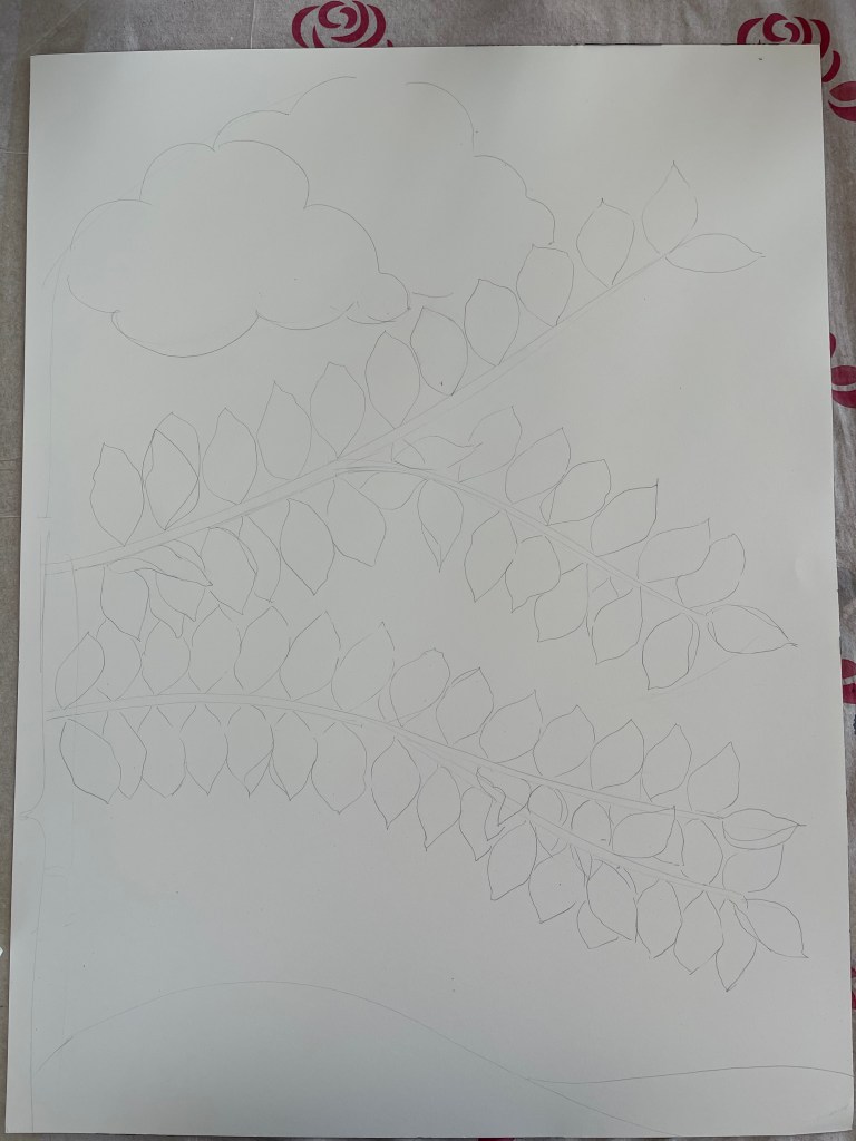
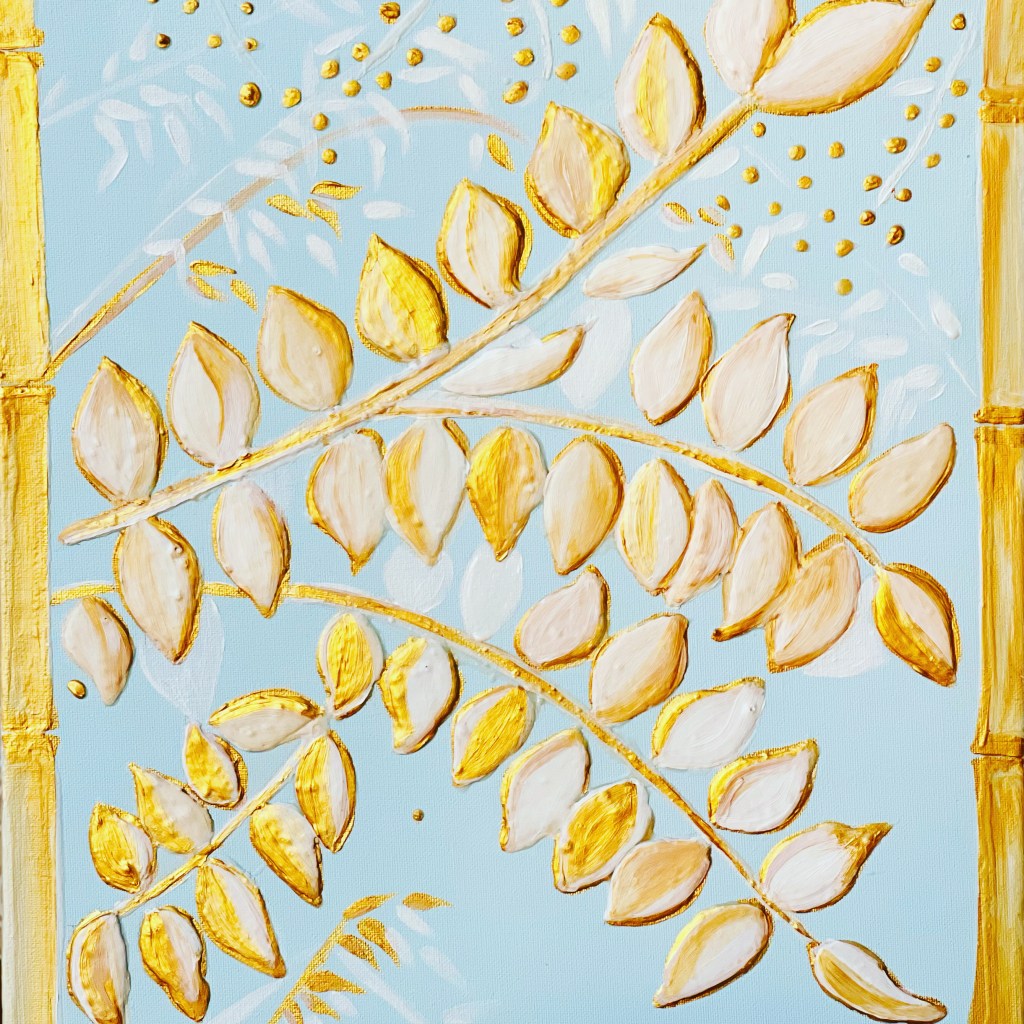
Painting 4: Impasto, acrylics
Materials: For this project I used the A3 size card board canvas, multi surface professional satin acrylic primer from Rich, gold acrylic paint from Fevicryl, white zinc mixing white 006 from Daler Rowney, white glue for kids from ArtDeco and white flour.
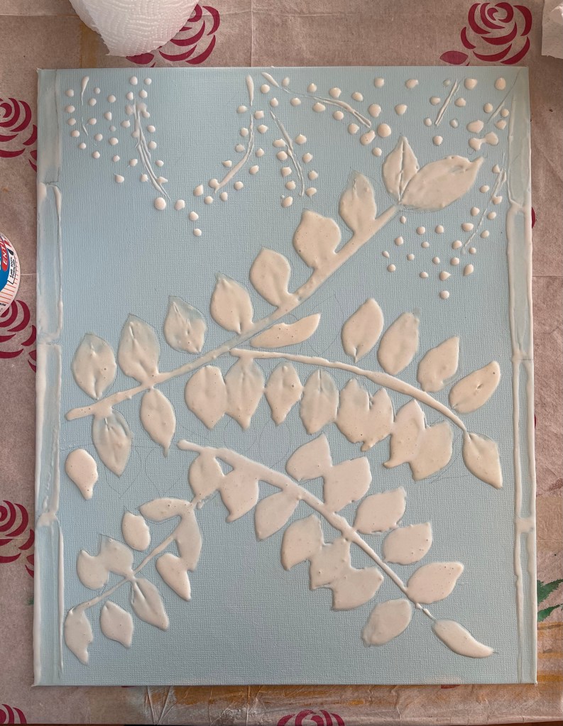
In this project I realised my ambition to push myself to a new direction which was creating a textured surfaces using impasto technique. I found the theme as very appropriate for this, because leaves and ornamental themes have been a traditional subject for decorating purposes such as bas-relief. The brunch with leaves and stems seemed do-able for me as for beginner. I had a good experience with creating the mix for impasto in my previous exercise during the Painting 1 course and I wanted to explore this technique more.
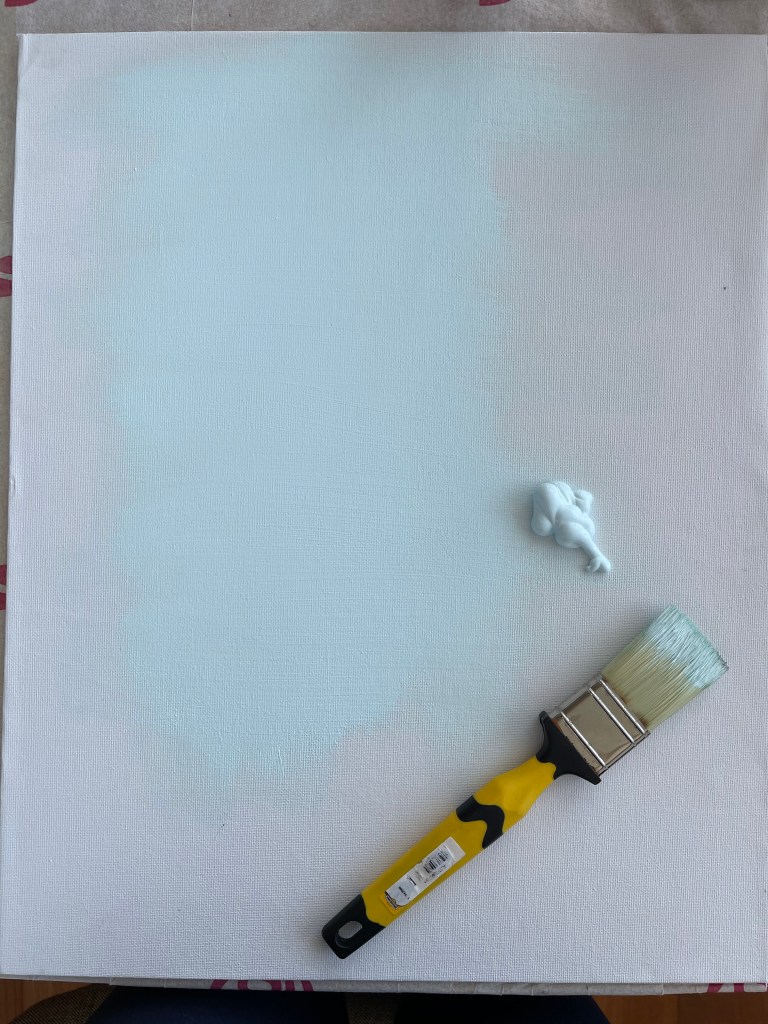
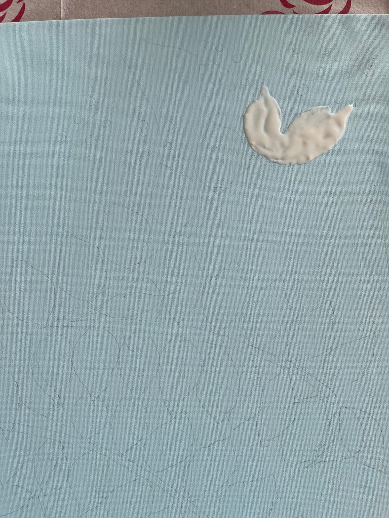
First I prepared the cardboard canvas with a primer. When I was starting my idea was to create the shapes and overall composition and then decide about the colours. I was totally open to work in a very new direction and I didn’t have any any rigid idea about the colours and the outcome. While I was working with a primer it appeared to have a very pleasant light blue shade and I really liked it. I decided to go after the mood it created and left it as the colour for the background for this piece. When the primer got dry I prepared the impasto mix using the white glue and the white flower. I had to do 3 layers in 2 days to shape the leaves and bamboo stems, as well as the flowers which I made as dots. I had to wait when the first layer would get dry and them applied the second and third layer on the shapes I was working on.
My approach to colours in this project was very open and intuitive. The impasto mix was white and white looked so good on the light blue shade of the background. It was just no room for any conventional green! Painting the leaves with any shade of green would be just so odd. While I was working on building up the texture I wanted, I was getting more and more confident that this piece should contain just 3 colours – light blue, white and gold.
Below is my final work and work in progress:


work in progress.
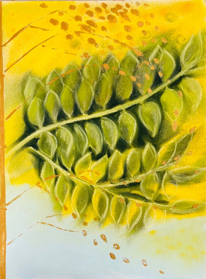
This drawing below I have added after I have received my tutor`s report for the Part 5 of the Painting 1 course. He really liked the aquarelle version of my Mimosa inspiration and didn’t like my impasto blue and gold version at all:))! So I decided to redo the last work and did one more version of blooming Mimosa in soft pastels. Here I used A2 size multi usage paper from Hahnemuhle and my set of soft pastels from Sennelier. I wanted to work more in abstract way so I let myself to be very loose and just go with the flow. I find Soft pastels as one of the best mediums to work in impressionistic and abstract genre because you can manage the colours easily – they blend nicely and you can create a certain sense of movement with your hands, directing the pigment.

Self reflection of my learning and artistic performance during the Painting 1 course.
In regards to when I observe and reflect on the final project and each work I have done within the final assignment, I clearly see the vast space for personal growth as an artist and further development of my personal artistic style. I clearly see that one theme can be and, may be, should be! developed in different directions to open up any artist` s creative potential and obtaining a better result. I dont write the “best” result since it is just impossible to obtain any, taking into consideration the endless creative possibilities, while there is always a large room for upgrading the quality of the particular outcome. My main conclusion is that exploring different options for developing the theme or subject is definitely “a must thing to do” in order to achieve a good analysis of the theme. From one hand I deliberately tried to come up with very different outcome with each work within the série and from other hand I was very open to new ideas about the same subject. I felt myself very creative and enjoyed the process.
Over the course I had lot of difficult moments when I was quite stuck as an artist in terms of the creative flow and particular technique. I tried to work with most mediums, mastering my skills in those I have been omitting earlier such as aquarelle and acrylics. Part III “Portrait and Figure” was particularly hard for me because I have never been interested in figure drawing, however by the end of this part, I discovered myself as very much interested in portraits which was very new thing for me. In Part IV “Looking Out” I discovered myself as a pastelist because I really enjoyed to do seascapes and sky with soft pastels- this was also a very new, revealing a new artistic side of me to myself; In terms of technique there is definitely still a lot to learn. Over the course I continued to master my oil painting skills and had a particular good progress with aquarelle and soft pastels. I am very much intrigued with creative opportunities of impasto technique with acrylics for still life. As one of the main outcomes of the course is the development of my personal style as an artist in terms of discovering new genres of painting for myself. The course was very stimulating and liberating me from many contraints I had in the past: now I understand that I can do portraits and landscapes because I can be inspired with faces and space. The course had awakened more artistic vibes in me, firmly establishing further my intention to become a professional artist.
Below is my Mimosa série of paintings: