
Before working on our own paintings we are supposed to look at some artworks done by different artists. Below is my selection of works for this particular exercise.
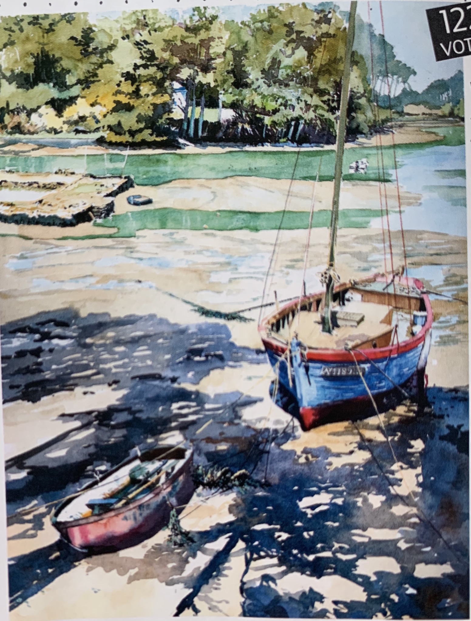
On the left: “Vieux cotre” by Loïc Dubois, aquarelle on paper;
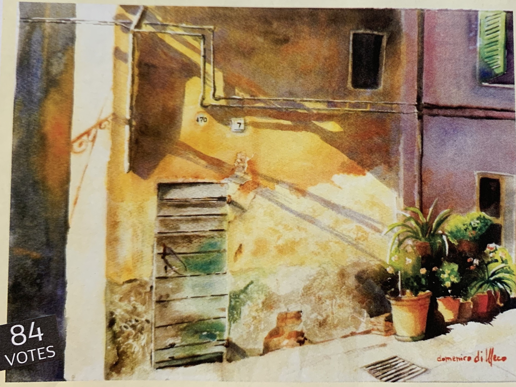
On the right: “ Le soleil d`ete dans mon pays” by Domenico di Meco, aquarelle on paper;
These 2 images are from the magazine, #45 “L’art de L`Aquarelle”. What I noticed and really liked about these paintings is the sunlight which was brought by the artists carefully depicting shades and different tones of objects. That helped me to come with my own ideas what to paint for this exercise and you will see it below: there is a study of sunlight coming upon people and trees.
“The Cherry Orchard” by Paul Nash, 1917, watercolour, ink and pencil; image via http://www.tate.org.uk.
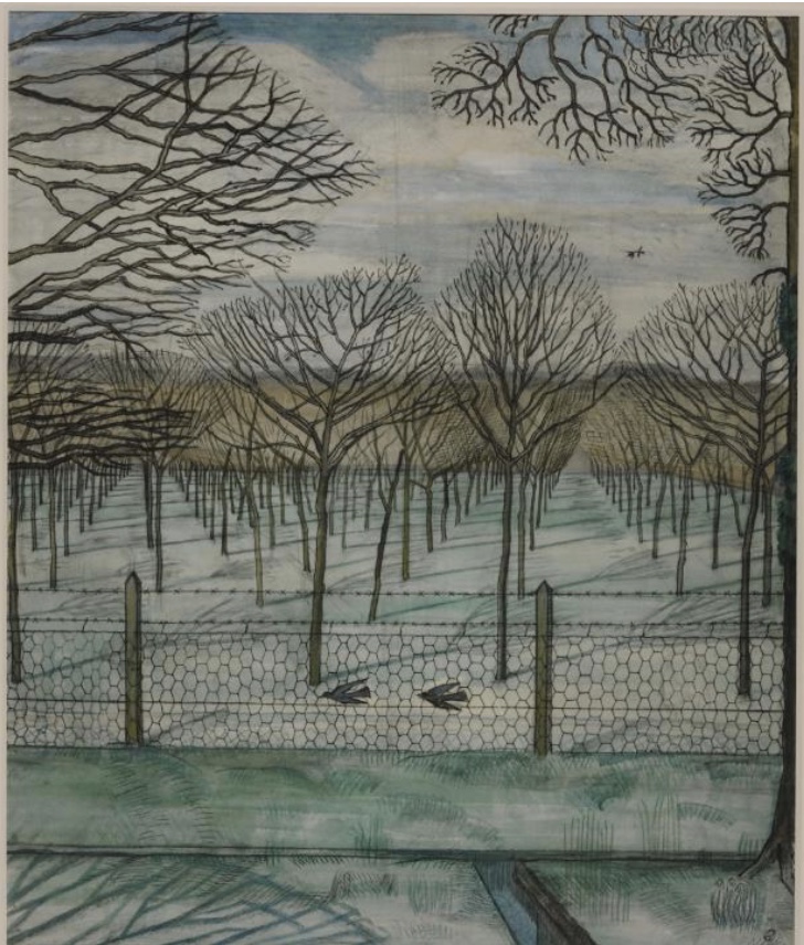
I liked this particular artwork because I also notice and get very attracted by the shapes of trees and their brunches. This painting is very elegant because of its geometry and tone which both give the overall impression of noble solitude and calmness. I just love it. As art critique Laura Cumming puts in her review of some of his artworks: “Nash is routinely described as Britain`s foremost surrealist” and she sees in this trunks and branches “ribs, bones and ghosts” what, actually, doesn’t contradict with my sensation from this paintings- ghosts are lonely.
Below are 2 paintings I picked up created by Vassily Kandinsky. On the left is a “Winter Garden”, oil on cardboard, 1909; on the right “Murnau.Garden”, oil on board, 1909. Images are via http://www.wassilykandinsky.net;


Reference list:
1) “Pail Nash review- between dream and nightmare”, Tate Britain, London, by Laura Cumming, 6.11.2016 at http://www.the guardian.com
2) http://www.wassilykandinsky.net;
3) “ Z.L.Feng – Amazing Watercolor Landscapes” November 3d, 2011 on http://www.wrtboom.info
My works below.
Project 1: Summer Heat ( aquarelle on paper)
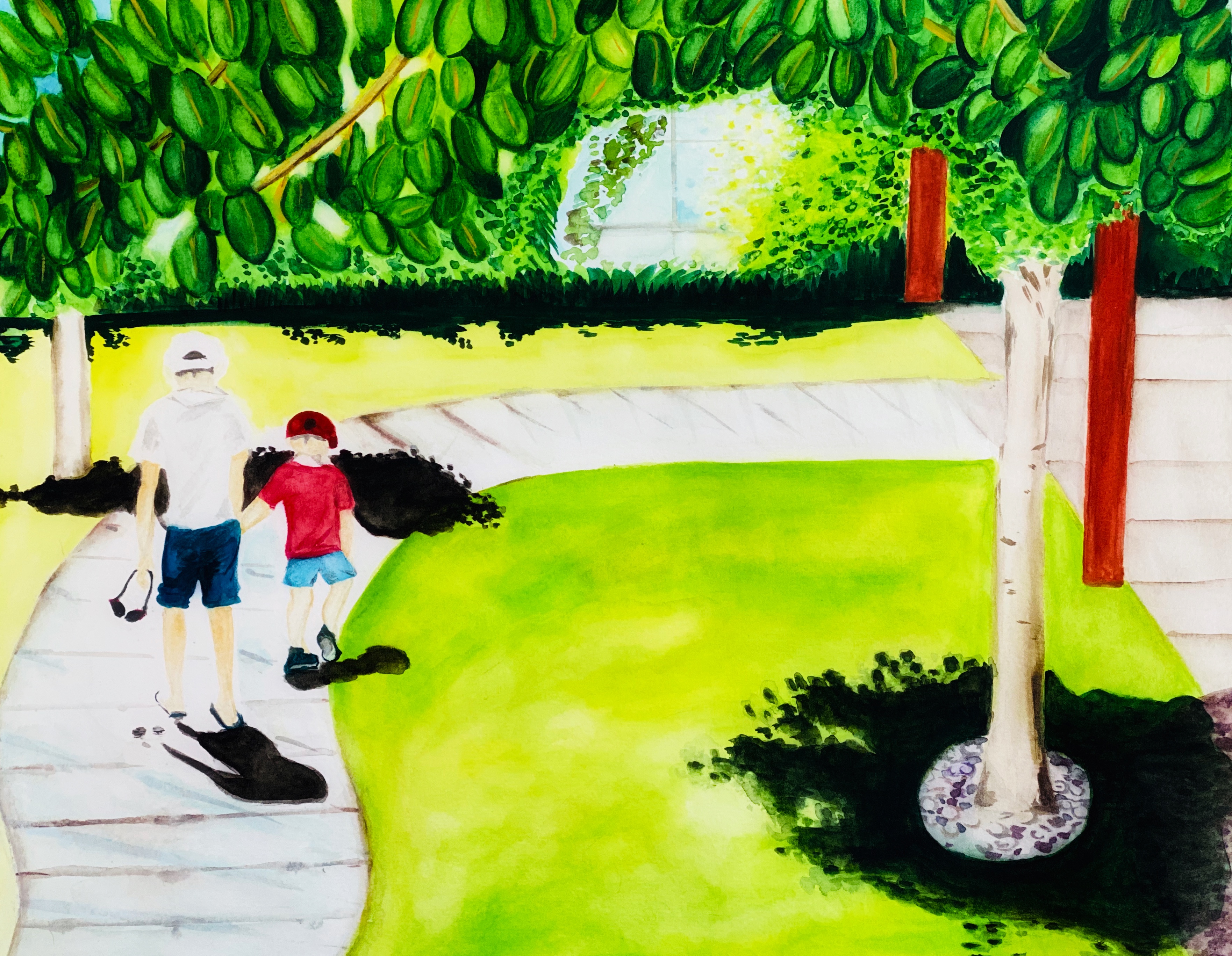
In this project I tried to work on expressing the summer heat and a very bright midday sun. I thought about painting shades and an intense sun light to come up with an expressive landscape painting. Usually I use Canson paper for my aquarelle drawings but this time I used a new paper from Hahnemuhle, 300 g/m. I liked it a lot more than Canson because it willingly receives and easily absorbs a lot of layers of pigment and water. I tend to work with aquarelles as with oils since my aquarelle technique is not great yet, so I do put more layers and pigment than required probably. I used my watercolours set from Sennelier. I wanted to paint summer via bringing lot of flamboyant rich greens which I have been observing during my vacation in Izmir, Turkey. I captured a moment of children`s tiredness who have been under a stern sun in midday. The greens were very bright and very intense under the summer sun, the bright light was scattered around as well as contrasting shades from the trees. Some ares are let as white to enhance the sense of the sun heat.


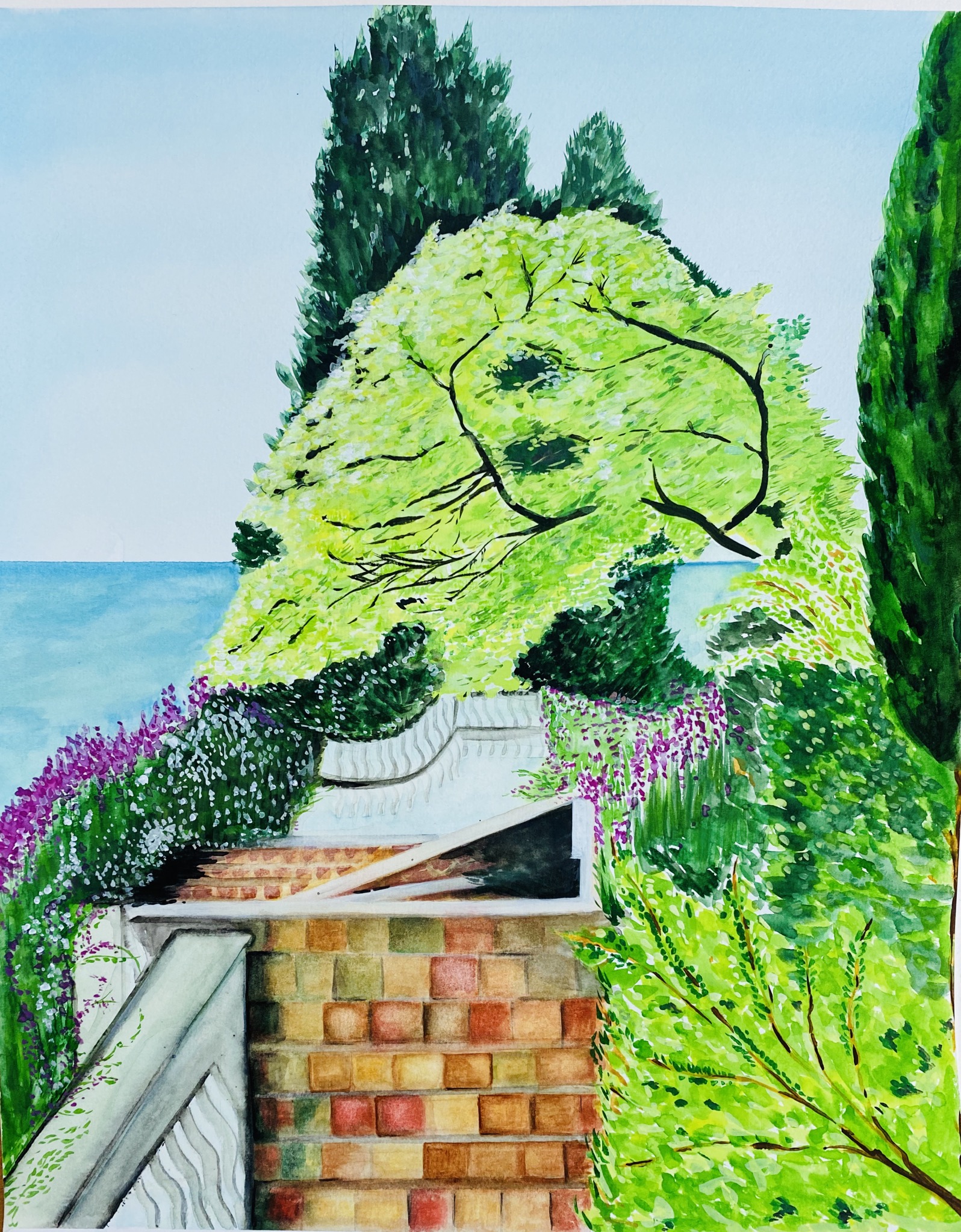
Project 2: Garden by the Sea
Below is another study for this exercise where we had to come with expressive landscapes. I had a chance to observe a fascinating view below: the greenery was rich, massive and movable like another ocean. I was also very much attracted by particular shade of the tree in the center. There were thousands of shapes and colours of the green. I used the same materials as for my project above. For the sky I did the graded wash. I wanted to transfer on the paper that all massive wild green motion I witnessed this summer. I used the same paper and and aquarelle set as above. I started with a wash for the sky and then continued with the trees at the center. I had to mix up different shades of green pigment in my set to obtain different colours of green. In this particular painting I think i did well with the greenery and a whole impression of movement of air and leaves. However I see I should work more on geometry of the path is far from ideal, it which should be smaller, not taking so much attention of the viewer.


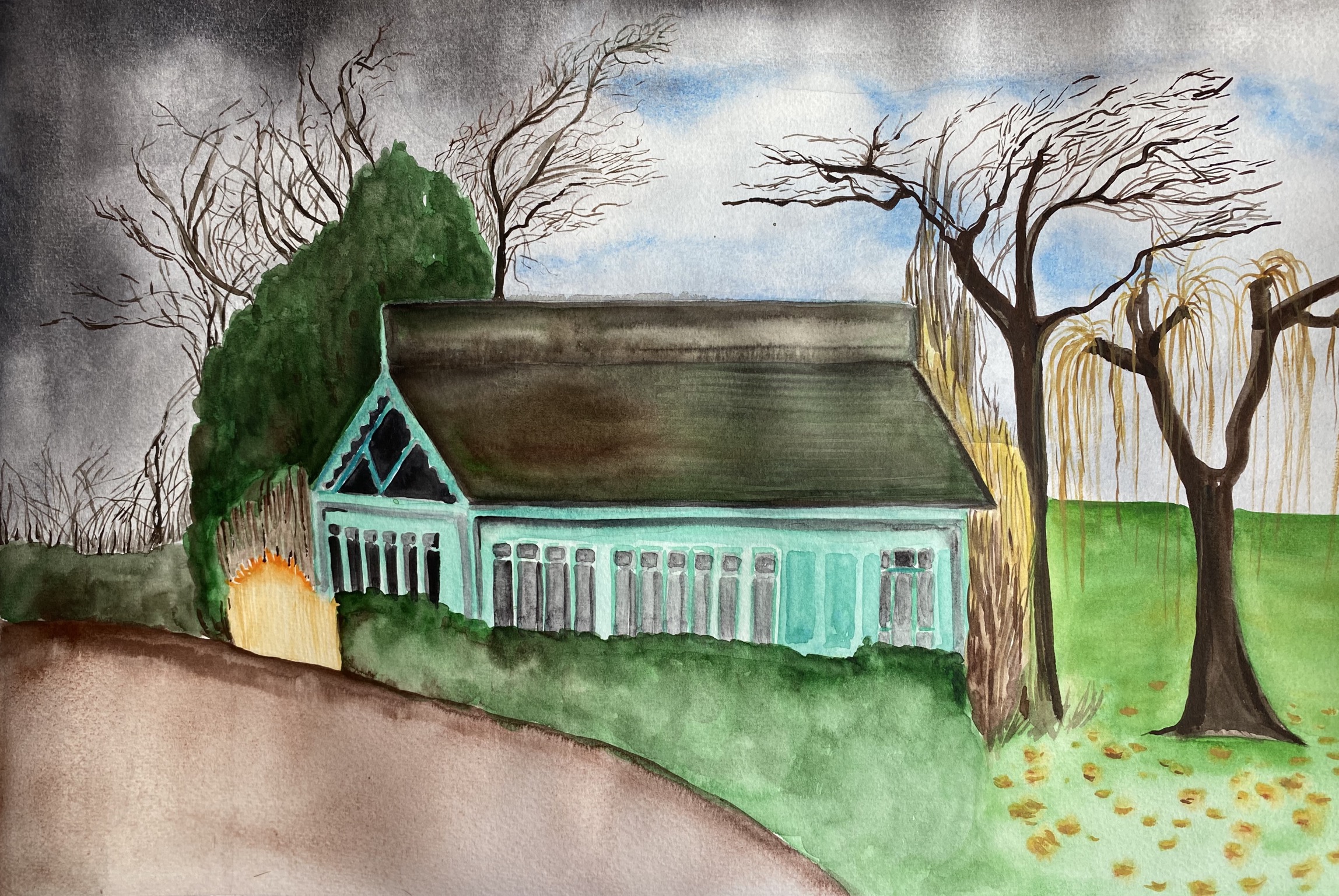
Project 3: The House, Regents Park.
I wanted to create another emotion, so I did the painting below bringing the moment what happens right after the storm when the dark clouds are still there but you can see patches of bright blue. I think the overall result brings/expresses anxiety, giving the feeling of uncertainty, like it is in life: you dont know whether you will be swallowed by the crisis or it is already over and behind you; I used the same materials for this study as for the above.


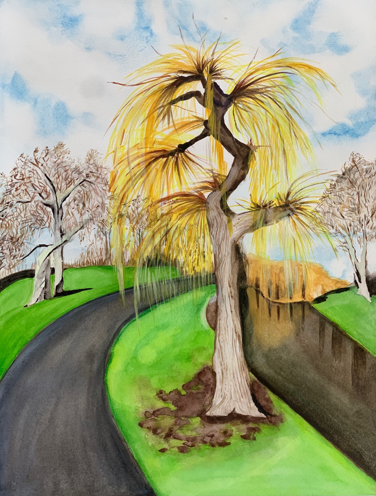
Above is another study I did for this exercise. This a tree in Regents Park, London. I think I managed well with the sky and the trees at the background. However I think the road path came out as not as it should be – it is too much of it on the painting and too much attention because I made it too dark and intense. I am sure that I had to rethink it.
