
Henry Matisse (1869-1954): “When I put down green it doesn’t mean grass, and when I put down blue it doesn’t mean sky”.
Claude Monet: ”Colour makes its impact from contrasts rather than from its inherent qualities … the primary colours seem more brillant when they are in construct with their complementary colours”
Since Michel-Eugene Chevreul formally established the Colour Theory intruding his famous Colour Wheel he altered the understanding and use of colour, greatly influencing Impressionist such as Monet, Matisse and many more in late 19th century. Although many artists experimented with colours and challenged the descriptive style of painting in terms of bringing “seeing” colours on to their canvases.
As it is well described in the article by Aleid on headforart.com: “…The Impressionits and many modern artists exploited the by-then-known visual impact of opposite colours, but painters had instinctively juxtaposed complémentaires for centuries before the theory was made conscious”. Besides using the colours for the sake of harmony, artists used them to create and imply distance, like Paul Cézanne in his paintings, where the backgrounds are done in blueish grey colours and darker tones and making the objects in front in vibrant colours.
The clear understanding of the fact that colours do affect and modify each other created a totally new direction in painting technique making the whole painting process as more strategic. New art movements emerged based on particular aspects of colour theory under the umbrella of Neo-Impressionism (1880s, 90s) such as Pointillism (1880s, 90s), Italian Divisionism (1890-1907), Cloisonnisme (1888-1894), Syntheism (1888-1894); Tweintieth century is marked with Orphism (1910-1913), Rayonism (1912-1914), Synchronism (1913-1918).
Below I put some examples which I found how the Colour optical effects have been used by different artists.
Claude Monet, “Woman Seated on a bench”, 1874, image via tate.org;

In this painting above Monet shows that shadows are not neutral but are the complementary colour of the light that comes on them, it means that yellow sunlight gives a violet shadow. This is can be especially well seen in the crease of her arm and a pool of shadow at her feet.
More of Claude Monet`s paintings where he exploits the power of complementary colours. I put the names of the works from left to right.
“Grain stacks At Sunset, Snow Effect”, 1890-1891; image via artnet.com; and “Impression, Sunrise”, 1872; image via artnet.com;


Vincent Van Gogh, “Vincent`s bedroom in Arles”, 1889, image via artnet.com;
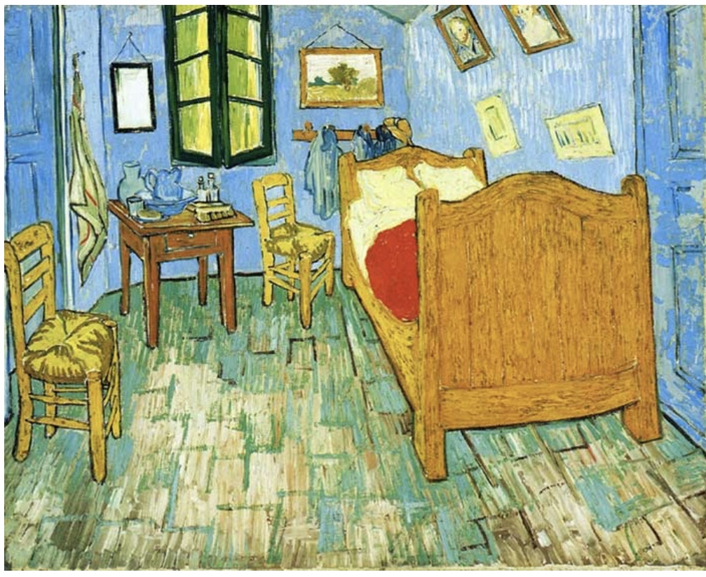
In this painting above Van Gogh exploits complimentary colours such as very intense red and weak blue and green.
Vincent Van Gogh, Self Portrait, 1889; image via artnet.com;

In his self portrait Van Gogh uses a combination of blues and orange so his face, its expression and facial features are very much accented, is giving a stronger impression for the viewer;
The research would not be complete without bringing a Pointillism. Below are some iconic artworks representing this art movement.
Paul Signac, “Portrait of Felix Feneon”, 1890, image via moma.com;

Georges Seurat, “A Sunday on la Grande Jatte-1884”, 1884-1886, image via Britannica.com;
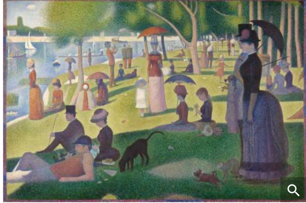
There is an interesting fact about Seurat. As Susie Hodge mentionnés in her book “ Painting Masterclass: Creative Techniques of 100 Great Artists”: “… For two years Seurat only drew with Conte crayons in black and white, in order to understand the tone. In those drawings and in his Pointillist paintings, he avoided hard linear contours and used instead a range of finely graduated tones with his dots. Theses are created with hundreds of tiny variations of colour, dark and dense or light and variegated. On his palette, Seurat only blended adjacent colours form the colour wheel- never complimentaries -so there are no tertiary colours in his dark areas, only the appearance of depth through deeper, closer dots”. Seurat kept colours pure and intense rather than mixing them. His procedure of juxtaposing tine dots of colour he used to call as “chromolumanrism”, although this technique became as Pointillism or Divisionim under category of Post Impressionism.
Reference list:
1) “Through a glass darkly: How the Old Masters allied optics to the easel” by NV, Los Angeles, Jul 7th 2014, The Economist, economist.com;
2) “Secrets of the Masters” by Nadia Van de Ven, YouTube;
3) “How Artists use Colour”, by Aleid, 16 December 2016, Head for Art, Art for Everyday, headforart.com;
4) “Colour Theory in Painting: Colour Wheel, History of Colourism, Characteristics/ Effects of Colours, Psychology” on visual-arts-cork.com;
5) “Complementary Colours”, Art Term, on Tate.org;
6) “How the Impressionists Used Complementary Colours to Great Effect” by Dan Scott, December 6 2017, on drawpaintacademy.com;
7) “Pointillism: 7 Things You Need to Know” by Sotheby’s, May 21, 2018; on Sothebys.com;
8) “ Painting Masterclass: Creative Techniques of 100 Great Artists”, Susie Hodge, 2019, White Lion Publishing;
