
Still Life with natural objects.
For this exercise I decided to practise monochrome painting technique to concentrate on tonal values observations and as a part of my practice to work with “all prima” Underpainting. I had a pair of very nice looking pale, tender skinned pomegranates in my kitchen. I have arranged them under an artificial light coming down on them from my right hand side. below is my final work, the photo of the still life composition and my work in progress. Painting in monochrome is a great exercise to improve the observational skills and studying tonal values. Below is my final work and my work in progress along with a photo of the still life I have arranged for this particular study.
For this project I watched the following tutorials in YouTube:
1) “Layered Flemish technique of the old masters” with Gabriel Barbu, YouTube;
2) “How to create an Underpainting Like the Old Masters: A step by step guide” by Classical Realism, Eric Bossik, e-book;


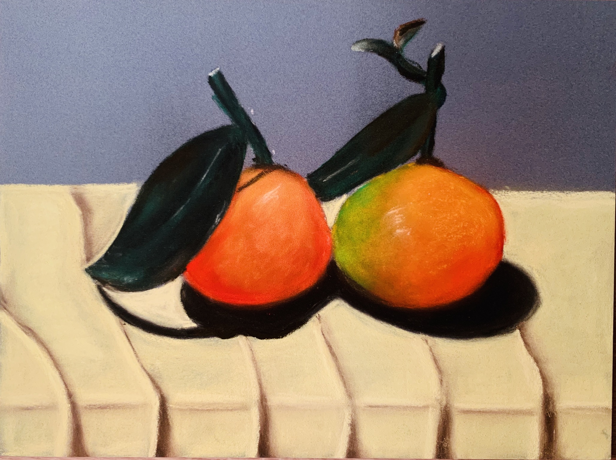
Another work of mine “December clementines” ( soft pastels on paper). I used my pastels set by Sennelier and a special paper ( grey colour) for pastel paintings and a special fixative for the pigment both also by Sennelier.
Below is my work in progress and a final work along with the photo of the clementines I painted.


Still Life with man made objects.
For this project I picked up 2 items I had in my kitchen- a stainless steel kettle and a drinking steel red bootle- both items with highly reflective surfaces. I added a brown egg because I wanted more reflected objects which could be not very difficult to paint. Also the egg was a nice addition because it` s shape and a smooth surface was in harmony with another two objects. I watched a following tutorials in Youtube about how to paint shiny objects with reflective surfaces:
“Still Life Painting with reflective surfaces” Mon Marte Art channel; “How to Paint Silver, Metallic & Shiny Objects” Painting explanation by SchaeferArt; “How to paint Gold & Brass” Walcott Fine Art channel;
I followed the explanations and as a common practice after sketching with a HB pencil, I blocked the dark areas on the surface of the kettle and the bottle. It was recommended to start with dark areas and then to work on lighter coloured areas. Indeed the more contrast you bring together the shiner you get the image. I used the black colour “Noir d` Ivoire” from Le Franc Bourgeois, the white 07 “Blanc de Titane” from AMT , the red as “Auzarine Crimson” from Old Holland Classic Oil Colours (OHCOC); “Gold Ocher” from BLOCKX for the egg. As a background I used a “Old Holland yellow medium” from OHCOC.
The overall result unexpectedly came out as a bit in avant-garde painting genre.


Another work for this project where I painted natural objects – pears with a man made object my small size Le Creusette red ceramic pot. The small dark red ceramic pot was about the same size of the fruits. Altogether they were nice to play into the composition and I found them perfect for the exercise. Placed together they gave lot of shadows and tones to study. I was not able to work at evening time placing the composition under a study lamp, however I tried to bring the light from upper left side, working on shadows and tones; I used a small canvas and oil paints. To accentuate the warm and rich colours of the objects I decided to go with black colour for the background. It took a while to think about the colour of the underneath surface because I had to paint a surface for the composition to stand so it will not float in the air. Here it was all about the colour relationship and I just understood that any of warm colours would not work because they would argue with the colours of the fruits and the pot. So I opted for a complimentary colour to red-yellow As blue-grey which are opposing colours on the colour wheel. I think it worked well. In this particular work I think I managed to make the subjects dimensional and not flat. I am quite happy with the fruits but the pot can be done better. The reflective surface really needs more time to work on. I think i had to be more confident with using white colour to bring more reflections of light.


