
It took a while for me to decide with a subject for my 5th assignment which was a final assignment in the Drawing 1 course. To come up with the decision I asked myself all the questions which were recommended on the pages 114- 116 of our course book. In our personal project for this assignment we were supposed to bring all the creative and technical skills we have obtained doing all the exercises and assignments of the course, our observational skills and artistic style developed through the course. Below is my work for this assignment and my thoughts about my personal project.
Title: “Studying sunlight in the large leaves” (oil on canvas);
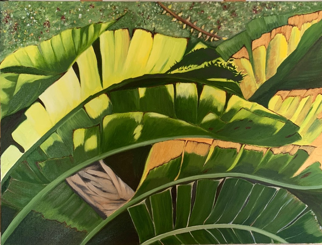
Subject: I picked as my subject big leaves of a plant with a focus on the sunlight they catch in a sunny day. These are the leaves of a plant in my garden so I could observe it and painted them au plein air. I have decided to paint them not only because I did feel very inspired with their beauty but also because painting them required to demonstrate technicals skills as linear drawing, creating light and shadows, different tones and demonstrate my observational skills – there are many small details to see and pay attention to in order to achieve at least some realistic look.
Format: I am very fond of still life as a genre and I really admire a nature morte works by Dutch painters of early XVII century. I am very much touched and influenced by a work of Ambrosius Bosschaert, “Bouquet of Flowers in a Glass vase”, (Dutch, 1573-1621); I do like to draw and paint plants, observing their beauty in many details.
Support: since I planned to paint with oils I chose to paint on canvas, size A2.
Medium: I used 2 mediums- oils by: Winsor &Newton, BLOCKX, AP, Old Holland classic oils; I also used acrylic in gold colour by Pebeo;
Line, tone: In my painting I used lot of lines and worked on many tones of green, brown and yellow;
Composition: I find the composition as a quite experimental because I painted just a fragment of the plant, focusing on particular leaves and incorporating gold colour among natural colours;
Mood, story, visual impression: While studying and going through the course, doing lot of research, I understand now that I would like to create a visual art which contains very positive mood via expressing a sort of “high”`= very attractive to observer`s eye aesthetics. I name it “high” because I put a great demand and appreciation of artist`s sense of colours and elegance of his/her painting technique. I appreciate attention to small details and ability to bring the beauty of the subject to canvas in its unique and indisputable senses. As an artist I am very much influenced by Japanese Kano school and Gustav Klimdt`s artworks what I have expressed trying the following: 1) being careful about small details of the subjects and mastering my skill to paint them close to what I saw; 2) painting realistically I tried to be expressive and loose in terms of letting myself to transfer the mood and story of the subject I got inspired and not just the realistic details; 3) in using and incorporating a gold colour into my painting what makes the image to change and transform into a new reality what I usually observe in the artworks of my favourite abovementioned artists.
Light: I want to master my skills of catching a natural light in my works;
Size: my tutor asked me to produce a work size A1 or A2;
Artist research for Personal Project.
Personally I am a big fan of Kano school painting style, as I mentioned earlier during the course in my blog post dated 23/02/2017. Kano school`s style has definitely shaped my style as an artist. So I am using again the opportunity to do an artist research about a painter who`s artworks are so elegant in terms of overall style, colours and painting technique.
Kano Eitoku (1543-1590)
Kano Eitoku was a Japanese painter ( 1543-1590), the grandson of Kanō Motonobu (1476–1559) – a founder of most successful and long lived, so called “Kano School” of Japanese painting. During his lifetime, Eitoku was an official painter for the Ashikaga shogunate, Azuchi-Momoyama and war lord`s Oda Nobunaga period. He was recognized for his artistic talent at a very young age. Under Motonobu’s guidance, he developed his grandfather’s style, which had influence from Chinese painting. He was born in Kyoto and received his first training under his fathers supervision. Kano Eitoku belonged to a famous Kano Family, he was a grandson of Kano Motonobu who was a founder of Kano painting style. Kano Eitokus most prominent artworks are six fold screen with a image of Japanese cedar tree called « Hinoki », a screen representing lions, and a pair of six part screens with hawks and pines. It is recognised that his style contained very original bold and colourful approach and characterised with broad vigorous brushstrokes. There is an opinion stating Kano Eitoku made Kano School style yet « more monumental and gorgeous by introducing a gold leaf back ground, upon which he applied brighter colours and heavier black ink outlines. Other critics say Kano Eitoku « introduced strength and dynamism to his large compositions ». His works are also described as « vigorous and magnificent « due to their size and energy they contain. I also fully share an opinion which applies a term to this particular artist`s works such as « that gorgeous aesthetic ». Most of his artworks have been destroyed over the times but we are lucky enough to have at least 10 of his works still available to contemplate.
Chinese Lions, image via mutualart.com

Cypress Trees, image via mutualart.com

Reference list:
1)Britannica.com; Kano Eitoku
2) Japanese-paintings.weebly.com
3) biography.yourdictionary.com; Kano Eitoku
4) metmuseum.org; essay « The Kano school of painting »; department of Asian Art, October 2003
5) nhk.or.jp; Cypress Trees by Kano Eitoku; 9th of November 2017,
6) moderntokyotimes.com; « Kano Eitoku and richness of Japanese art despite warring times » by Lee Jay Walker, February 16, 2018
Written element:
Artist`s statement for the project: “Studying sunlight in the large leaves”.
My main objective in this project was to demonstrate a set of skills I have developed and obtained through the Drawing 1 course and development of my artistic sense of aesthetics, development of my path and style as an artist. I have painted a fragment of a large leafy tree from my garden – large leaves catching the sunlight. I wanted to create a realistic painting with the impression of a sunlight and different tones of green colour. I have developed two preliminary works in oils which I send by email to my tutor and he asked me to develop and work in the direction I have picked up – below left;
I also developed another preliminary work of the subject using a a medium dry pastels (below) to see, feel and compare which medium would let me to get the mood and visual impression I wanted to bring. I have decided to continue with oils because they appeared to be the best medium for my objectives since only oils give that much control on creating different shades of green leaves and sunlight:


Below is my final work:
My work consisted of the following elements:
1) Leaves and stems: even though our first perception of leaves is “they all are just green” in my work it was nothing like this. I had to create 8 different tones of green colour and 5 tones of yellow colour. Painting leaves required good linear skills to create a movement and elegance of the large leaves. As it is noticed some parts of the leaves are dry and their drying process brings a lot of detailed work. I was very much attracted by those brown dried parts: to me that dry lifeless part of the leave was not dead at all and I wanted to emphasise it`s beauty. So I have experimented with adding and incorporating a gold colour to the dried parts of the leaves which I found as very appropriqte because this gold colour was in a quite a harmony with green and yellow in the whole painting, giving it more aesthetics and fresh approach.
2) the stem of the tree: I wanted to create a realistic look of the stem, mixing black, brown and white colours to obtain that natural greyish colour for the stem`s skin. I also worked on tones on the stem using black;
3) the background of the lower part of the painting. The lower part of the painting had to be dark where the sunlight didn’t reach. The plant was standing in a area with a very dense leave mass which could be indicated as dark shades of green;
4) the background of the upper part: that part could not be painted just in a flat different tone because the upper part was lit by the sunlight and many other plants, leaves; branches and flowers were visible. To me this upper background part happened to be as an another painting because I used a different technique to create a mass of leaves and flowers – I painted lot of tiny points and dashes smoothing their edges after; I have also incorporated small dashes of gold colour;
5) The sunlight. My attention to the subject of my personal project was attracted because of the sunlight, which was coming from the top of the tree and made the leaves look very graphic: there were edges and very distinct shades on the surface of the leaves. Some parts of green leaves had so much sunlight that looked almost white.
Below is my work in progress:


