- Below is my study of group of trees. February trees in Regent’s Park, London. I used wax pastels by Prismacor and heavy weight grain paper. I was walking in the Regent’s Park on a sunny day and was very much attracted by the look of these trees in winter time. They have been coated with some light green plant what made them look really beautiful. So I tried to catch this beauty.


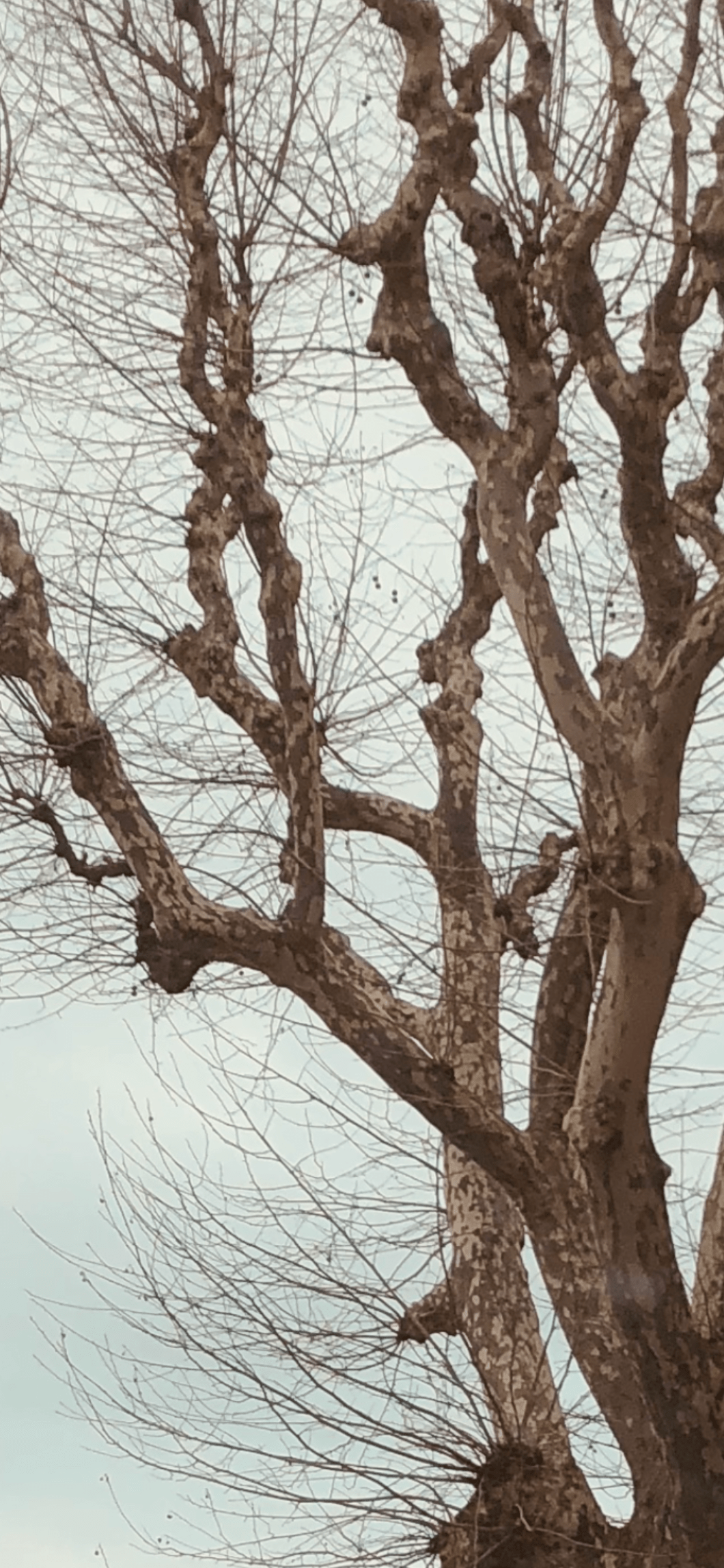
Today I also post my photos I took during my “tree search” and my sketches of Platan trees. I have spotted them from car’s window. Actually, they stricken me so much that I could not wait when I would have a moment to draw them I find Platan tree as one of the most beautiful and inspiring tree to draw. Here is my sketch and photos of the Platan tree below:

I used paper and pencils: from my children’s set of coloured pencils “color’ pep” Dark black, which gave very strong while soft and deep black line, also I used a very simple graphite pencil and I did final touch ups with ink pen “Graph’ It” 0.5 mm. below is my final sketch and my sketches in progress.

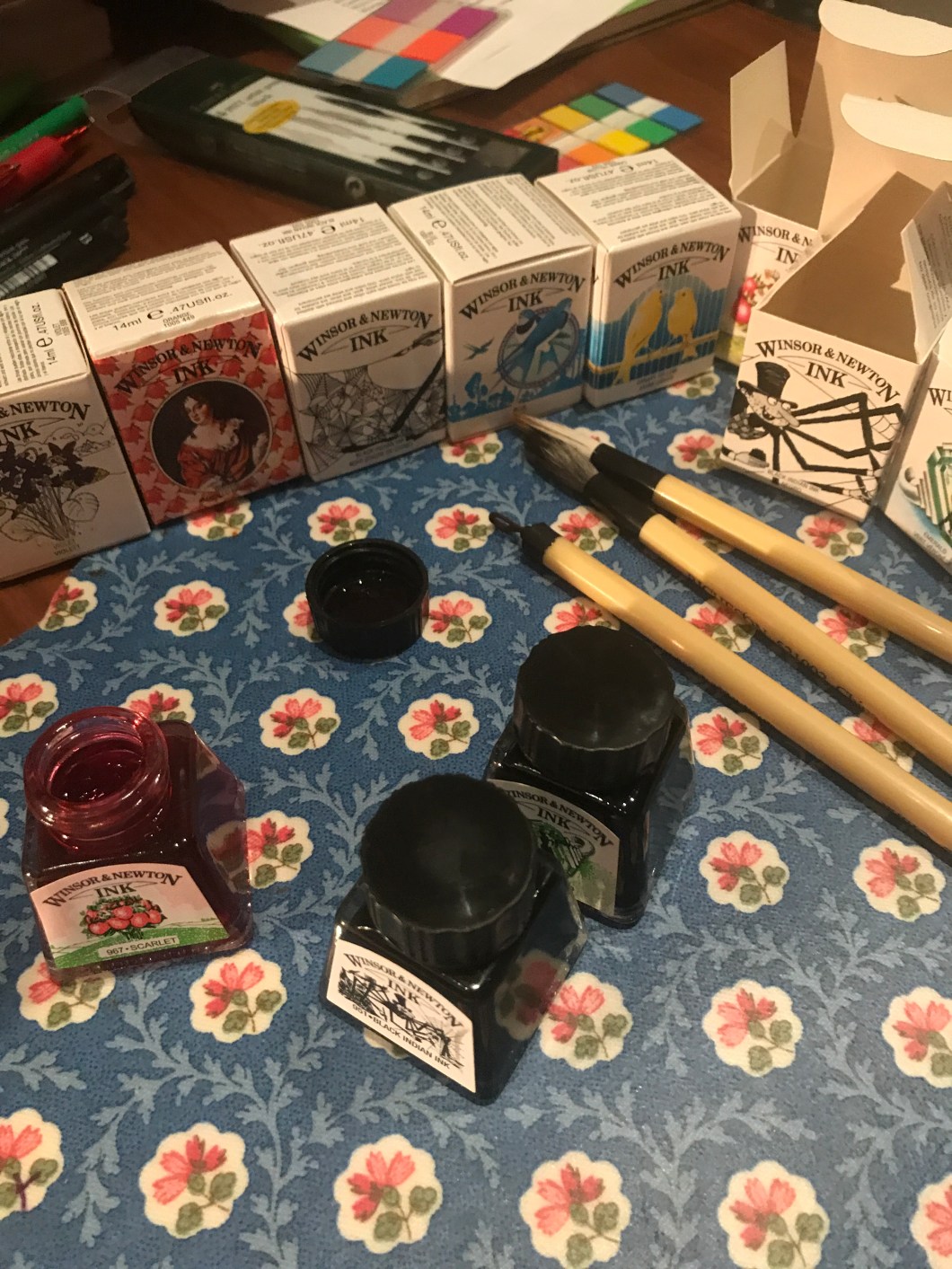
For this exercise I have tried my coloured ink by Winsor and Newton ( photo below) to paint a brunch with blossom flowers. I tried to practise a traditional object in Chinese painting – a blossom flowers working on my technique in this genre. I have to say that I didn’t have any intention to come up at the end with any strong colors as a background. First I focused on practising drawing shapes of the petals and the shape of a branch. But the white background looked very empty and I decided to go further experimenting with my blue ink. I started to work on the background without having a clear idea how they should like and how they will come out because that was pure trial of how blue ink will behave and will look on paper. At some point I understood that too much blue will look quite heavy and I started to incorporate yellow and green. I think they work quite nice together. Working with ink is very comfortable because you can build up lot of layers and inks give lot of ideas and flexibility- they dry fast, dont get messy when you you put on top another layer, they do blend nicely. I think my finishing touches with a black ink pen – I lined over the petals of the flowers and green petals of the branch – do bring a nice accent making the drawing to look very isslustrative. Below is my painting.