Project 1: Detailed observation of natural objects.
Exercise 1: Detail and Tone.
In this exercise we were required to practice “building up dark, medium and light tones, principally using pencils and hatching and cross-hatching techniques”. For this purpose I chose 2 zucchinis and a half of an eggplant I found in my kitchen, placing them on wooden chopping board. I used coloured pencils and A3 size smooth paper by Canson. Below is my drawing. I also used brown charcoal to fill negative space. Zucchinis skin was fun to draw because it was very colourful and rich for pattern- there were many lines and spots, also there were different shades of green colour. I liked the contrast between spotty skin of zucchinis and a smooth rich coloured and even texture of an eggplant. I used a rubber to create light on the skins of the vegetables. Following the instructions in the exercise I tried to pay a lot of attention to creating contrast, concentrating of dark and light areas, patterns and variety of marks of my pencils. I found that pencils are perfect to draw complicated patterns and working on shades and lights. My zucchinis' skin contained a lot of very fine horizontal lines and different shades, so I could not work better with a different medium. In terms of composition I took 2 zucchinis and placed them together because I loved their shape and wanted to bring an accent on it. To outline their tender green skin I placed a dark smooth eggplant beside them. Placing all veggies on a wooden chopping board seemed kind of natural, because warm wood plays very well with their skin texture rather than plastic.


Project 2: Still life.
Exercise 1: Still life using line
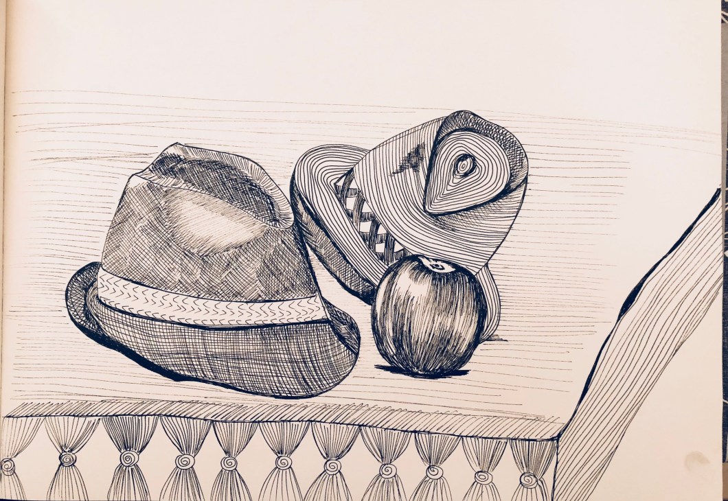
In this exercise we must show and practise our composition skills and develop line drawing technique. It took for me some time to create a composition which would be thoughtful and aesthetically attractive. I picked 2 objects created by man and 6 objects created by nature: 5 apricots and 1 apple. I tried to place fruits with fancy objects carefully crafted by human: I found an olive oil glass bottle painted in gold and a porcelain saucer with gold ornament. I also thought that the white napkin would unite all objects nicely. Delicate items for delicate creations of Nature. I used my Graph’It 0.5 Ink pen.


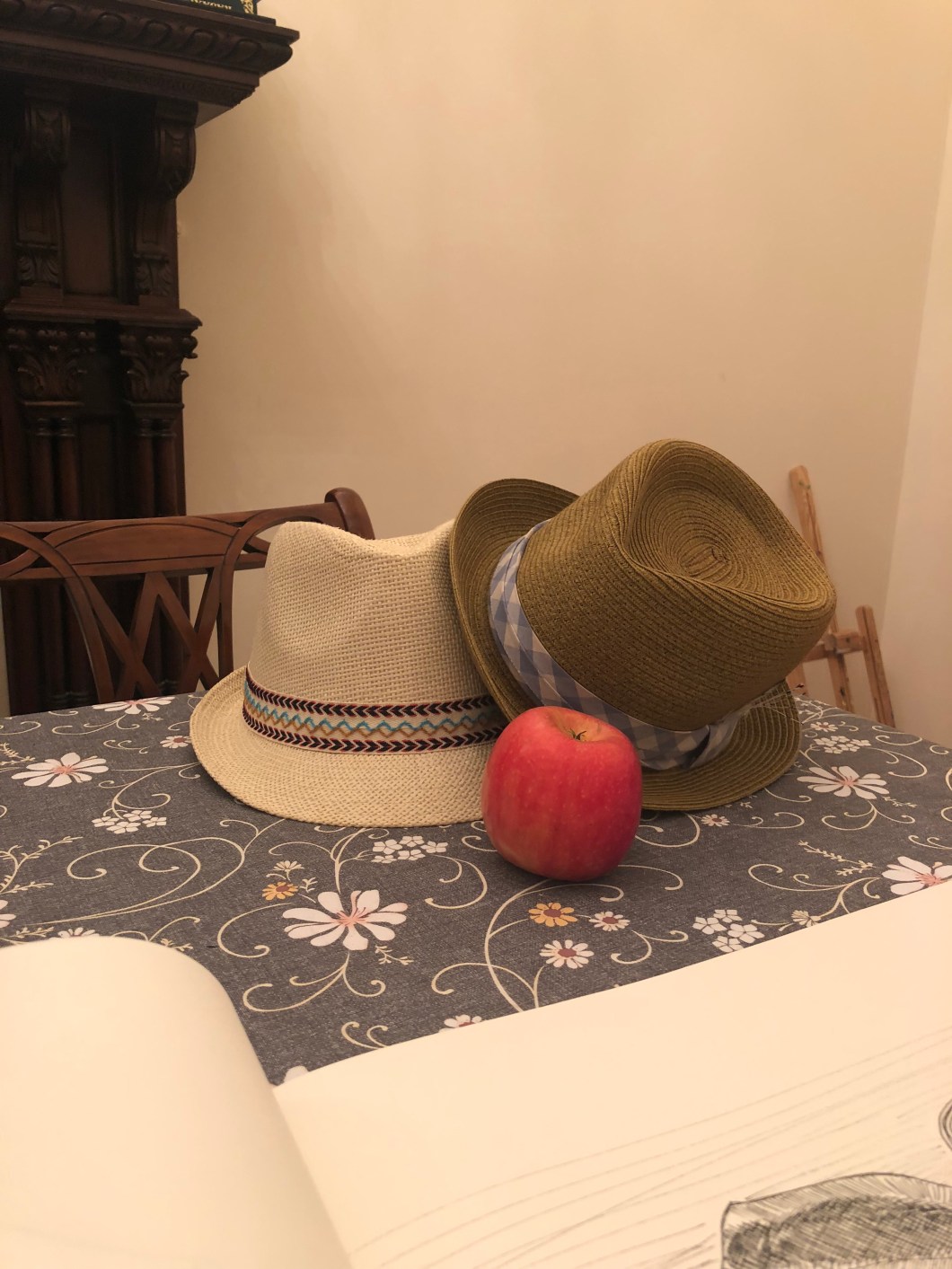
I also did another drawing which is below. I was looking for objects to create another composition and found 2 straw summer sun hats which I thought were ideal for practising drawing with lines by ink pen. I called the result as “Summer romance”.

Exercise 2: Still life in tone using colour
For this exersice we were required to practise drawing shades and shapes using strong artificial or natural light, using pastels. I deliberately picked up objects with rich colours: red, black, orange and bright yellow. I think all the objects made up a very nice and attractive composition. I enjoyed working on this drawing. I placed them on the dining table outside of my kitchen under strong sun light, it was 3 pm. I had got a very strong dark shades and I worked quickly, since the sun was moving and shades changed their position. I took a photo to refer in one hour later. I used my Jaxell extra fine pastels and my favourite Canson A3 format fine paper. I started to work with general shapes first, mapping the shades with an HB pencil. Then I worked in colours of each object, most difficult one was my Le Creuset pot, which contained two shades of red, black, brown and bleu colours. The pepper mill and fruits were monochrome. I used an eraser to create a reflection of light. Below is my work.


Exercise 3: Experiment with mixed media
For this exercise we were required to use in usual mediums- something which is not conventional for art and is not usually used for drawing or painting. I have used a craft brown paper and nail polishes. As an object I picked up apples and orchids. I used normal art brushes. For the drawing of apples I also used black sumi ink and Jexel pastels. While I was painting apples with red colour nail polish I understood that the general direction in terms of colours is very bright, I had to choose colours for negative space to balance my very red glossy apples. I opted for bright yellow pastel stick and very deep black colour sum ink which is very velvety and soft. I find a harmony between the texture of mediums and colours I picked up.

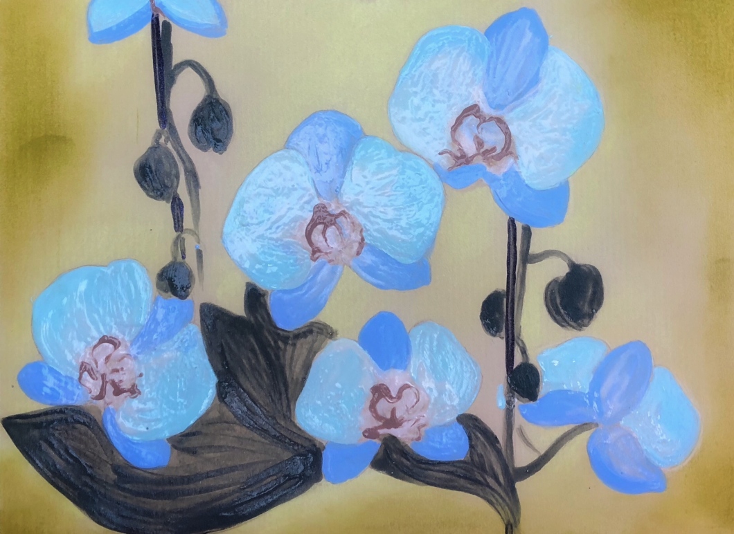
I did another drawing for this exercise which is below. I had a lot of nail polish left overs from my teenage daughters. I had plenty of green and blue. I thought that the best object for this exercise with mixed media would be a flower. I painted an orchid using a nail polish of blue shade. I also used pearl colour nail polish on top of the light blue which gave the sense of texture of the petals and made their colour more delicate and soft. For the central part of each flower I used a light brown nail polish. To bring nice finishing touch I used light brown pastel stick which worked well with the brown craft paper I used for the exercise.
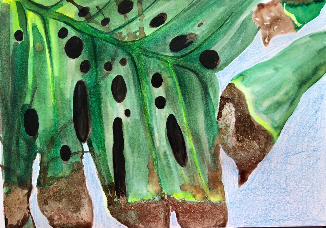
Another drawing for this exercise – Monstera leaves. I used green, brown and black ink. To emphasise the beauty of the brown ends of the leaves I used some gold and brown nail polish.
Exercise 4: Monochrome
For this exercise I used grey colour pastels to draw orchids in the pot I had at home. The pot had a surface with lot of reflected light. To draw white petals I left some areas blank which I lightly sketched before with a HB pencil, following the technique with working on negative space while creating a subject. I put lot of layers of grey pastel colour around the petals to create a contrast with white trying to achieve that authentic orchids petals` softness.


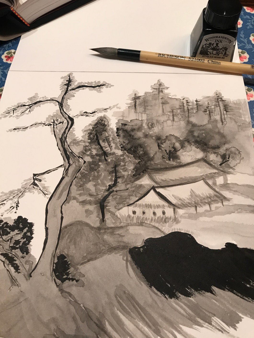
I did another drawing in monochrome using Windsor & Newton ink and a Richeson ink brush. This drawing was done in tradition of Chinese old ink paintings after my visit to MET in NYC and some of my studies of this subjects I did recently. I used a special ink brush and a plain black ink. I can say that I really enjoyed working with ink because I find it as an ideal medium for monochrome drawings- the number of shades the brush and the ink can give is limitless. The lines and strokes can be very versatile. The duo of this brush and ink is artistic by nature. I also did some research about how to hold the brush, since it is important – hand should be relaxed and easy, what enables you to produce beautiful lines. Stretching ink with water to different extend and using different amount of water and ink let you produce really elegant and beautiful lines. The more you draw with ink- the more you like it. Ink dries very quickly and when you put another layer, your fine or thick line which was put first – doesn’t leak, smudge, stays in place and keeps the shape. This lets you produce lot of effects you even couldn’t think off. You can keep putting strokes and touches infinitely. Below is my work:

Project 3 “At Home”
Exercise 1:Quick sketches around the house and Exercise 2: Composition an Interior;
In exercise 1 we have been required to draw quick sketches around the rooms in the house. We should practise a fast action of drawing skill without going in too much of the detail. I used A4 format drawing paper, HB pencil, soft paper mat pen;
In exercise 2. we should develop our previous sketches into detailed drawings. I used A4 format drawing paper, HB pencil, soft paper mat pen;
I must confess that this part was not a most interesting one for me, I am not attaracted to draw interiors. However I tried to do my best and looked around my house to find corners which would inspire me. Drawing interiors requires lot off geometry and strong line skills. I did the first sketches but they’re were quite bad. The most decent ones are those I have developed into drawings below. I watched some tutorials on YouTube how to draw interiors and discovered that you can use the ruler. It is also important to find a vanishing point and to draw central straight parallel lines to check the dimension, sizes and overall proportions and accuracy. I tried to be careful and accurate with mapping and drawing shades which were many in the corners and ceiling.


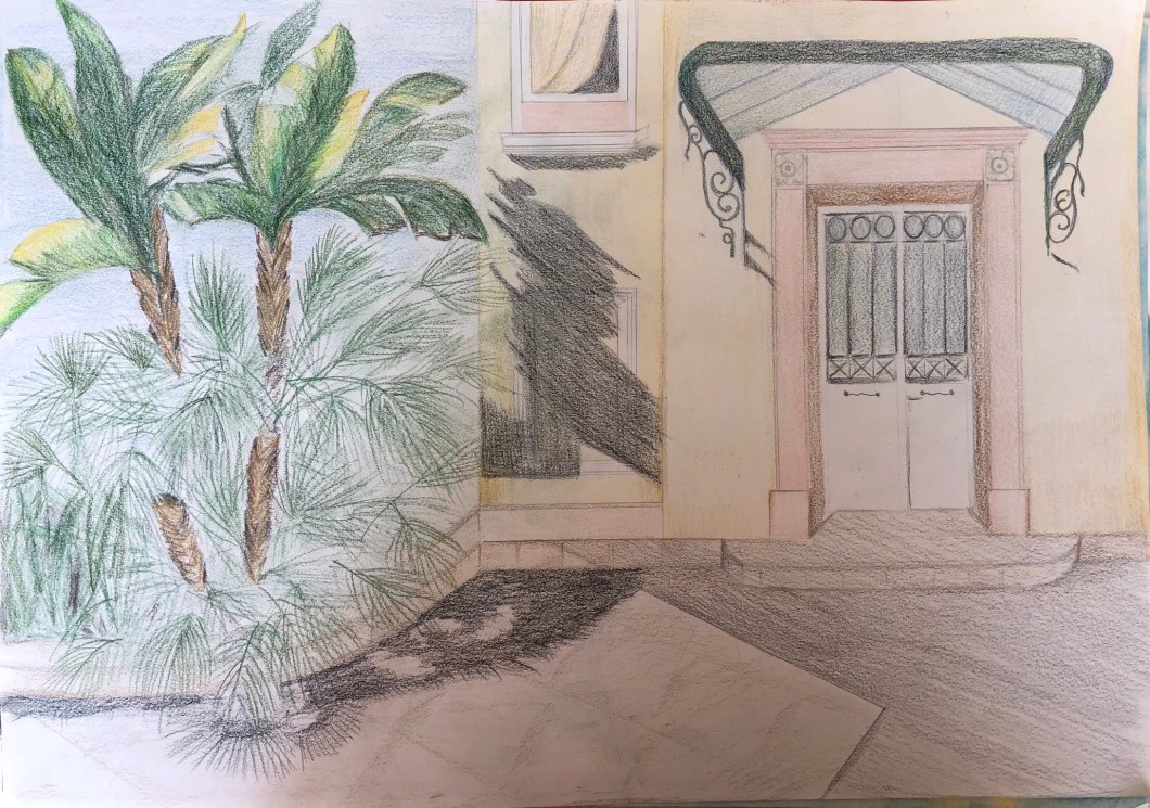
Exercise 3: Material difference
For this exercise I used my new knowledge about ineterior drawing after I watched some good tutorials. This is an entrance door of my house. I did use this time a ruler and checked the lines and angles so my drawing looked much neater and accurate. I used new medium for this exercise my PRISMACOLOR coloured pencils. I was drawing around lunch time so I had a strong sun light coming from south east part, left side of the drawing.