Project 1: Feeling and Expression
Exercise 1: Experimenting with experessive lines and marks
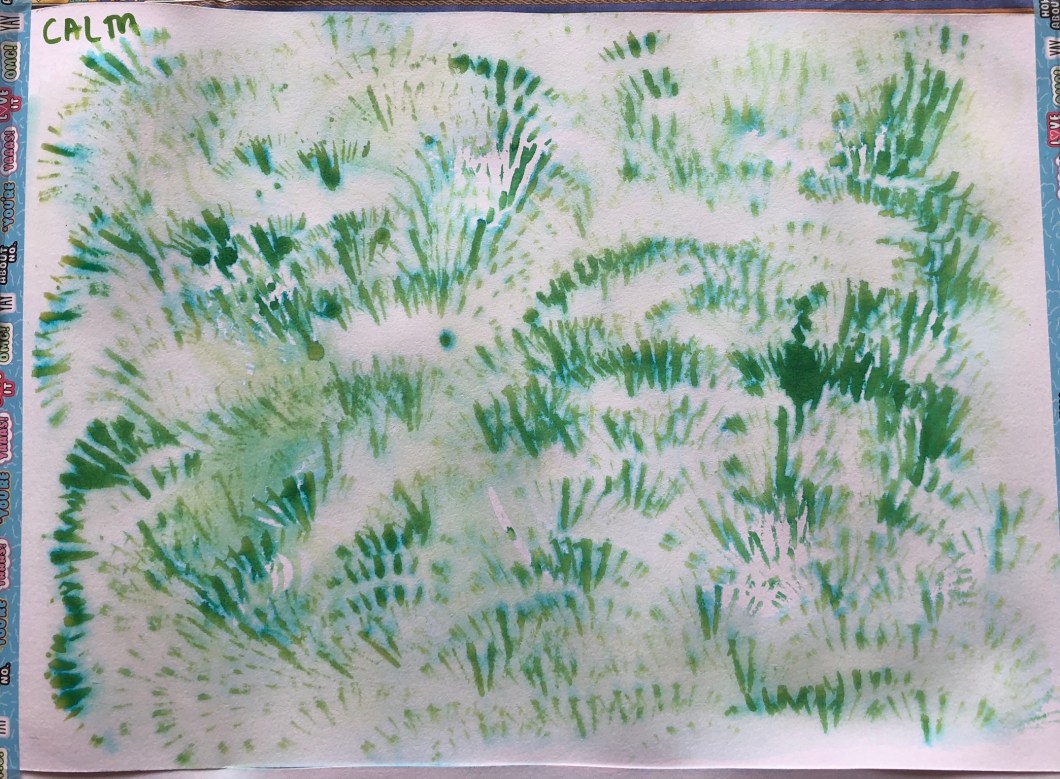
I started with my first panel as for “CALM”. I thought about what brings calmness to us and where/when we feel ourselves calm, find tranquility and emotional balance. My first thoughts were: garden is always calm, I feel calm being in the garden, I feel calm when it is raining and the nature is quiet after the rain, when the skies are still grey and wet. Deep ocean is very calm. The moon is calm. Which medium I should use? I decided to work with green, blue and yellow ink (Windsor & Newton), because it creates soft lines and tones. I find ink drawings as bringing very much of this feeling. On the 4 parts of my first A1 panel I put marks trying to bring the feeling of calmness via my ideas above – wet garden, deep blue ocean and jelly fish, moon.

2nd A1 panel – “ANGER”. To me anger is black and sticky, blocking the vision, sharp and it is never small or little, because it is always a force. I used gouache paints (Maped) and new brushes such as large brush (°32 Rafael; Kaerel) and a thin brush “0” Isabel by Isacryl. On this panel you can see a black blocking noise, which blurs the vision, thousands of war arrows surrounding a war pike, a spinning spiral, a narrowing vision.


3d A1 panel – “JOY”. Joy is light, intense, it can be timid, bright, silly and always short. Morning is joyful, Sun is a symbol of joy, a flower, a river, a road ahead. I think a genuine and universal source of joy for all people is our food. I used aquarel pencils for this panel. On this panel I drew: a bacon, salami and fried eggs bring me joy!:)), rays of light as our roads ahead, smiles in the air.

My 4th A1 panel I named as “ANXIETY”. I had to use a different medium, I had charcoal sticks (from Seurat) which to me were perfect to express this feeling. Anxiety is grey, smokey, dense, desperate; an obstacle and tiredness. On this panel you can see anxiety as stains from my hands, thick lines as an obstacle in front of me like a dense fence or forest, a growing mountain in a smokey cloud, an eye. Out of these trials I think charcoal stains from my hands and a dense fence lines are very expressive for anxiety.
The image below I call as “We lose ourselves in anxiety as in the dense forest and we have to make our way through it”.

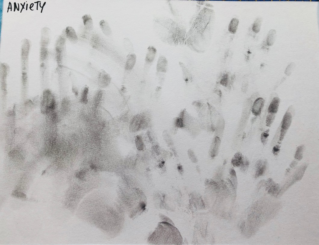

I found this exercise as very useful because it really brings up your creativity to the surface. While I was thinking about particular feelings I have got a couple of very ineteresting ideas for my future works. I also explored different mediums. This is a good exercise to train your ability of being spontaneous and loose. It is also a very brainwork stimulating exercise. Below I put a collage I made of different A3 sheets bringing together different moods: anxiety, anger, calmness and joy.

I developed my images into my contemporary style art work which is below: I called it as “Joy suppresses anxiety or fried eggs help to uplift the mood”:)

Exercise 2: Experimenting with texture
For this exercise I took a couple of kitchen sponges – metallic and a rubber one. I also had 2 pears on the plate for about a week and which were not fresh anymore. I had been keeping them on my table observing everyday the changes they were going through: new brown spots, lines and wrinkles, their fading beauty. Their skin was a good object to draw an interesting surface. These aging pears reminded me my parents and drawing the pears I ended up with an idea of “ Pearents”.
For my objects I used coloured pencils, water colour markers (Winsor & Newton) and ink pen (Graph`IT).

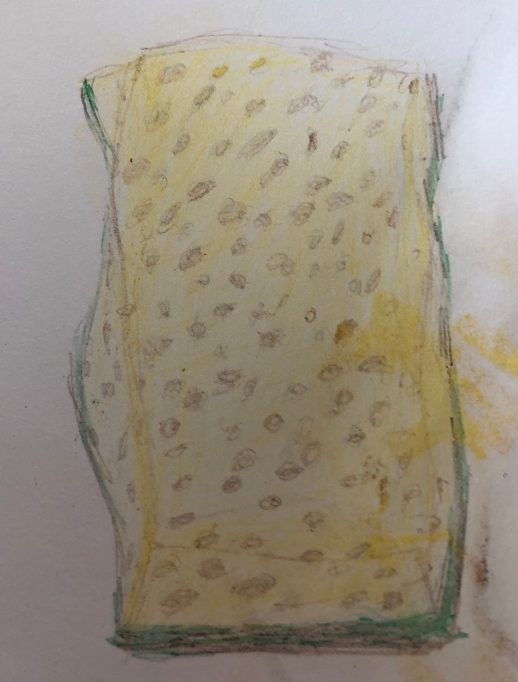


Above is my pear’s skin in coloured pencils. Below -pear’s skin in water soluble oils and another one in water colour markers.
”The Pearents”


I like to experiment with my drawings using filters of Snapseed app :


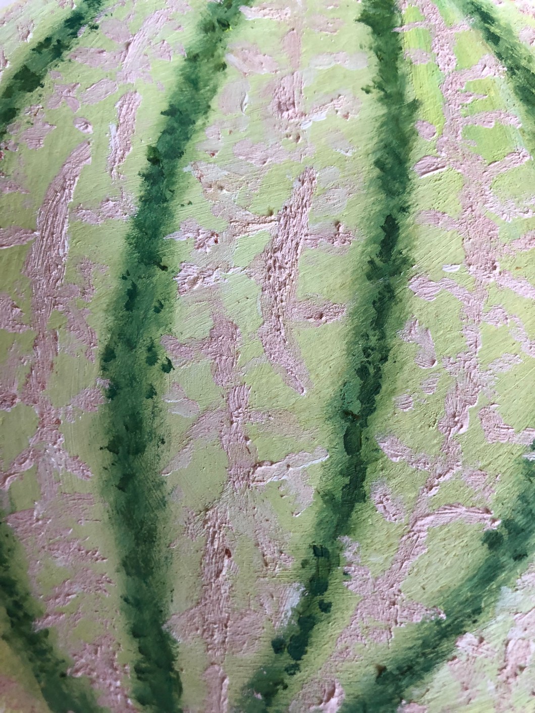
Another suitable object for this exercise was a melon in my kitchen. It’sskin was very rich in terms of texture. I decided to use oil paints because I could create texture using an “impasto” technique. I used oil paints from Seurat. I drew a melon and an amplified fragment of my melon`s skin which is below.


And some experiments for my melon texture drawings with filters:


Some frotting:

Project 2: Basic shapes and Fundamental Form
Exercise 1: Groups of Objects.
For this exercise I picked up random objects in my kitchen. I used a charcoal stick and an ink pen. I cant say that I managed really well in this exercise because I must improve my linear skills. Drawing pure forms is not my strength, I need to practise more.


Exercise 2: observing shadow using blocks of tone
I placed a bottle of water and a tea cup under direct sunlight to obtain a distinct shadow. I also thought that the stone tiles floor would be a good addition for this exercise. I used a charcoal stick, working on A3 format paper. The sun light created strong shadows and sparkles on water in the bottle. I used my rubber to create light and sparkling areas. Below is my drawing with charcoal sticks.


Exercise 3: Creating shadow using lines and marks
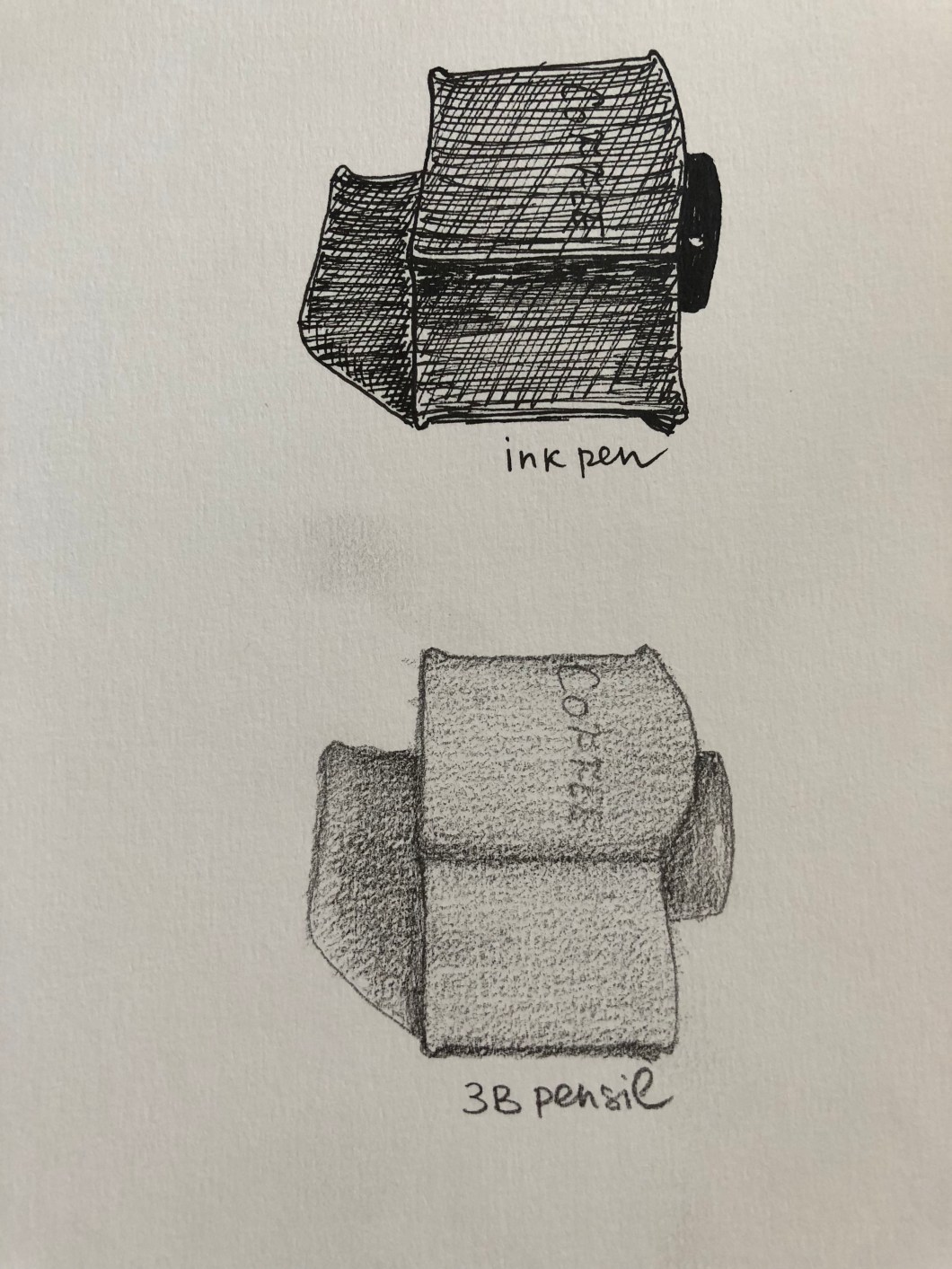
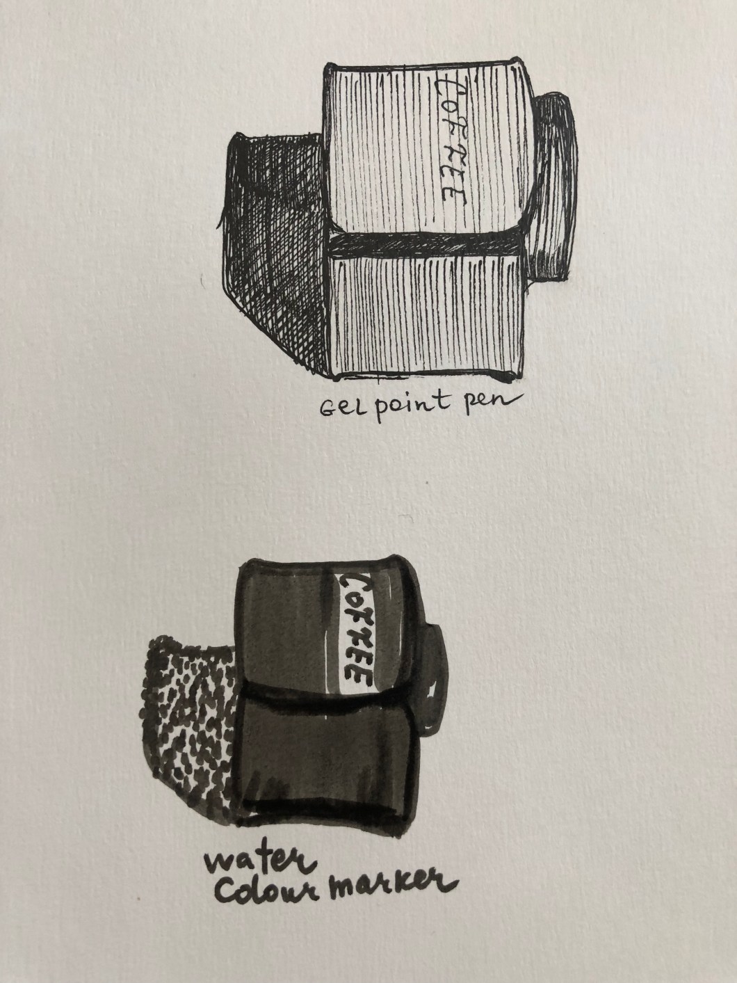
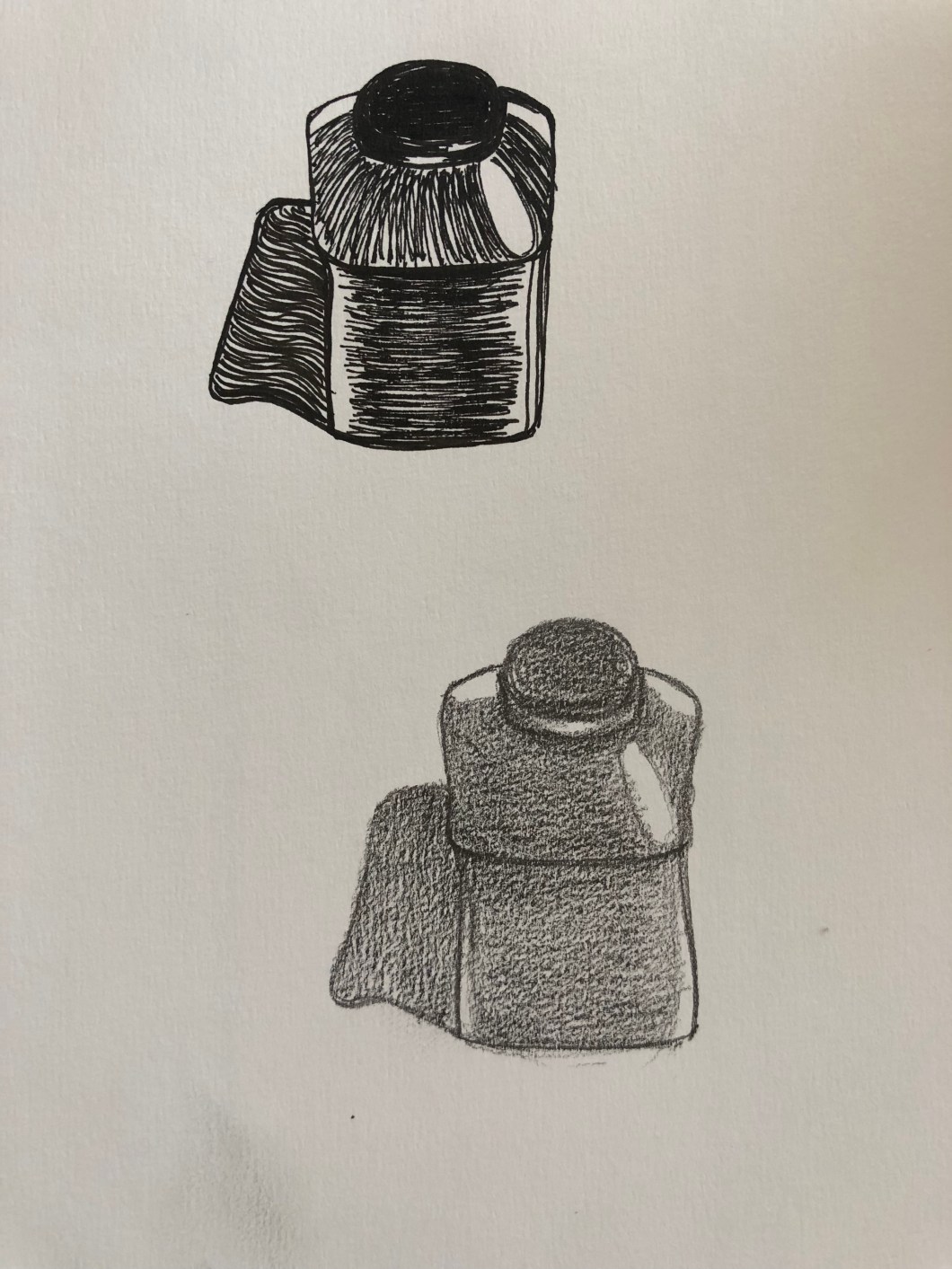
For this exercise I picked up a ceramic coffee storage bowl in my kitchen. I placed it under direct sunlight to obtain a shadow. As it was required to use different 4 mediums, I used a ball point he’ll pen, an ink pen, an HB pencil and and a water colour marker. I used different lines and strokes for creating shadow and colour my object. I did straight lines, angled lines, horizontal and vertical, 2 types of lines together. Please, take a look below :


Exercise 4: Shadow and refelected light
For this exercise we were required to use a charcoal and a conde stick to draw 2 objects with a highly reflective surface. I found a yellow colour metal hot water jug and used the same black ceramic coffee container. I used an A3 size paper and charcoal sticks.
Below are my objects.


Another object was an olive tree near my house which was highlighted at night. The light comes from the lower left corner. Quite unexpectedly my olive tree at night appeared as a quite descent image. I used charcoal sticks and pastel. With charcoal I created the tree and leaves. I used brown and dark blue coloured pastel sticks to make an accent on the night sky and leaves. While finishing the drawing I used a rubber to create the lighted areas of the tree. I think I did quite well with drawing the olive tree`s skin texture, brunches and leaves. I also tried to create a certain dynamic – as a feeling of wind at night. I think I managed to get some atmospheric potential in that drawing.
Below is my drawing of the olive tree at night. ( charcoal and pastels)

Below is photo of the olive tree I drew above.

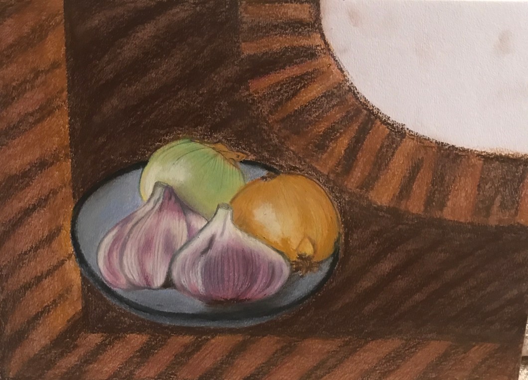
Final Assignment (Redone in June 2018)

After I have catched up with all the exercises for the first assignment, I have decided to re do my first final assignment, bringing the skills I have developed over the time and through doing my exercises. I also read very carefully again the assessment criteria on the page 7 of our folder for the Drawing 1 course to make sure that my work will be relevant to what will be looked for by those who will decide whether or not I should pass the assessment. Below are those criteria and my thoughts and self reflection about my drawing.
1) Demonstration of technical and visual skills – materials techniques; observational skills; visual awareness, design and compositional skills.
I decided to draw peaches and apricots because I was attracted by their looks – texture and colours. I used JAXWELL pastels for them and brown charcoal stick to work on shadows arround the fruits, the details of their texture and to create the folds of the napkin. Also I used a new paper – CROQUIS, grain fin.
Before starting I had to think about compostition and design. I decided to place the fruits on the yellow napkin and created some folds, so I could demonstrate my skills of creating a feeling of a “real space” and an impression of three dimensionality.
2) Quality of outcome – content, application of knowledge, presentation of work in a coherent manner, discernment, conceptualisation of thoughts; communication of ideas.
I am quite happy with an outcome because people can recognise the peaches and apricots and certainly pastels appeared as a very good medium for drawing a particular texture of these fruits. I think I managed to bring the idea of softness and tenderness of these fruits via my medium and colours. I used an A3 paper format.
3) Demonstration of creativity – imagination; experimentation, invention, development of the personal voice.
Definitely over the time I gradually develop my “personal voice”, I can say that obtaining my artistic personality is the most wonderful part of all my work. I place my best drawings on this website in “My portfolio”- where anyone can evaluate how I experiment and evolve.
4) Context reflection – research, critical thinking; critical reviews and essays.
I can say that I have improved my work under this criteria. The more artist research I do – the better I do in terms of critical thinking, personal artistic development and broadening the mind, understanding of different kinds of art and styles.


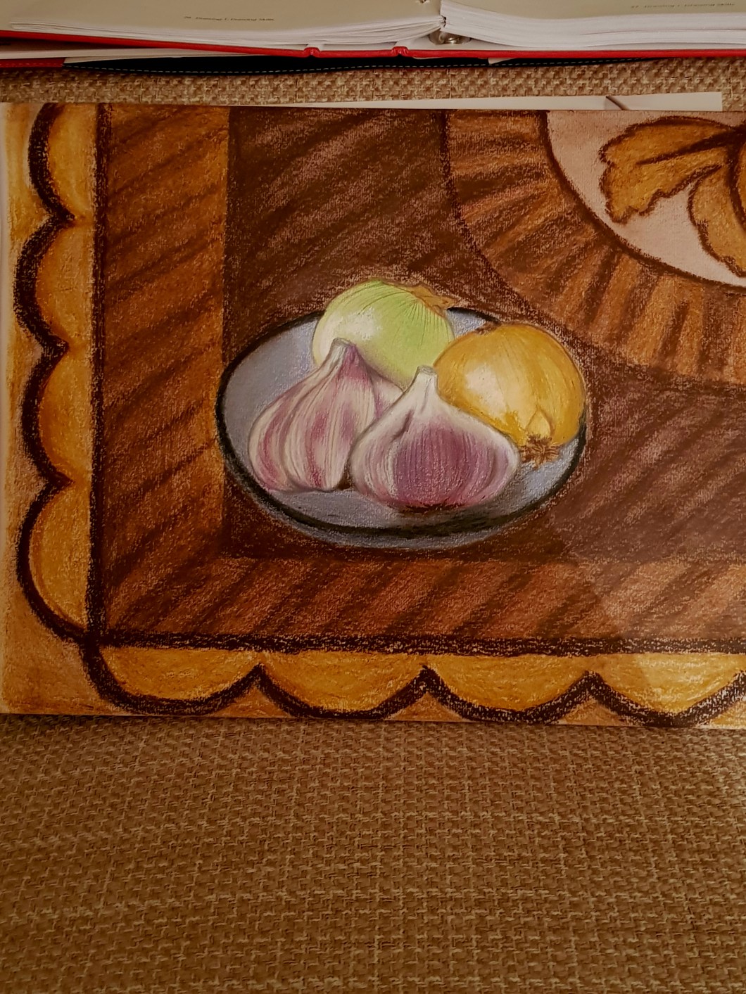
1st Final Assisgnment – first trial done in October 20127
Today I have completed my 1st assignment from my course “Drawing skills”. I was required to pick up some objects “that trigger a response for me”. I should set them up in a particular way, at interesting angles, so I would be able to draw shadows and lights, textures. It took some time for me to figure out what objects to pick up for my ‘still life” drawing and I decided to draw natural objects, since they usually contain lot of texture, colours and lines: I took 2 onions and 2 bulbs of garlic. I have placed them on the plate and put that plate on my wooden coffee table which contains lot of texture- lines and spots of natural wood. Recently I bought oil pastel pencils from SENNELIER and I decided to try them out with this assignment. They have 12 colours and when you use them they feel very sticky and oily. I used a graphite pencil and later on, as I proceeded I decided to use normal colour pencils from Fabre Castell.
First I tried to center properly my still life objects – the plate with opinions and garlic – on my A3 format paper. I used normal graphic pencil to draw light contours of each onion and garlic bulb. That was not difficult. First challenge was to figure out how to colour the garlic. My set of oil pastel pencils contain a nice white colour, but it doesn’t contain any “garlicky” purple one. On a separate paper I experimented with mixing colours and I think that mixing red and deep blue gave me a good colour for my garlic. Another challenge for me was drawing straight and perfect circle lines for my objects – the bulbs and the table. Doing countouring is one thing, but drawing a strong nice perfect line – also is a skill to obtain.
Both garlic and onion contain very nice long and just perfect fine lines – I did them with my graphite pencil. I don’t know why – but I enjoyed this part of work most, probably, because when you do them – the object appears to look much better.
In terms of colour I really like how my peeled onion came out -I find its final colours as very natural and fresh. I also cared about shadowing and light which came from my left side, so I shadowed my objects – make shadows on right sides and placing with my white oil pencil – white spots on left sides – reflecting light.
Working with oil pastel pencils requires lot of rubbing! I experimented: rubbing with a piece of paper and with a make up sponge – both work. Below you can find the photos I took during my drawing process.